| Image |
Comment |
| 04/29/2005 07:03:45 PM |
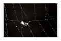
Le Petite Moustiqueby SimonkasprzakComment: Very nice picture, although I feel the main subject is too small (or maybe I just need some glasses...). Anyway, I like the overall feel of the image. What I truly dislike is the large border and believe the picture would be greatly enhanced if you eliminated it. |
 Photographer found comment helpful. Photographer found comment helpful. |
| 04/29/2005 06:57:31 PM |
|
| Photographer found comment helpful. |
| 04/29/2005 02:34:39 PM |
Pink Flowerby I Enjoy HamComment: Though you have a nice, average macro shot of a flower, it doesnt fit the challenge.I feel It's not minimalistic and the main subject fills almost the whole picture area. Nice colors and composition (perhaps cropping the bottom area would work out nicer), though. |
| Photographer found comment helpful. |
| 04/29/2005 02:30:57 PM |
Buttonby ckdakeComment: While it is indeed a minimalistic image, I feel it's not an interesting one. Besides, the main subject here -the belly button- is very soft, almost out of focus. The composition is, however, fine. Better luck next time. |
| Photographer found comment helpful. |
| 04/28/2005 12:32:21 AM |
Photo---9editedcattonge.jpgby gwendyComment: Very nice shot. The cat's head in on perfect focus and Dof is good - the background is perfectly blurred out and has a nice saturated green. Perhaps the photo has too much contrast. Anyway, pretty good. |
| Photographer found comment helpful. |
| 04/28/2005 12:28:37 AM |
Photo--12cat.jpgby gwendyComment: In this one, the focus in on the cat's back, when it should be on its eyes or nose or sharp teeth lol. That's the only thing I have to point out. |
| Photographer found comment helpful. |
| 04/27/2005 07:54:54 PM |
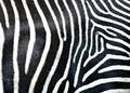
Out, Out, Damn Spotby DiComment: Great, great shot of zebra stripes... However, one can barelly see the "damned spot", which is intended to be the main point of the image... That, of course, is a turn off. I feel that, in a different context, I would have scored this image much higher...
Anyway, very nice shot and good job. |
| Photographer found comment helpful. |
| 04/27/2005 07:49:48 PM |
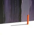
Orange # 5by LowLghtComment: Well, I dont think you have the most interesting subject... However, I must say your image is rather catchy and appealing, with its simple and minimalistic forms. The colors are very well chosen and produce a pretty good combination. Tecnichally, no flaws to point out. Nice job. |
| Photographer found comment helpful. |
| 04/27/2005 07:44:10 PM |
door knobby robadsyComment: Nice minimalistic shot - basic forms and colors, strong composition and perspective. I only feel that the imperfections on the blue part are too visible, which is a bit of a turn off... Maybe by smoothing or blurring it a bit, the image could improve... I'm not sure - I'm no expert on photo editing... But it sure does stand out. Good job.
|
| Photographer found comment helpful. |
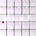
| 04/27/2005 07:35:22 PM |
Thicker than Waterby conglettComment: The concept is very clever - creating a pattern, in which the strong point of the image emerges -, but I'm not sure about its execution... I don´t think the drop of blood (??) is such a strong point, perhaps due to its framing and dimension... I feel you ended up with an image less interesting than it was supoosed to (and the reflection of the light is a bit distracting too). Anyway, 6 for originality and effort. |
| Photographer found comment helpful. |
Home -
Challenges -
Community -
League -
Photos -
Cameras -
Lenses -
Learn -
Help -
Terms of Use -
Privacy -
Top ^
DPChallenge, and website content and design, Copyright © 2001-2025 Challenging Technologies, LLC.
All digital photo copyrights belong to the photographers and may not be used without permission.
Current Server Time: 06/15/2025 01:56:00 PM EDT.