| Image |
Comment |
| 05/28/2006 04:11:02 PM |
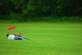
father & sonby Nikonian NinjaComment: Sweet shot with good empty space. I think it might be an improvement if you could bring the saturation of the father, son, and umbrella down a bit. They seem a tad oversaturated. |
 Photographer found comment helpful. Photographer found comment helpful. |
| 05/24/2006 01:32:41 AM |
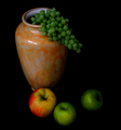
Cezanneby JutildaComment: Straight in to the favorites. I love the light. |
| Photographer found comment helpful. |
| 05/22/2006 03:09:40 PM |
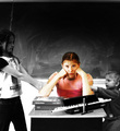
Teenage Tormentby NeuferlandComment: Nice entry, Deannda! I'm not a selective desat fan, but I can see why you chose to use it here. Like Manny said below, the diagonals of the kids' heads is really cool... the flute contributes to the lines, and there's no clutter at all in the shot. I love, love, love how much you all work together with your entries. You're a wonderful mom and you have awesome kids! Congratulations on a very nice entry. |
| Photographer found comment helpful. |
| 05/15/2006 01:16:12 AM |
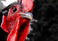
Demonic Psychotic Chickenby suemackComment: Ha ha ha haha, awesome entry, Sue! He definitely looks scary, but I am naturally terrified of roosters anyway. I love the crop and the detail on his left side. |
| Photographer found comment helpful. |
| 05/15/2006 01:10:59 AM |
Dorothy's Pixy Cousinby NeuferlandComment: Cute shot, Deannda! It's wonderful how much of a family activity photography is for all of your family; that's probably my favorite thing about your work. It just warms my heart. Technically, you also did a good job here. The only thing I can see that might have got a better reaction is if Melissa's shirt were a solid color that matched or complimented either her hair ribbon or Ellie's shirt. I wish I had a pure white wall like that! |
| Photographer found comment helpful. |
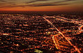
| 05/15/2006 01:03:31 AM |
Dusky Pulsating Cityby DigiFotoBuddyComment: Hey Shail, nice entry! I haven't read the comments you received, so mine are completely uninfluenced. When I first looked at this, I thought it was smaller than the 640 px allowed, but checked and see that it is that in width. So here comes my tip: I've noticed that my scores have gone up in general by between 0.5 and 1 point since I've started to make both dimmensions wider. So I think if you had made the vertical 30-50 pixels wider, it would've helped your score. The shot itself is really good for a movie poster, imo. You've got some nice colors going on and I like the comp. The lights look a little blurry, but one could say that the blurriness adds life to the shot. (probably the voters don't think so, though :-) Amazing sunset! |
| Photographer found comment helpful. |
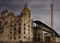
| 05/15/2006 12:57:15 AM |
Dark Phantom's Castleby SandyPComment: What a spooooooky looking sky, Sandy! It's a very cool building too, but the sky makes it. The title is perfect. I'm surprised this didn't score a little higher. I enjoyed reading your description - it does sound like a great assignement!! |
| Photographer found comment helpful. |
| 05/14/2006 02:41:15 AM |
DSC_4843.JPGby wavelengthComment: What Jutilda says goes for me too. I might like to see the vertical crop either a little more or a little less, though. It looks like you meant to get the whole hand and the whole top of dad's head in this version; if you wanted it to look cropped, then a bit more of a crop wouldn't hurt. Otherwise, cropping to include the rest of dad's head would help, in my opinion. This is one that they will treasure forever, either way. It's crisp, colorful and pure joy. |
| Photographer found comment helpful. |
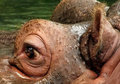
| 05/13/2006 01:03:17 PM |
1337-hippo.jpgby BeeCeeComment: I have to also agree about the eye, and not because of peer pressure this time, but because that is the first place my eye landed. The crop is interesting in a good way. I get a view of this animal in a different way. The blown highlight between the ears is a tad distracting, though. |
| Photographer found comment helpful. |
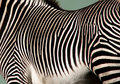
| 05/13/2006 12:57:17 PM |
1373zebra.jpgby BeeCeeComment: You've done an excellent job of capturing and retaining the detail with all of these zoo shots, as well as the color. I like this the way it is and only want more green under the belly because of peer pressure :-)
I'd love to see your camera info in the descriptions so I can learn from you. Again, great job! |
| Photographer found comment helpful. |
Home -
Challenges -
Community -
League -
Photos -
Cameras -
Lenses -
Learn -
Help -
Terms of Use -
Privacy -
Top ^
DPChallenge, and website content and design, Copyright © 2001-2025 Challenging Technologies, LLC.
All digital photo copyrights belong to the photographers and may not be used without permission.
Current Server Time: 08/12/2025 10:51:48 PM EDT.