| Image |
Comment |
| 03/20/2005 04:41:53 PM |
Sensualby ericsuthComment: You couldn't have picked a better title. The slightly soft focus complements the stark definition of colors and lines. |
 Photographer found comment helpful. Photographer found comment helpful. |
| 03/20/2005 07:18:08 AM |
|
| Photographer found comment helpful. |
| 03/20/2005 07:16:43 AM |
The Horizonby CutterComment: This is a fantastic capture, but it looks like it's a capture from television. |
| Photographer found comment helpful. |
| 03/19/2005 01:18:26 PM |
lines of comunicationby kforgComment: Clever with the shadows in the backround especially. The colors are good and this makes a nice abstract. I wish it could've been sharper to really make it "pop". |
| Photographer found comment helpful. |
| 03/19/2005 01:16:52 PM |
|
| Photographer found comment helpful. |
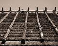
| 03/19/2005 01:13:44 PM |
Rooftopby dr rickComment: I'd like to see this in color - not sure whether the desaturation was right for this (in my opinion - please take what I say with a grain of salt, as I am just learning myself). |
| Photographer found comment helpful. |
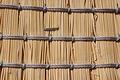
| 03/19/2005 01:07:15 PM |
My outside broomby camelotnorthComment: Very creative. I'd like to see a tad more saturation (or possibly the other way - b&w) and also no staple in the middle. I think the composition is very good. |
| Photographer found comment helpful. |
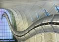
| 03/19/2005 01:05:07 PM |
Structuredby hdogg4uComment: Can't wait until after the challenge to see where this is. Looks like a top ten to me! |
| Photographer found comment helpful. |
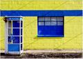
| 03/19/2005 01:04:04 PM |
Urban Land Linesby jpochardComment: This is one of my favorites of the challenge. Very simple on the surface, good and stark colors. The diagonal shadows provide a nice contrast to the right angles of the lines in the building, sidewalk, and phone booth. You might have wanted to rotate the canvas just a wee bit clockwise. |
| Photographer found comment helpful. |
| 03/19/2005 12:59:43 PM |
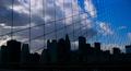
Websiteby charmayneComment: Great composition and by the way, great title too! I'd love to see the skyline either a complete sillouette or have it be lighter. It's kind of frustratingly in the middle right now. The upper right with the blue sky is stunning, as is the perspective lines of the fence/net. |
| Photographer found comment helpful. |
Home -
Challenges -
Community -
League -
Photos -
Cameras -
Lenses -
Learn -
Help -
Terms of Use -
Privacy -
Top ^
DPChallenge, and website content and design, Copyright © 2001-2025 Challenging Technologies, LLC.
All digital photo copyrights belong to the photographers and may not be used without permission.
Current Server Time: 08/06/2025 12:01:21 AM EDT.