| Image |
Comment |
| 07/25/2003 04:30:00 PM |
|
 Photographer found comment helpful. Photographer found comment helpful. |
| 07/25/2003 04:28:55 PM |
Baby, I'm a star by swaroskjiComment: WOW! This is one of the cleverest shots I've seen for ages - talk about really looking for a new angle on a straight-forward object! I love the use of one shoe as frame to the other.. it really makes the DOF choice zing out! |
| Photographer found comment helpful. |
| 07/16/2003 04:56:02 PM |
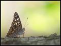
Camouflageby GordonComment: Purty and particularly good background. And I do see some circles! Great DOF on the bark... |
| Photographer found comment helpful. |
| 07/14/2003 03:30:44 AM |
|
| Photographer found comment helpful. |
| 07/11/2003 11:24:41 AM |
Raptureby KarenBComment: An interesting shot though my overwhelming thought is "Goodness she looks uncomfortable" - and that thought overrides the thoughts I also have about the interesting shapes formed by the pose.
I think it's a good nude - I like that it's a little riske - with the inclusion of quite a lot of the bum and the bosoms left uncovered. It's not too "false modest" if you know what I mean.
I find the contrast between colour in the wrap and desaturated body interesting but also feel that skin is so beautiful in colour that it loses something in some black and whites... in this one I feel I'd rather see the skin in full colour.
I like the use of negative space, the positioning of the girl within the frame itself appeals. |
| Photographer found comment helpful. |
| 07/11/2003 10:51:30 AM |
Nude Dailyby wingyComment: A really interesting image - I like the reflections caught in the showerhead and the stop motion on the water. I also like the choice to go for high contrast in post processing. The crop (cutting out the eyes and rest of the head) works very well for me. I like the dark spaces too. |
| Photographer found comment helpful. |
| 07/11/2003 10:49:23 AM |
Stone agedby AnastasiaComment: Firstly, I want to say how much I like the lighting in this - exposure seems just right.
Please don't take this the wrong way but the pose really looks very strange to me - lifting just one leg like that kind of makes me think of a pet going to the bathroom and the hand on the bottom doesn't help dispel that. Truly, I'm not trying to be rude or offensive but to let you know honestly how the image strikes me.
I think a similar pose with her sitting on flat rock, with both legs tucked to her right, bent to the same extent, would work much better.
If this comment does upset you, please just drop me a PM and I will be happy to remove it ASAP.
Kind Regards
Kavey |
| Photographer found comment helpful. |
| 07/11/2003 10:45:45 AM |
Tatooedby kosmikkreeperComment: What a clever use of light projection - this is such a quirky and unusual image. Just a touch dark for my preferences but still one of my favourites in this challenge. |
| Photographer found comment helpful. |
| 07/11/2003 10:44:36 AM |
Sun baskerby kiwinessComment: An absolutely great example of someone really enjoying the warmth of the sun upon their skin. And, look, a little nipple poking out! I feel a strange kinship with this entry! (See my SP Revisited entry LOL).
Great background too - fantastic shapes and texture to it but softness too.
Lighting and skin tone seems just right.
One of my favourites. |
| Photographer found comment helpful. |
| 07/11/2003 10:40:27 AM |
Shy by mariomelComment: Very strong shapes in this - and excellent pose to protect modesty whilst still conveying "nude".
I don't like the way that the border is slimmer at the top - I would prefer it to be uniform width all around, even though that's quite wide because of your decision to have the feet "fall out" of the border. |
| Photographer found comment helpful. |
Home -
Challenges -
Community -
League -
Photos -
Cameras -
Lenses -
Learn -
Help -
Terms of Use -
Privacy -
Top ^
DPChallenge, and website content and design, Copyright © 2001-2025 Challenging Technologies, LLC.
All digital photo copyrights belong to the photographers and may not be used without permission.
Current Server Time: 08/21/2025 05:03:57 PM EDT.