| Image |
Comment |
| 02/09/2004 11:50:50 AM |
|
 Photographer found comment helpful. Photographer found comment helpful. |
| 02/09/2004 11:49:34 AM |
Constraintby jenesisComment: Lovely lighting! This is a really lovely image - the kind of image where content itself doesn't matter - the end result is visually appealing because of the light/ shade/ form/ lighting and not because of the choice of content. |
| Photographer found comment helpful. |
| 02/09/2004 11:40:49 AM |
|
| Photographer found comment helpful. |
| 02/09/2004 11:36:56 AM |
|
| Photographer found comment helpful. |
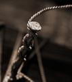
| 02/09/2004 11:34:44 AM |
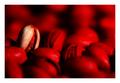
Ride the Crimson Tideby moodvilleComment: I'm not sure I like or understand the choice of such a strong red colour but I like the image and the way one lone nut stands out. |
| Photographer found comment helpful. |
| 02/09/2004 11:30:50 AM |
Ladybugby ladpupmoeComment: Great composition with the opposing diagonals. Colour seems too orangey to me. |
| Photographer found comment helpful. |
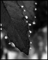
| 02/09/2004 11:23:05 AM |
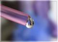
A delicate dropby ScantyNebulaComment: Lovely colours and the droplet detail is great. I think I'd prefer the straw to push further into the frame in terms of composition. Even though the droplet is centred it feels kind of oddly balanced because the straw adds more weight to one side. For that reason I'd not opt for the centred composition and go for a two thirds/ one third instead. Just my preference. |
| Photographer found comment helpful. |
| 02/09/2004 10:59:33 AM |
Bodyscapeby tariqueComment: This is a beautiful image - the lighting is flattering to the skin tones and the composition is really unusual.
I'm not sure I like the inclusion of the hair - I think either more or none would work better in terms of composition, for me. And, although I like the texture and stripes of the cloth on her body, it feels a little too neatly folded and placed - I wonder if it would be more interesting with a few folds in it?
Altogether a wonderful image. |
| Photographer found comment helpful. |
| 02/09/2004 10:56:19 AM |
Networkingby tomlewis1980Comment: Vibrant background colour really lifts this image. I like the jagged white lines in the background too. |
| Photographer found comment helpful. |
| 02/09/2004 10:52:54 AM |
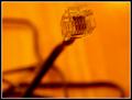
Matrix-Revisitedby tfarrell23Comment: I quite like the strong orange tone but I am not so keen on composition. Although I like the diagonal of the cable, I think the head is too close to the top edge of the frame and not well positioned horizontally. I find the position of the other cables somewhat messy and not adding to composition in any way. |
| Photographer found comment helpful. |
Home -
Challenges -
Community -
League -
Photos -
Cameras -
Lenses -
Learn -
Help -
Terms of Use -
Privacy -
Top ^
DPChallenge, and website content and design, Copyright © 2001-2025 Challenging Technologies, LLC.
All digital photo copyrights belong to the photographers and may not be used without permission.
Current Server Time: 08/26/2025 05:49:33 PM EDT.