| Image |
Comment |
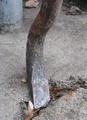
| 12/29/2004 02:07:30 PM |
Prybarby GeneralEComment: I admire this for the very fundamental take on what it means to be mechanical; a prybar is the original machine, aka "lever". The foreground leaf reall distracts, and I wish the image were more dynamic. |
 Photographer found comment helpful. Photographer found comment helpful. |
| 12/29/2004 01:59:37 PM |
"Hidden Face"by tfarrell23Comment: I really don't see a face here, except maybe a squinting one on the big rock, not really "trhere" for me... |
| Photographer found comment helpful. |
| 12/29/2004 01:58:10 PM |
Ent of Fangornby scrum8Comment: It's a nice face, but the background is way too confusing and cluttered to show the face to best advanhtage. |
| Photographer found comment helpful. |
| 12/29/2004 12:44:56 PM |
Liberty & Justice, Great Briton Edition.by marboComment: ***CRITIQUE CLUB RESPONSE***
There's really not much I can say about this image except "well done!" The score says the rest, and I quite agree it's a top-10 image in the deja vu challenge. I went to the original, and I think this is a fabulous variation on it.
One thing I noticed is that the original is more "linear", where yours has a "zoom-out_ effect, with the zoom popping down to the crossed-bars center of your image. It may not be intentional, but it's a nice subtle metaphor; UK is an island, a focused place so to speak, where USA is a sprawling, linear kind of place. So that's good.
If I had any suggestion for improvement, it might be to try cleaning up the whites a little bit with curves. I'd like to see how this worked witha little more pop int he tonal range. But that's a nit. Good job!
Robt.
|
| Photographer found comment helpful. |
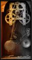
| 12/29/2004 02:30:15 AM |
TIME IN MOTIONby DDYJRComment: A nice shot. The hot, over-warm "arch" upper left is unfortunately a real eyetrap here. |
| Photographer found comment helpful. |
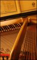
| 12/29/2004 02:28:08 AM |
Hammer and Stringsby sbeaumontComment: Very beautiful. Maybe a hair too yellow. I feel like if the large, diagonal bar were angled so it landed a bit further left, this would be better, but that would level the score (not good) or obscure the posts and soem of the red (not good) so.... |
| Photographer found comment helpful. |
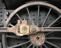
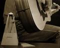
| 12/29/2004 02:26:03 AM |
Black Beautyby AlbireoComment: This is exceptionally nice. I'd like to see a slightly more agressive tonal range (a little denser in the dark-but-not-black areas), and I'd have been inclined to 'shop out the light rub-marks above the wheel. |
| Photographer found comment helpful. |
| 12/29/2004 02:23:52 AM |
The Pratice Issueby graphicfunkComment: I very much like the play this makes on the concept; not only have we the metronome, which is a purely mechanical device, but we have the idea of the musician practicing the mechanics of his craft. I'd quibble with the cropping left (needs a tad more space) and fore (I don't want to lose the tiny bit of the metronome cover that's missing). |
| Photographer found comment helpful. |
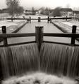
| 12/29/2004 02:20:40 AM |
Mechanical lock gates by geewhyComment: This is really, really sweet, the tonalities are so pure, the composition is so locked-in, the flow of the water is so palpable. I appreciate also that this one is outside the box, not just one more of the same thing. There's a LOT of gears, sprokets, and clocks in this challenge... |
| Photographer found comment helpful. |
| 12/29/2004 02:18:59 AM |
|
| Photographer found comment helpful. |
Home -
Challenges -
Community -
League -
Photos -
Cameras -
Lenses -
Learn -
Help -
Terms of Use -
Privacy -
Top ^
DPChallenge, and website content and design, Copyright © 2001-2025 Challenging Technologies, LLC.
All digital photo copyrights belong to the photographers and may not be used without permission.
Current Server Time: 08/29/2025 09:10:31 PM EDT.