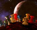
DPChallenge: A Digital Photography Contest You are not logged in. (log in or register
 
Browse Settings
Currently viewing:
AdministratorBear_Music

Show comments:

Per page:

Order:

Comments:


Comments Made by Bear_Music
Pages:   ... [1010] [1011] [1012] [1013] [1014] [1015] [1016] ... [1124]
Showing 10121 - 10130 of ~11232
Image Comment
tAcKs iN SpAcE
04/29/2005 02:02:33 PM
tAcKs iN SpAcE2nd Place
by Mick

Comment:
***** CRITIQUE CLUB COMMENT *****

Yowza, this is a fun one to draw! I had this picture pegged for a ribbon as soon as I saw it, and it was the second one that opened for me in the challenge random draw. My original comment was somethign like "I sure hope this isn't Calvert in a rut", I hope you took that as humorously as I meant it.

This wildly imaginative shot is one of my favorites among all the challenge entries I have voted upon. For me it excels on so many levels it's almost funny.

1. Technically it's exceptionally nice, and allt he more so given your relatively primitive lighting setup. Some might say the BG should be sharper, but I disagree with that. I think the tacks would be downvalued if the BG image were crystal-sharp (as, for example, it is in Scalvert's "Nightbulb" shot, where the sharpness is an asset since the BG becomes part of the foregrounds, as it were).

2. It has an extremely high, but not "in-your-face", humor quotient, only underlined by the bizarre spelling of the brilliant title, which calls to mind all sorts of low-budget sci-fi movies in my twisted brain.

3. It's metaphorically complex. It's amazing that such a mundane subject material and a few odds-and-ends can produce such an example of visual stortytelling. It has an air of "documentary", it has a heavy aura of "science fiction", It has hints of "global domination", it raises questions in my mind as to whether the tacks are a malevolent or a beneficient force, and it speaks (for me at least) to the loneliness of the human condition and our quest for meaning in the universe. Quite a load for a handful of tacks to tote, eh?

4. It's visually appealing; it's beautiful "eye candy" even though (as explained in 3) it's far MORE than eye candy.

In summary, this is a powerfully good image, and one of which you should be estremely proud. I wish I had some specific areas I could address by way of suggested "improvements", but honestly nothing stands out for me as being in NEED of improvement. Perhaps the large, central blue tack could be better-separated from the background? jejejeĆ¢„Ā¢

Thanks for the chance to comment upon this image in depth.

Robt.
Photographer found comment helpful.
blackhack pilots.jpg
04/29/2005 01:16:04 PM
blackhack pilots.jpg
by No1_Dogman_2004

Comment:
This appears to be outstanding. It's hard to judge it fairly in such a small size though, the limited size/resolution can hide a lot of merging & layering flaws. I'm not sure how I feel about the blur you've added, but I'm not negative on it. I just wonder if it's too much, or not even needed at all. I'd have to see an original without blur to have an opinion.
Photographer found comment helpful.
IMG_8479possible.jpg
04/29/2005 03:34:04 AM
IMG_8479possible.jpg
by I Enjoy Ham

Comment:
LOL... See my just-posted daffodil, "yellow and blue" thread, for a deja vu dose.
Photographer found comment helpful.
Poofie
04/29/2005 03:30:54 AM
Poofie
by allankent

Comment:
Now that's EERIE! Consider using the desat brush (if you have photoshop) on the cyan highlights on the cat's fur upper right? And maybe clone out the speck under the nose?
Photographer found comment helpful.
Baby Fern
04/29/2005 03:28:20 AM
Baby Fern
by JPR

Comment:
KIller nice shot, JP... LOVE the lower right corner, the way it voids down subtly and gives us so much depth.
Photographer found comment helpful.
My Wife's Favorite Necklace
04/28/2005 01:51:29 PM
My Wife's Favorite Necklace
by rlinn3

Comment:
Beautifully rendered, especially on the spherical element. A little austere overall IMO.
Photographer found comment helpful.
Pure Pearls
04/28/2005 01:50:37 PM
Pure Pearls
by bobdaveant

Comment:
This is lovely in conception, nice to look at until one gets in close. Unfortunately the forwasrdmost pearls are in front of the zone of sharpness and this hurts you badly IMO. More DOF would have done the trick. 7 from me, I really like the design, fonts, and tonality of this.
Photographer found comment helpful.
"Timeless" Classic
04/28/2005 01:48:53 PM
"Timeless" Classic
by Zapperzac

Comment:
Easily among the best of the watch pictures. Nice work. The connection of the fob to the watch is not, perhaps, as well-displayed and lit as it ought to be, it's getting lost in the background. The watch itself is beautifully rendered.
Photographer found comment helpful.
Zuni Butterfly
04/28/2005 01:46:21 PM
Zuni Butterfly
by GeneralE

Comment:
I love this one. It doesn't shout "creative", it just renders the object skilfully and incorporates simple, effective text and a striking title font that works very well.
Photographer found comment helpful.
Fijian Black Pearls
04/28/2005 01:45:05 PM
Fijian Black Pearls
by dkubin

Comment:
The pearls are beautifully rendered here. I like the inline as well. The photo's very "commercial" (as opposed to artistic), which is what I take the challenge to be about. Or, rather, this is a challenge in which "commercial" can be an asset. Good job.
Photographer found comment helpful.
Pages:   ... [1010] [1011] [1012] [1013] [1014] [1015] [1016] ... [1124]
Showing 10121 - 10130 of ~11232


Home - Challenges - Community - League - Photos - Cameras - Lenses - Learn - Help - Terms of Use - Privacy - Top ^
DPChallenge, and website content and design, Copyright © 2001-2025 Challenging Technologies, LLC.
All digital photo copyrights belong to the photographers and may not be used without permission.
Current Server Time: 06/25/2025 04:40:03 AM EDT.