|
|
|
Showing 10111 - 10120 of ~11232 |
| Image |
Comment |
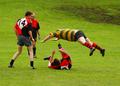
| 04/30/2005 11:41:53 AM | Penalty! Tackling the man off the ballby BigChrisComment: *** C R I T I Q U E C L U B C O M M E N T ***
I recall being both charmed and amused by this image in the challenge. I found (and find) it easy to look at and worth closer examination. In that sense it draws me in; I want to "know more" about the sequence of events here. So it's an effective image, and a strong entry; with this many photos shouting for attention, any photo that draws viewers back is a "winner", and your final score of 5.8776 reflects that other viewers kept coming back as well, IMO.
So why didn't this score higher? That's an interesting question, and I have an opinion. I believe that despite its many strong points that engage us, the image has some equally strong flaws. I'm of course aware that this is an action capture and there's nothing you can DO about any of this, but nevertheless if I'm going to be critical of this as an image, here's what doesn't work for me:
1. Least importantly perhaps, but also most fixable; the playing field doesn't seem level. You need maybe 3/4 of a degree of CCW rotation to make it seem so. It may actually BE level for all I know (the background due, who's static, appears to be close to true vertical) but the feet on the leftmost guy, the back of the guy on the ground, and even the angle of the pouncing fellow, all descripe left-to-right diagonals that are skewing our perspective. So try balancing this visually, see if you can get it feeling upright.
2. It doesn't feel quite sharp. Looks like some USM would fix it though, no biggie.
3. There's nothing you can do about this now, of course, but the grouping of the figures, as a compositional element, is relatively weak. The overlap of the leftmost guy witht he BG guy is singularly unfortunate, in how precisely one half of the rearmost figure is occluded and the matching of face aganst face is keeping us from seeing EITHER face well. Hypothetically speaking, imagine the leftmost guy 6 feet closer to the camera (more depth) and the rearmost guy 2 feet further to the right (no overlap, or little overlap).
4. It's VERY strange the lack of readable faces in this action shot, and even MORE strange the lack of a head on the leaping man.
5. On the "faces" topic, upon closer examination the two faces we CAN see, seem to be more amused than anything else. This leads me, at least, to finally deduce that the incident is not occurring during actual play, but is instead a bit of horseplay. When I got that sense out of it (and it speaks well of the picture that I looked hard enough to get that much out of it) I felt a little let down.
6. On a completely irrelevant note, I'm amused that the guy on the ground's sporting red socks, and his teammates have black socks and/or black shin protectors.
So that's it, that's how I react to this one and why. Tell me, WAS it horseplay or an actual fould during game play? I want to stress that it's a very intriguing image with many strong points, and that I gave it a 7 myself, but the above represent areas (mostly not fixable) that separate a perfect capture from a merely good one.
Robt. |  Photographer found comment helpful. Photographer found comment helpful. |
| 04/30/2005 04:36:55 AM | Tough Times Bring Friends Closerby DannyMComment: Just saw this. Lovely, lovely shot. One of the few cases I've seen where extreme neat image is used lovingly and effectively. The coolness of the colors works well here.
Robt. | | Photographer found comment helpful. |
| 04/30/2005 04:34:09 AM | Voicesby DannyMComment: **** C R I T I Q U E C L U B C O M M E N T ****
There's a quirky affability to this image that I like very much. The overall composition is eefective, viz placement of the subject down and right and the crowd of messages surrounding and compressing her. The facial expression is downright amusing and endearing. The overall sense of being lost & confused in the midst of a sea of messages and communication comes across clearly. Although others have commented negatively on the shades, I disagree; they fit the gestalt of the image perfectly for me with their overtone of anonymity.
So why didn't this techincally competent (sharp, well-exposed, well-composed) image score better? Personal vagaries of the voters aside (and those are hard to factor in, except to say it's not a WOW type of shot no matter how you slice it up, it's more of a subtle, endearing shot) I have these observations:
1. The tonalities of her flesh are somewhat too dull, too cyan maybe, it's a little offputting in a subtle way.
2. The background messages are crisper and sharper appearing than the subject herself (because they ARE crisper and sharper, more saturated colors and hard edges do that), so the BG is actively competing with the subject for our attention.
3. The DARKEST part of this image, perversely enough, is the part we should be drawn to; the subject's face. Her arm and shoulder stand out more than her face does.
How can you deal with this? In basic editing, it's hard to do. Since this was an advanced editing challenge, here's a possible approach;
Make a careful selection of the subject herself in whatever manner works best for you, via masking, lasso, magic wand+lasso, whatever. This will take some time. Feather the selection to maybe 6 pixels and save it.
Invert the selection and go to work on the background with a combination (each on a separate adjustment layer) of hue/saturation, selective color, and levels to mute it down somewhat. With the selection still loaded, create a duplicate layer from background, name it "blur", and apply slight gaussian blur to pull some of the sharpness out of the background. Then go back to the levels adjustment layer and tweak that so the end result is good for you.
Now go to make the "bur" layer the active layer and make a copy of that. name it "subject". Load the original selection of subject only onto this layer and use dodge and burn at a very low percentage to bring the face up a tad and take the shoulders/arms down a tad. Then make a levels adjustment layer to bring a little visual "pop" into the subject, taking care that the hotspot on the nose doesn't go grotesque on you. If necessary, use a little healing brush to bring some borrowed tonality to that hot spot. Finally, make adjustment layers for selective color and, possibly, hue/saturation to warm up her flesh tones and bring her to life.
When allt his looks good, save it with layers intact, flatten image, resize, and save as jpg. Be sure you're working in sRGB color space (image/mode menu to assign color profile).
Hope this helps. I'm assuming you have photoshop. If you don't, put it on your wish list :-)
Robt.
| | Photographer found comment helpful. |
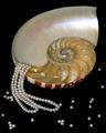
| 04/30/2005 03:25:15 AM | Treasures of the Sulu Seaby flip89Comment: The lighting on the pearls is very nice. Overall, the relatively shallow DOF is working against you. IMO it should either be sharp throughout or even more OOF at the back. | | Photographer found comment helpful. |
| 04/30/2005 03:23:46 AM | The Earringby saiphfireComment: This is quite striking in a subdued, minimalist way. I wish you'd given us some subdued, minimalist text to show us how you visualize using that negative space.. | | Photographer found comment helpful. |
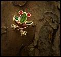
| 04/30/2005 03:21:55 AM | Take the Leap: Buy Me!by dsidwellComment: Very appealing rendering of the jewelry itself, crisp and luminous, lacking a bit in catchlights on the facets, but the BG is REALLY working against you here, it's SO dreary. Mutes foliage, for example, might have been more inspiring. I accept that your idea may have been to show beauty arising out of dreck, but it isn't working for me at that level. | | Photographer found comment helpful. |
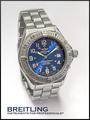
| 04/30/2005 03:19:08 AM | Who says girls have all the fun? by snackwellsComment: Very professionally done. Nice to see someone shooting a watch with the hands in balance, most didn't bother. Overall tonalities a bit flat, and this is hurting the luminace of the metal. A bit of a goose in levels would do wonders. Well-balanced, a strong entry. | | Photographer found comment helpful. |
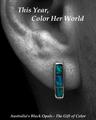
| 04/30/2005 03:17:15 AM | Surprise Herby BradComment: The picture itself is remarkable. Crisp, well-lit, wonderful and appropriate use of desat. Those are not easy stones to shoot. The type is doing you no favors herem however. One thing I notice that's really bugging me, though; this would appear to be a MAN, with a BEARD, and then there's the downy ear-hair... Seems at odds with the headline, "Color HER world"... What do you mean, if I wear an earring it color's my GAL's world? I don't quite get it. So basically you're confusing me with an otherwise wonderful image. Strong score regardless. | | Photographer found comment helpful. |
| 04/30/2005 03:11:15 AM | OUTBACKby DrJOnesComment: I love this one. It is beautifully lit, and makes a rational virtue of understating both the watch and the copy in a way that's entirely appropriate to the perceived marketing thrust; men who don't care about flash and value substance. I hope this does well. I'm afraid the voters may see "not enough jewelry" and score it down for that, but I think it's terrific. | | Photographer found comment helpful. |
| 04/30/2005 03:08:53 AM | February by nico_blueComment: This is VERY nice. Crisp and detailed, luminous, nigh-key BG that still retains visual iinterest, Elegant type. | | Photographer found comment helpful. |
|
Showing 10111 - 10120 of ~11232 |
Home -
Challenges -
Community -
League -
Photos -
Cameras -
Lenses -
Learn -
Help -
Terms of Use -
Privacy -
Top ^
DPChallenge, and website content and design, Copyright © 2001-2025 Challenging Technologies, LLC.
All digital photo copyrights belong to the photographers and may not be used without permission.
Current Server Time: 06/25/2025 04:40:06 AM EDT.
|