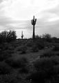
DPChallenge: A Digital Photography Contest You are not logged in. (log in or register
 
Browse Settings
Currently viewing:
MemberAzrifel

Show comments:

Per page:

Order:

Comments:


Comments Made by Azrifel
Pages:   ... [210] [211] [212] [213] [214] [215] [216] ... [221]
Showing 2121 - 2130 of ~2207
Image Comment
Cottage
01/27/2003 12:21:42 PM
Cottage
by Gotcha

Comment:
Ha ha ha, I didn't know what I was seeing. Was it noise? Was it the sharpness? Was it bad focus? Noooooooooooooooo! It's all curled up. :)

Nice.
Photographer found comment helpful.
Stained Glass
01/27/2003 12:17:38 PM
Stained Glass
by Yomi

Comment:
This must be so beautiful at full res. Nice
Photographer found comment helpful.
Inspired
01/27/2003 12:16:11 PM
Inspired
by Ptman

Comment:
Interesting subject, but the blue of the sky is overdone. It is too unreal.
Photographer found comment helpful.
Window to the Soul
01/27/2003 12:15:18 PM
Window to the Soul
by SharQ

Comment:
Nice clean eyeshot, beautiful iris. One that is nice to look at for a change.
Photographer found comment helpful.
Oasis in the Snow
01/23/2003 05:00:56 PM
Oasis in the Snow
by mariomel

Comment:
~~~~Critique Club Comment~~~~

Composition (content)

Excellent composition, the beams of sunlight and shadow in the foreground pull the eye into the island of trees and create a nice perspective.
Did you know the sun would do that or was it a coincedence? The amount of time per day that the sun does this shadow game must be short and only for a couple of weeks per year.... I like it how you captured it in perfect balance with the island of trees and the island of trees in a perfect balance with the foreground and shadow positions.
Good crop, equal amounts of space at each side. The foreground takes a lot of space, but that works really well on this picture.

A nice coincedence is that the angle of the hill finds a parallel in the angle of the treetops.

Background
Too bad that there are trees on the left, something like the right would have made the island/oasis stand out even more. The sky is a nice rich blue.

Camera Work (Technical)
Good exposure, there is no way that you get detail in the shadows of the trees when you shoot at the sun with a bright sky and a bright foreground. The capture of the sky and the sun without overexposing the snow is very good. The darkness of the trees works very well even, as it makes the whole pack of trees appear like one entity.
Focus is good, sharpening a bit too much, but it could be the way the light works around edges here, I have seen it happen before.
Whitebalance is perfect. Very clean picture.

Digital Processing (technical)
No comments.
The filesize is only 113kb, you are allowed 150kb. Saving it at a higher quality level can enhance detail sharpness here.

My opinion
Nice.
Photographer found comment helpful.
Serenity
01/23/2003 04:30:02 PM
Serenity
by lykofos

Comment:
~~~~Critique Club Comment~~~~

Composition (content)

I like the composition of this. The right line of the pebbles, the left line of the hill and the lines of the river seem to take the eye around the corner. The balance of pebbles on one side and water on the other side is nice too and the good thing is that that the break between that starts in the right corner.
The amount of sky above the hill and the big tree on the left bank is good. A tighter crop would harm the scenic view I think.
I like how the lower reflection is a kind of miniature mirror of the sky.

If it wasn't for the very bright sky (a lack of dynamic range of digital camera's, I run into these problems with both my camera's as well, especially natural dark greens and blacks vs bright skies) you would have succeeded in bringing your message of serenity. I find it a bit too hard on the eye really come to rest. Perhaps that a polarizer filter(I don't think the A40 can take one) could do something about the haze and perhaps a bit about the sky, but I still have got to test that myself.
The natural emptyness and balance of this is very nice.
The twigs in front add a sense of size, it is easier to judge the size of the pebbles and enhance the already rich depth. I personally wouldn't crop that out, altough many might not agree.

One thing, it has been mentioned a lot in the other comments, the horizon isn't straight. When you have photoshop, you could use the ruler to draw the line of the horizon and go to rotation, arbitrary to get it straight really easy.

Background
I am somewhat amazed to see how well the F2.8 aperture worked here. A smaller aperture (higher F) would have given more sharpness (in focus) at the central tree and beyond. I have no other ideas about the sky, except for layering different exposures, but that is illegal for dpchallenge.

Camera Work (Technical)
Keep it level. :)
The exposure of the rest of the scene is good. A longer exposure / wider aperture would have caused an even more blown out sky and shorter would have lost too much detail in the shadows, with darker greens.
Focus and sharpness are good.

Digital Processing (technical)
One thing that seems to enhance the exposure of the foreground without further worsening the sky is too set the input levels of the middle slider in 'levels' to 1.15.
It also looks very nice in black and white after channel mixing the monochromes to R40 G30 and B30 (before this I had set the levels as above). It seems to neutralize the sky.
Judged on the pebbles the sharpness is good.
The image could be saved at a higher jpeg quality setting, you still have room for 30kb. The advantage of a higher quality setting is that it preserves detail sharpness, color consistency etc. There is nothing wrong here however, just something to keep in mind.

My opinion
The bright sky spoils what could be a very pleasing image.
Photographer found comment helpful.
Stenocereus Thurberi
01/23/2003 02:37:34 PM
Stenocereus Thurberi
by Annida

Comment:
~~~~Critique Club Comment~~~~

Composition (content)

The choice of subject is interesting, a lot can be done with this kind of landscape. There are however a lot of things that could improve this photo.
I think that for this shot a landscape view was more desirable to be able to do more with the composition. The width of the land is not enough for what the eye expects when it sees this. The huge empty sky above it enhances that feeling. Using a landscape view you can widen it and by positioning the horizon either at 1/3 or 2/5ths from the top or the bottom you get a more natural balance between the ground and the sky. It would also allow you to make more use of composition 'rules' (guidelines, they are ment to be broken when necessary) that are discussed in the tutorials (rule of thirds is just one example of many composition tricks, I'll provide a link further down).
You could perhaps put one of the cactii in one of the thirds crossings and cut some of the sky off the top of your picture.

A nice example of something that is already in this compostition is the perspective of the two cactii. You can see the height difference between the two, it creates depth in the image. That is something you could build on in relation to the more off-center positioning of the front cactii. Work on an idea with that and shoot from different positions for example.

Another thing you could try is a different vertical shooting angle. The way it looks now is a huge foreground sloping downwards toward you, with the background leveling out behind the cactus. That is also enhanced by the portrait view you used instead of the landscape view I think you could better use. Go up, stand up, use a household ladder, stand on the roof of the car, search for a small hill, stand on a crate. When you use the composition rules for the sky as well and use landscape mode, I think that you can get a better balance in the depth of the image.

I am not sure if black and white is the best choice (depends very much on the output of your camera, I understood from the forum discussions that the output of the Polaroid is often a bit messy). The tones of grey are very dark, but the sky is very bright. Perhaps that a bit of (good) color could have given a better contrasts in the details.

Background
The background is the sky. The big exposure blow out white in the middle is very bright, it draws the eye out of the scene. I believe that this is almost unavoidable with this camera, the ccd simply can't cope with the exposure differences of the sky and ground.

The horizon is level, which is good.

Camera Work (Technical)
The foreground looks a bit underexposed, but the sky overexposed. I already said something about this in the background section.
Not much to add really.

Digital Processing (technical)
When you have photoshop, you could try adjusting the curves. Grab the curves line in the middle and pull it at a 45 degree angle towards the lower right corner. I did a quick curves like that and it turned the sky bright white, but equalling out the bright spot. The land itself became more nicely 'exposed'. Perhaps that the enhance colors/ gamma correction of the free Irfanview can do something like that. I encourage you to check that program out, I used it a lot before I got photoshop, it is easy and multifunctional.

I can't say much about the sharpness, because the jpeg quality is very low. There may be a huge improvement possible with just a higher quality setting. Your filesize is 34 kilobytes. Dpchallenge allows 150kb. Your low filesize tells me that the image is compressed very strong and my eyes could already see that it was too strong.
What is the result of strong compression? Loss of detail, halo's around subjects, loss of texture in the sky and ground, tone inconsistency, jpeg artifacts (square color shifts and strange fringing of details) etc etc.
You can see it here around the cactii and horizon, the loss of detail in the bushes, the overal soft and unsharp look of the image and artifacts above the right side of the horizon.
That can also be the result of the output of the camera, but at the highest resolution it should produce a 450kb file that you can work with. The highest setting is the best.
Now, to prevent all the above happening to the image, save it at a higher quality setting. You open the file from the camera, you work on it, you resample it (never resize, always resample with a bibubic or lanczos algoritm - lanczos available in irfanview), when necessary crop it. When necessary, now is the time to sharpen it. After that you save this as a tiff/tif file first!
Now use the tiff file (huge and dpchallenge will not take it) to create several copies at different quality settings and try to approach a filesize of 150kb. The closest will most often look the best and that is the one you need to submit.

My opinion
As it is I don't find it very interesting.
I have made this cc comment this long because I understand that you are pretty new to this.
Here are also some useful sites:
Agfanet photocourses These very broad and useful Agfa photocourses are online for free. When I started I found this site very useful. Read them all. :)
Photo.net learn section This guy made me understand exposure and has great tutorials about subjects.
DPreview When you are looking for a new camera, this is the best place to check if it is worth the money. These camera reviews are the best you can find.
Megapixel.net articles Easy to read articles on many of the issues mentioned in this comment.

Good luck, hope you think this was useful.
Photographer found comment helpful.
Trying to butter me up?
01/22/2003 06:00:26 PM
Trying to butter me up?
by catpixel

Comment:
Nice to see the face this time. Funny idea and good pose, composition is good.

But the use of flash has created some very harsh hard shadows around the right side of the face and shoulder, on the right side of the nose and around the packet of butter. Diffused flash light or bounce flash would have a much better natural lighting effect. Don't know to which extent that is possible.
And you'll possibly disagree with me again, but the whitebalance is off. The color of the flash light is very blue and needs a manual whitebalance setting to create more natural colours istantly. Now the face looks violet/purple.
Photographer found comment helpful.
Sundae Best
01/22/2003 05:52:56 PM
Sundae Best
by DougPaz

Comment:
Very clean and sharp pic.
Good depth, altough the background would be a lot better blurred. I like it how the read edge of the saucer and the tip of the spoon are in the field of focus.
Good colors and excellent lighting.
But the background seems so out of place, it doesn't relate to the icecream at all.
Photographer found comment helpful.
Milky Bath
01/22/2003 05:46:21 PM
Milky Bath
by Jean

Comment:
Beautiful how the subtle tone differences work out.
Very nice composition. The droplets of milk on the flower seem to add something. When I imagine the image without them it seems more empty.
Not a straight line to be seen, very natural, nice.
Photographer found comment helpful.
Pages:   ... [210] [211] [212] [213] [214] [215] [216] ... [221]
Showing 2121 - 2130 of ~2207


Home - Challenges - Community - League - Photos - Cameras - Lenses - Learn - Help - Terms of Use - Privacy - Top ^
DPChallenge, and website content and design, Copyright © 2001-2025 Challenging Technologies, LLC.
All digital photo copyrights belong to the photographers and may not be used without permission.
Current Server Time: 09/04/2025 01:56:02 PM EDT.