| Image |
Comment |
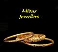
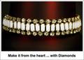
| 04/27/2005 11:46:48 AM |
midas jewellersby naomikComment: The pieces of jewelry you selected have nice character to them. Well lit and presented in a professional manner. The text color choice I don't agree with and it looks funny (to me) centered as it is. Maybe if it had been on one line instead of two? Good luck in the challenge. |
 Photographer found comment helpful. Photographer found comment helpful. |
| 04/27/2005 11:45:05 AM |
Ocean's Mystery Braceletby SondaComment: I like the way you've lit this. Very creative use of lighting. The text in the bottom left could be cleaner. Overall, nice job. Good luck. |
| Photographer found comment helpful. |
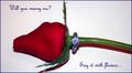
| 04/27/2005 11:43:39 AM |
Diamonds are Foreverby slingshotComment: Nice concept. Lighting seems a little hot on the ring and flower stem. Multiple light sources may help with this. I like the style of text you used. Overall, nice job. |
| Photographer found comment helpful. |
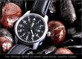
| 04/27/2005 11:30:40 AM |
History In The Makingby RedOakComment: Wow! That watch face just jumps right out at you. Great use of the rocks and water...is this Lara? Lighting is great, focus is out of this world. Only negative I have, and it's hard to avoid, is I'm seeing some jaggies in the watch numbers, date border and watch hands. Nitpicky, I know. Hope you ribbon with this. Good luck. |
| Photographer found comment helpful. |
| 04/27/2005 11:29:43 AM |
*by Moose101Comment: Ho-hum. Technically it's fine, just lacking something in the creativity department. I think it's the text outside the image in a plain white border that pulls the attention away from what is otherwise a nice image. It's like a MS Word document with a table and an image inserted with text put under it. Sorry if this comes across the wrong way...really. I like the image - just the total package isn't jumping out at me. |
| Photographer found comment helpful. |
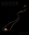
| 04/27/2005 10:41:56 AM |
MAMBAby aznymComment: Looks like a snake at the top end! ;^) I like the color combinations you used for this. The text may be just a bit too subdued, but I like the choice of font style, size and color. Only wish I could see just a little more of the main piece of jewelry. Good luck in the challenge. |
| Photographer found comment helpful. |
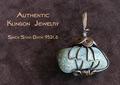
| 04/27/2005 10:39:55 AM |
Gorcon's Fine Jewelryby Dr.ConfuserComment: Nice choice of background material. Interesting jewelry piece. Go Trekkies! ;^) No, I'm not one, but I used to watch the show. I think you've balanced this photo and text very well. The lighting and focus is fine too. Good luck in the challenge. |
| Photographer found comment helpful. |
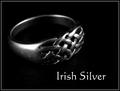
| 04/27/2005 10:37:27 AM |
Irish Silverby banmornComment: Simple, to the point. I like it. Good choice of using black with the silver. Lighting is fine in my opinion, although I'll bet you will see a couple of comments that it's hot in a couple of spots. Good luck in the challenge. |
| Photographer found comment helpful. |
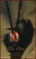
| 04/27/2005 10:07:25 AM |
The Oneby jperez1690Comment: I must be missing something. The scary looking hand shadow, the red color cast...? Interesting photo. The lighting, composition, and details are very good. I think the red border distracts, but then you're probably trying to tie it in with the overall red tone. Good luck, this should make top 20. |
| Photographer found comment helpful. |
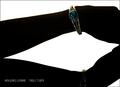
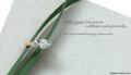
| 04/27/2005 09:56:50 AM |
Writing a Love Poemby admart01Comment: Cool props for your composition, it balances nicely. This would have really popped with a navy or black background behind the paper IMO. Good lighting on the ring (very nice diamond by the way...). Good luck in the challenge. |
| Photographer found comment helpful. |
Home -
Challenges -
Community -
League -
Photos -
Cameras -
Lenses -
Learn -
Help -
Terms of Use -
Privacy -
Top ^
DPChallenge, and website content and design, Copyright © 2001-2025 Challenging Technologies, LLC.
All digital photo copyrights belong to the photographers and may not be used without permission.
Current Server Time: 08/07/2025 04:05:12 AM EDT.