| Image |
Comment |
| 11/17/2006 03:08:29 PM |
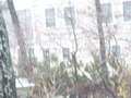
Caught a Glimpseby KelseeComment: This seems so busy, both the subject and the background, that it's rather uncomfortable to view. Could also stand to apply some sharpening to this. It's quite colorful! :D Good luck in the challenge. |
 Photographer found comment helpful. Photographer found comment helpful. |
| 11/17/2006 11:32:36 AM |
Sunspotby marboComment: Interesting. Kind of. Seems too documentary to me personally. Would work well in a science school book or something perhaps. |
| Photographer found comment helpful. |
| 11/17/2006 11:31:32 AM |
Spots & Stripesby RazorsEdgeComment: Wonderful texture and detail. Clever idea on the "Spots" connection - hopefully the viewers will agree that there's enough spots. Very nice tonal range covering the blacks to whites. Well done. Good luck in the challenge. |
| Photographer found comment helpful. |
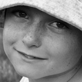
| 11/17/2006 11:29:27 AM |
Frecklesby WildcardComment: What an adorable face and smile! :D Very nice portrait here. Hard to tell for sure with this work monitor, but the tonal range looks a little flat, like you're short on the blacks a little. Overall, nicely done. Best of luck to you in the challenge. |
| Photographer found comment helpful. |
| 11/17/2006 11:27:42 AM |
Your handkerchief, Sirby AngusiaComment: Nice props and good placement of the key elements in your composition. The lighting is near the edge on being too hot (you've lost some detail in woodys shoulder and head). Cute idea with the spotted kerchief. Good luck in the challenge. |
| Photographer found comment helpful. |
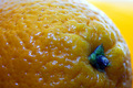
| 11/17/2006 11:25:05 AM |
Spot the fruitby marvinComment: Ok, this works. :D Good detail and it's sharp. The color temp is a little cool (bluish) and could start warming up some. Good luck in the challenge. |
| Photographer found comment helpful. |
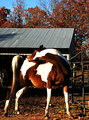
| 11/17/2006 11:23:47 AM |
That's The Spotby sfmorrisComment: Cute. Nice title too. :D The color is very strong in this. Almost too strong as I'm seeing some yellow in the whites. The whites on the horse also appear to be slightly overexposed. A consideration for this shot would be to lose the area above the roof line. It's not really adding anything to the photo and is slightly distracting IMO. Give the horse a little more breathing room in the framing of your photo - it's a bit tight. All JMO of course. Good luck in the challenge. |
| Photographer found comment helpful. |
| 11/17/2006 11:14:08 AM |
|
| Photographer found comment helpful. |
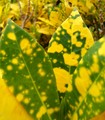
| 11/17/2006 11:13:42 AM |
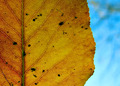
Dead Spotsby philupComment: Probably the best of the bunch (leaf spots) that I've seen yet. The placement of the subject in your framing works well as does the background choice. Very good detail in the leaf itself. Good luck in the challenge. |
| Photographer found comment helpful. |
| 11/17/2006 11:07:00 AM |
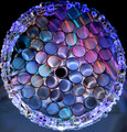
Abstract Spotsby SaraRComment: Light thru straws is always pretty cool. Wrap them up in a bracelet/necklace and voila! Clever use of light and nice creative thinking here. I really like the richness of the top half of this against the black background. The bottom half is "ok" but not as strong IMO. Best of luck to you in the challenge. |
| Photographer found comment helpful. |
Home -
Challenges -
Community -
League -
Photos -
Cameras -
Lenses -
Learn -
Help -
Terms of Use -
Privacy -
Top ^
DPChallenge, and website content and design, Copyright © 2001-2025 Challenging Technologies, LLC.
All digital photo copyrights belong to the photographers and may not be used without permission.
Current Server Time: 08/28/2025 04:22:06 PM EDT.