| Author | Thread |
Comments Made During the Challenge  |
|
|
11/21/2006 04:04:22 PM |
|
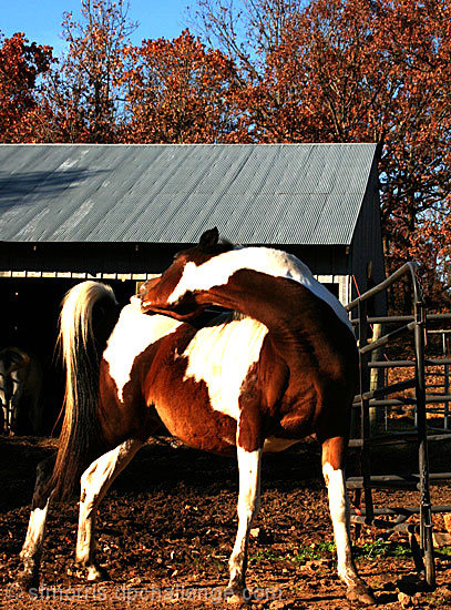
Seems a bit oversharpened, but that might just be the effects of shrinking it. The horse is a little hard to make out - it's almost an abstract. I would try cropping it so the horse is more central to the composition. Right now, the entire upper half isn't relevant to your subject. |
|
 Photographer found comment helpful. Photographer found comment helpful. |
|
|
11/18/2006 07:05:03 PM |
0-2 meets challenge = 2
0-3 creativity = 2
0-3 technical merit = 3
0-2 biased wow factor = 1
Total 8
Nicely done! |
|
| Photographer found comment helpful. |
|
|
11/17/2006 07:55:38 PM |
|
lol love the title. It's a little too contrasty for my liking. But great capture either way. |
|
| Photographer found comment helpful. |
|
|
11/17/2006 11:23:47 AM |
|
Cute. Nice title too. :D The color is very strong in this. Almost too strong as I'm seeing some yellow in the whites. The whites on the horse also appear to be slightly overexposed. A consideration for this shot would be to lose the area above the roof line. It's not really adding anything to the photo and is slightly distracting IMO. Give the horse a little more breathing room in the framing of your photo - it's a bit tight. All JMO of course. Good luck in the challenge. |
|
| Photographer found comment helpful. |
|
|
11/16/2006 03:11:24 AM |
|
Looks oversturated & oversharp. |
|
| Photographer found comment helpful. |
|
|
11/15/2006 12:50:53 PM |
|
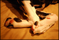
Someone scratch this for the poor thing! |
|
Home -
Challenges -
Community -
League -
Photos -
Cameras -
Lenses -
Learn -
Help -
Terms of Use -
Privacy -
Top ^
DPChallenge, and website content and design, Copyright © 2001-2026 Challenging Technologies, LLC.
All digital photo copyrights belong to the photographers and may not be used without permission.
Current Server Time: 06/29/2026 10:53:08 PM EDT.