| Image |
Comment |
| 06/18/2006 02:37:11 PM |
Window to Lifeby JibComment: I really like the colors. I might have tried increasing the contrast some. |
 Photographer found comment helpful. Photographer found comment helpful. |
| 06/03/2006 08:14:15 PM |
|
| Photographer found comment helpful. |
| 06/03/2006 07:55:32 PM |
Please Mister Postmanby iamutopiaComment: This is a case where the things that I would usually want to change actually enhance the image. You show great courage submitting this to the sometimes insensitive dpchallenge audience. Great job. You inspire me. 10. |
| Photographer found comment helpful. |
| 06/03/2006 07:25:08 PM |
|
| Photographer found comment helpful. |
| 06/03/2006 07:18:12 PM |
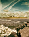
Mother Nature's Sonby k4rpComment: Nice catch. Love the energy and all the movement. That sky is wonderful. I usually try to say at least one thing I might change but I can't find anything. |
| Photographer found comment helpful. |
| 05/21/2006 10:44:07 PM |
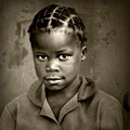
Tones of Homeby esdarbyComment: I really like your framing. Makes an inviting scene but the overexposed window are distracting. |
| Photographer found comment helpful. |
| 05/21/2006 10:41:45 PM |
In memory of...by ApeeComment: The background seems a bit busy and the really bright spot in the upper center is distracting. The rose looks really good. Sharp and I love that red. |
| Photographer found comment helpful. |
| 05/21/2006 10:35:05 PM |
Spicyby cornettcagComment: Seems a little hazy. Nice choice of subject. Might of gotten closer to some of those bottles. |
| Photographer found comment helpful. |
| 05/17/2006 07:18:54 AM |
(Angel of the North.) Englandby judojoeComment: For me as observer, the white line symbolizes the boundary of the physical world. Thought of that way, everything in the image is a projection out of the same thing, which transcends the limits of the physical.
IMHO, the inner border is an integral part of the image.
|
| Photographer found comment helpful. |
| 05/14/2006 03:13:53 PM |
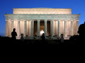
lincoln memorialby coralahnComment: I like this idea and I love the exposure of the facade of the monument. Too bad the statue is over exposed. I might have cut out a lot of the foreground, too. The blue of the sky is more interesting than the black. I like the silhouettes of the other people though. 5. |
| Photographer found comment helpful. |
Home -
Challenges -
Community -
League -
Photos -
Cameras -
Lenses -
Learn -
Help -
Terms of Use -
Privacy -
Top ^
DPChallenge, and website content and design, Copyright © 2001-2025 Challenging Technologies, LLC.
All digital photo copyrights belong to the photographers and may not be used without permission.
Current Server Time: 08/18/2025 03:02:59 PM EDT.