| Image |
Comment |
| 06/21/2006 01:44:25 AM |
yosemite fallsby RikkiComment: Great composition. Very classical ... again. But I am going to go against the flow. The detail in the rocks seems to be 'smoothed'. Too much Neat Image? Or just a result of resizing? |
 Photographer found comment helpful. Photographer found comment helpful. |
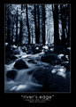
| 06/21/2006 01:40:10 AM |
river's edgeby RikkiComment: Like the blue. But not a fan of soft water. Very effective composition. The gap in the trees leads very gracefully into the water and the lighter areas of the picture (maybe lighten this area a bit more?) |
| Photographer found comment helpful. |
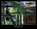
| 06/21/2006 01:20:01 AM |
reflectionsby RikkiComment: My least favourite of the series. I just don't know where to look. Seems a bit chaotic compared to your, normally, very controlled photographs. |
| Photographer found comment helpful. |
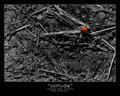
| 06/21/2006 01:18:10 AM |
solitudeby RikkiComment: Has all the the wrong ingredients for a good picture ... a messy nusy background, harsh lighting, big empty areas on the canvas. But it seems to work. |
| Photographer found comment helpful. |
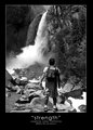
| 06/21/2006 01:14:28 AM |
strengthby RikkiComment: My immediate reaction was that you have wrongly titled this ... 'awe' or 'awesome' seem to be more appropriate ... and a lot of other people see that too. I wonder if you need so much space on the right of the picture ... it is a bit dead ... and has nothing of interest to draw the eye. |
| Photographer found comment helpful. |
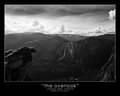
| 06/21/2006 01:10:54 AM |
the overlookby RikkiComment: I like the composition ... and I don't think you need someone on that ledge. People in landscapes are there to give a sense of scale ... and there is no need for that in this picture. I think that the haziness of the waterfall area detracts from the image. |
| Photographer found comment helpful. |
| 06/21/2006 01:04:33 AM |
mirror lakeby RikkiComment: Had a quick look at all six. This one stands out head and shoulders above the rest. Very classical. Good detail. Nice balance between water and the rest. A beautiful broken and rippled reflection. What could be changed? Nothing ... works as is.
I partly agree with the comments about the text. Seems too large for the picture and with the quotes makes it more important than the picture. |
| Photographer found comment helpful. |
| 06/12/2006 12:52:59 PM |
Duskby whiteroomComment: Now I understand why the shadows were important on the similar pictures. |
| Photographer found comment helpful. |
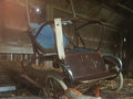
| 06/12/2006 02:55:16 AM |
Cooling Offby idnicComment: I think that you need either more of the fan ... or none. |
| Photographer found comment helpful. |
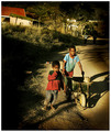
| 06/07/2006 08:50:46 AM |
Forgotten Strollerby snafflesComment: This picture and location have so much potential ... and I don't think you have taken advantage of it. |
| Photographer found comment helpful. |
Home -
Challenges -
Community -
League -
Photos -
Cameras -
Lenses -
Learn -
Help -
Terms of Use -
Privacy -
Top ^
DPChallenge, and website content and design, Copyright © 2001-2025 Challenging Technologies, LLC.
All digital photo copyrights belong to the photographers and may not be used without permission.
Current Server Time: 08/05/2025 03:04:27 AM EDT.