| Image |
Comment |
| 01/28/2003 05:54:34 PM |
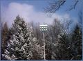
Bird Houseby DianaComment: A good idea and an attractive setting. However, I think a tighter crop would have been benficial. It would have reduced some of the negative space putting greater enphasis on the main subject and allowing greater detail to be seen. Still a pleasing image though. |
 Photographer found comment helpful. Photographer found comment helpful. |
| 01/28/2003 04:31:47 PM |
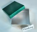
dimensionby jurasComment: This is definitely a case of “Less is More”. The subject is so basic, yet from it you have produced a very striking image. I love the way the texture contrasts so starkly with the surrounding darkness and the way the side of the box falls away to nothing. This image definitely dispels any doubts that lighting is the key to a good photograph. I cannot offer any advice, but I am curious about how well the image may have worked if the top of the box was also unseen – did you try this?
An excellent shot – well done!
|
| Photographer found comment helpful. |
| 01/28/2003 04:54:29 AM |
Something Too Rareby togtogComment: This is a clever picture which works on a number of levels. Although the individual components are quite ordinary (boring) you've brought them together to make an interesting composition to make a statement. Definately a good example of thinking outside of the box. |
| Photographer found comment helpful. |
| 01/15/2003 09:20:00 PM |
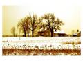
House in the Snowby nathaliedooComment: I think this is a superb picture, full of mood, which is helped by the wonderfull colouration. I particularly like the way the top of the picture fades out into the border. However, at the same time, I feel the border is a bit of a distraction because of it's uneven proportions. This is particularly noticeable at the bottom corners. I think if you had kept the proportions even all around it would have added even more to the charm of the image. Even so - an excellent shot. |
| Photographer found comment helpful. |
| 01/15/2003 09:04:03 PM |
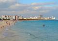
Lunada Bayby daysezComment: This is an excellent picture. I missed the people initially as they blended in with the grass, this was because my eye was drawn to the background. However, once I became aware of them, their presence adds much to the scene, both in terms of the composition and also cementing the wonderfull idyllic mood. I would love to know if they appear there by chance or if you positioned them deliberately. On the strength of the rest of the picture I'll assume the latter and add and extra point. |
| Photographer found comment helpful. |
| 01/14/2003 05:43:37 PM |
|
| Photographer found comment helpful. |
| 01/14/2003 05:40:54 PM |
A little walk in the ol' countryby blind_as_a_batComment: I love the atmosphere in this picture but, for me anyway, it is let down slightly by the composition. The building on the left is what really grabs my interest and it seems a pefect focal point, in line with the general tone of the picture. However, every time I try to scan across the image, the tree in the centre just seems to get in the way and obstruct the flow, bringing my eyes back to the foreground.. |
| Photographer found comment helpful. |
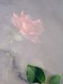
| 10/04/2002 06:54:00 AM |
Stone Roseby myqylComment: I really like this picture and certainly the Rose appears to be trapped within the stone. The tone is excellent. I assume the leaves were placed bottom right to help with the composition. However, for me personally, I think this distracts slightly - as the leaves appear to be out of proportion and disconnected from the Rose. I hope you understand my point (even if you disagree with it) as overall I still think this is a very good picture – 8 :-) |
| Photographer found comment helpful. |
Home -
Challenges -
Community -
League -
Photos -
Cameras -
Lenses -
Learn -
Help -
Terms of Use -
Privacy -
Top ^
DPChallenge, and website content and design, Copyright © 2001-2025 Challenging Technologies, LLC.
All digital photo copyrights belong to the photographers and may not be used without permission.
Current Server Time: 08/01/2025 02:17:07 AM EDT.