DPChallenge: A Digital Photography Contest You are not logged in. (log in or register
 
Browse Settings
Currently viewing:
Registered Usereschelar

Show comments:

Per page:

Order:

Comments:


Comments Made by eschelar
Pages:   ... [71] [72] [73] [74] [75] [76] [77] ... [127]
Showing 731 - 740 of ~1266
Image Comment
A Clean Well Lighted Place
07/18/2006 02:08:48 PM
A Clean Well Lighted Place
by thomaspeople

Comment:
Dude! Looks fantastic!
Photographer found comment helpful.
Frozen
07/17/2006 09:20:15 AM
Frozen
by Lorene

Comment:
Here we go!

It's pretty rare to find a challenge entry with 0 comments, so I'll give this my best.

I don't really care much for this pic myself. Here's why.

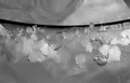
#1 - No major point of interest. There's nowhere for my eye to go to start, nowhere for it to go afterwards and nowhere interesting for me to think about afterwards.

#2 - That aside, I start looking for secondary points of interest. Rhythm is a major one that is common in shots like this, but the rhythm doesn't seem to be very strong here. The bubbles really took away from that.

That's about what it's lacking. The next bit is about what it has.

#3 - Hard edges. The picture has a look of being oversharpened and overprocessed. The edges are very hard and very sharp without adding anything (kinda like one of my own pics... my first submission). It looks like the pic is soft and has been sharpened too much. There's also a bit too much noise in it, but this is a minor issue.

So what can you do about it?

Suggestions:

#1 Stick your camera in f/5.6 or higher for better results in sharpness. I find that many small P&S cams get better results from f/4 to f/5.6. It's best to start with good results.

#2 Watch your lines... think about how your lines are going to appear in the picture and give a little consideration to flow.

#3 try to find some element that contrasts in your picture. Be it a color, an edge, the overal luminance of one part over another....

Try to use the dynamics of the composition to highlight that contrast.

This means that a light area could be opposite a dark area.

Further, you might choose to use the contrast of the two areas to create a line... diagonal lines flow better...

You've done something right in this pic because you have two different areas in the pic and they are separated into thirds... This is a good proportion for your contrast, although for this type of thing, thirds are not really essential.

A useful goal might be to use this contrast to try to bring some depth to the picture. Curved lines are fantastic for this purpose.

One interesting contrast that could be exploited in this one might be the smoothness of the ice cubes against the sharp edges of the salt crystals.

Probably would have to change the composition a fair bit to accentuate that though... currently, the ice cubes are something of a minor, background element...

These are just some ideas and are not rules carved in stone. Keep working at it!
Photographer found comment helpful.
Smile!
07/17/2006 09:06:03 AM
Smile!
by Yorina

Comment:
Perfect for the WHAT? challenge...

very well modulated as well... in basic editing I guess there was no way to clean up that bit of caulk that is a little distracting.

This one is also really cool in negative.
Photographer found comment helpful.
Poisoned Apple for My Little Pretty?
07/17/2006 09:01:56 AM
Poisoned Apple for My Little Pretty?
by annasense

Comment:
Very nice stuff.

Did you consider trying it with a hue shift?

I bet that the green color really helped smooth things out though in a way that a hue shift wouldn't have...

Photographer found comment helpful.
Skin Deep
07/17/2006 08:58:52 AM
Skin Deep
by amber

Comment:
Interesting High contrast shot. I feel that it needs to come in another 10 pixels on each side though...
Photographer found comment helpful.
Funny Guys
07/17/2006 08:47:06 AM
Funny Guys
by Art Roflmao

Comment:
One of these days I'll get my very own spot in one of these shots with Godzilla the Flame Master...

He sure is dreamy!

HEY. I can dream right? ;)

Oh and Kenart, your sprite looks like a lego man!
Photographer found comment helpful.
Dredge Ship
07/17/2006 08:15:56 AM
Dredge Ship
by rox_rox

Comment:
Definitely very nice and I agree with the comments about the light in the haze on the water's surface, but I will add appreciation for the reds in the water...

I'm having a little trouble with the saturation though. I think that the saturation is just pushed a tiny bit too much and has caused clipping... Either that or it's .JPG compression...

Not so much of a gripe as a 'be careful that the original is clean'...
Photographer found comment helpful.
Connection
07/17/2006 12:09:51 AM
Connection1st Place
by Djabordjabor

Comment:
My top pick for #1, although I will say that I agree that it's overprocessed just a bit... I think the specks in the BG and on the hand are just a little too strong. Gentle use of blur tool maybe?

Your Grandma's hand looks fantastic.
Photographer found comment helpful.
Big Boys Toys
07/16/2006 11:49:16 AM
Big Boys Toys
by Judi

Comment:
Very well done... A small suggestion might be to put black tape on the kidckstand to prevent the excessive reflection.
Photographer found comment helpful.
Making progress with my model photography
07/16/2006 11:45:35 AM
Making progress with my model photography
by Pixlmaker

Comment:
Hrm. I read this "Making Progress with my Model" Photography the first time...

Certainly looks like it in her eyes... :)
Photographer found comment helpful.
Pages:   ... [71] [72] [73] [74] [75] [76] [77] ... [127]
Showing 731 - 740 of ~1266


Home - Challenges - Community - League - Photos - Cameras - Lenses - Learn - Help - Terms of Use - Privacy - Top ^
DPChallenge, and website content and design, Copyright © 2001-2025 Challenging Technologies, LLC.
All digital photo copyrights belong to the photographers and may not be used without permission.
Current Server Time: 08/30/2025 04:18:45 PM EDT.