| Image |
Comment |
| 01/08/2005 12:10:30 PM |
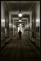
The Janitorby tyt2000Comment: 3rds and be d@mnd on this one. It's great. Has a fine art feel to it, is a little on the dark side, but would make a great addition to any wall. While it does not seem to need a border, I don't think it detracts at all. Looks like the Mt Washington's Hallways. Bumping to an 8 |
 Photographer found comment helpful. Photographer found comment helpful. |
| 01/08/2005 12:03:57 PM |
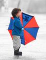
Hey, look! by arpitaComment: Bumping this up to a 9. The colors are perfect and the desaturation of the rest puts all focus on the subject and the excited expression. Simple, focused and candid. Great! |
| Photographer found comment helpful. |
| 01/08/2005 12:02:10 PM |
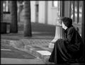
"No Where"by ace flymanComment: A little too light on the face for me, but otherwise a great image. I like the beveled edge effect before the border as it seems to push the eye inward. Could use a slight counterclockwsie rotation to line up the posts and windows. Their alignment seems to cause a slight falling effect towards the right and tips the balance a bit too heavily. a 7. |
| Photographer found comment helpful. |
| 01/08/2005 11:58:06 AM |
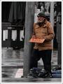
Or Just a Smile if Nothing Elseby stragsComment: A slight rotation to pure vertical the pole would go a long way to putting a finishing touch on this shot. It seems selectively desaturated which I like, but wonder if the impact would have been more striking if you had left all colorized except for the sign holder. With him in the stark black and white, it would lend well to editorial commentary. A bit dark, and the walkman wearer in the background is a bit distracting, but overall a great capture. 7 |
| Photographer found comment helpful. |
| 01/06/2005 12:16:52 AM |
Long Trip Homeby sparklyComment: Exposure is perfect. Details in the shadow are not dropped because it is too dark, and the face has no highlights that seem blown out. There is a somewhat yellowish cast to his face that may be a result of a spectacular sunset or sunrise as the shadows seem here to be low and long. Overall not an abundantly interesting piece of art, but a nice picture that would often be shared within the family and friend circle. Moving from the 4 holder to an average 5. |
| Photographer found comment helpful. |
| 01/06/2005 12:13:32 AM |
A visit from the neighbor's childrenby camelotnorthComment: Neither child appears to have not anticipated this shot, in fact, they both seem posed and ready for the flash. This does not seem candid, but may have some elements of candidness. What is most unfortunate in the presentation of this image is the save and upload.
If at all possible, DPChallenge images should try to fit the longest side on a 640 pixel range. This gives the art more presence and smaller images often take a beating simply becuase they are small and tend to not present the finer details to the rushed audience. If you click the LEARN menu option and choose TUTORIALS, you will find an article on how to save and upload a picture so that your image size is not the factor forcing you into the below average categories.
Its a nice capture, but too small to evaluate properly. A five. |
| Photographer found comment helpful. |
| 01/06/2005 12:07:43 AM |
Love & Laughby rameviComment: A very nice capture. Does not come off as candid. He appears to be anticpating the shot, however the infant could not and the expression is the redeeming piece in the challenge validity. Some backlighting here would go a long way to adding points on the scale. The older child's hair is lost in the shadows and it would be nice that it not 'seem' that his head is cut off where the hair begins.
I see nothing else in the capture to speak on, but would like to offer some post procesing ideas if you have the software. A slight dodging in the whites of the eyes on both children may be something to play with. I think this would enhance the beauty of the shot. A great wall hanging for the family as is tho. Bumping from the 4 place holder to a 5 |
| Photographer found comment helpful. |
| 01/06/2005 12:01:09 AM |
In momy's armsby dimitriiComment: A great scrapbook capture, enhanced by the choice of a scratch and peel border that I find helps, rather than hurts. Does not seem artsy, but is well executed with the top corners blurred and shadowed so as to drive the eye to the subject. The infant's face is Perfectly exposed and no elements distract this viewer from the true focus. This image moves from my 4-holder to a 7! |
| Photographer found comment helpful. |
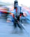
| 01/05/2005 11:57:01 PM |
Snowbodyby LevTComment: While this image may be considered candid, the blurred action is far too overdone, the main subject is placed exactly in the center of the shot, so the art aspect is lost and the sky has been way overexposed. One of the few that upon review I regret that I must reevaluate down to a 2. |
| Photographer found comment helpful. |
| 01/05/2005 11:25:16 PM |
Brother's Passingby stupidcatComment: I like the capture but not the loss of detail in the shadows of the black coat. There should be a collar in there somewhere I think. On the other end of the spectrum, the shirt seems overexposed. In this case, the photoshop SHadow/Highlight tool would help to brind some detail back into the whole. A slight counterclockwise rotation to level off the pitcher/sill and railing and the image would shine. Bumping from 4 to 5. |
| Photographer found comment helpful. |
Home -
Challenges -
Community -
League -
Photos -
Cameras -
Lenses -
Learn -
Help -
Terms of Use -
Privacy -
Top ^
DPChallenge, and website content and design, Copyright © 2001-2025 Challenging Technologies, LLC.
All digital photo copyrights belong to the photographers and may not be used without permission.
Current Server Time: 08/19/2025 08:57:01 PM EDT.