| Image |
Comment |
| 02/07/2005 11:41:01 AM |
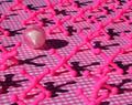
X's and Oby GolferDDSComment: This is very, very cool. Just a little too busy, I would love to see that shot without the grid. |
 Photographer found comment helpful. Photographer found comment helpful. |
| 02/07/2005 11:19:54 AM |
The Pink Teddyby prefishingComment: The subject does not stand out enough because of the background. Also, I would have removed the the plush in front of its eyes. |
| Photographer found comment helpful. |
| 02/07/2005 02:52:09 AM |
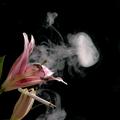
Agent Pinkby peeteComment: Interesting concept... A flower smoking a cigarette... I think you smoked something else to cpme up with this. Nice result, I love how the smoke was captured. The lighting is good. |
| Photographer found comment helpful. |
| 02/07/2005 02:47:19 AM |
It's A Girlby karmatComment: Eventough I'm not the author of this photograph, I think it should be dedicated to Jacko's baby-girl, Stéphanie. |
| Photographer found comment helpful. |
| 02/07/2005 02:43:39 AM |
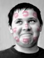
Ladykiller!by L1Comment: Great picture! The expression is brilliant. |
| Photographer found comment helpful. |
| 02/07/2005 01:51:52 AM |
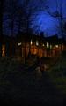
Night Lightsby RosskoComment: One more comment... I love the negative space at the bottom, it gives it grandeur... And the darkness makes it look more spooky. Again, exellent composition, I wouldn't change a thing. |
| Photographer found comment helpful. |
| 02/07/2005 01:36:22 AM |
Nailpolishby danamarielouiseComment: That's a really cool shot. The focus is a little too soft. That light reflection on the front would have really contrasted and stand out. I love black, white and red composition... Very "White Stripesque"! |
| Photographer found comment helpful. |
| 02/07/2005 01:17:18 AM |
Pepto Pinkby agrimaceComment: Nicely done. I think if this would be for an advertisement photograph, the client might not be happy with having it's name blured, even lightly... But I like it. The lighting is very good exept a little washed-out on the rim of the cup. |
| Photographer found comment helpful. |
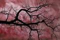
| 02/07/2005 01:03:50 AM |
Apocolypseby ruffianComment: I absolutely love this shot. I only see one thing that could improve it to my opinion. It would have been to include the trunk from wich the branch comes from. Just to set it in space, because my first impression was that it was tilted (actually going up). But the branches work much better coming down like that. Beautiful shot. I'm a bit envious. 9. |
| Photographer found comment helpful. |
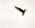
| 02/03/2005 08:06:23 AM |
Lightness of Beingby aznymComment: Absolutely beautiful. The negative space gives the bird freedom. I love the details on its feathers. Rule of thirds makes it perfect. Good luck! |
| Photographer found comment helpful. |
Home -
Challenges -
Community -
League -
Photos -
Cameras -
Lenses -
Learn -
Help -
Terms of Use -
Privacy -
Top ^
DPChallenge, and website content and design, Copyright © 2001-2025 Challenging Technologies, LLC.
All digital photo copyrights belong to the photographers and may not be used without permission.
Current Server Time: 07/31/2025 05:53:32 PM EDT.