| Image |
Comment |
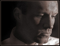
| 05/22/2006 09:40:17 PM |
.......by NaldComment: I like the lighting of this shot overall. I think the shadows on your face created by the light down in front create sortof a menacing feel (which is good if that is what you were going for). I like the symmetrical composition and I think this works very well in black and white. |
 Photographer found comment helpful. Photographer found comment helpful. |
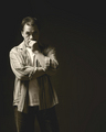
| 05/22/2006 09:37:09 PM |
down timeby margiemuComment: I like the soft lighting and casual pose. The catchlights in your eyes are good and the lighting of your hair really makes it glow nicely. Good composition and DOF. |
| Photographer found comment helpful. |
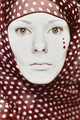
| 05/22/2006 09:35:25 PM |
Polka dottedby EnnilComment: I like the boldness of this shot. The masterful DOF keeps your eyes in razor sharp focus while softly blurring the rest of the image. The dots on your face work well with the color of the fabric. My only little complaint is the white polka dots in the fabric are somewhat busy and distracting compared to the less busy plain white face. Good catchlights in your eyes. |
| Photographer found comment helpful. |
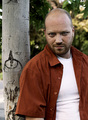
| 05/22/2006 09:32:25 PM |
Just Me.by ArtysteComment: Good solid portrait. I like the composition placing the tree almost at the edge (but not off), and your face out of the dead center. Good color and detail in the eyes (were they dodged a little?) along with nice smooth overall lighting. |
| Photographer found comment helpful. |
| 05/22/2006 09:28:44 PM |
|
| Photographer found comment helpful. |
| 05/22/2006 09:25:51 PM |
In Thoughtby gt7435bComment: I like the texture of this shot. Both your skin and stubble are in sharp focus. I like the lighting. The shadows are not too underexposed, and the highlights are still holding detail. The composition is good and I like the border. Looks like it has a nice full tone range. I like that neither eye is in shadow too. |
| Photographer found comment helpful. |
| 05/22/2006 09:23:47 PM |
Who needs Models.......I do !!by sir_bazzComment: I don't see anything really wrong with the shot, but it isn't quite grabbing my attention. The lighting is fine, though I wish there were a small catchlight in the eyes. The composition is fine, and I like how it isn't dead centered on you (which could make it a little too static). I'm not sure what to think about the coloring. It seems like a dark copper duotone, but could be achieved other ways. I think a straight black and white would be great as long as the histogram was pushed all the way to pure black and pure white. |
| Photographer found comment helpful. |
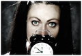
| 05/22/2006 09:19:34 PM |
What time is it?by heidaComment: I like the dark feeling to this shot. Your eyes are wonderful, and their detail and color really hold my attention. The catchlights are great, and the lighting across your face is nice and smooth. I like the background and dark border (inside the white border) to the image. |
| Photographer found comment helpful. |
| 05/22/2006 09:15:45 PM |
Staring at the Sunby vergComment: I like the composition of this shot and the bright lighting. The grey vertical lines on the left side of the shot are a little distracting to me, but I like the stripes created on your shoulder and face. |
| Photographer found comment helpful. |
| 05/22/2006 09:12:56 PM |
Miss Cheekyby CheeksComment: I think this concept is great, though I would be interested to see different framing and lighting. The negative space behind the head makes the shot feel very off balance to me, especially with the main facial features leaning heavily on the left border. The lighting seems a little harsh to me. I think that a softer lighting setup would maintain fine detail in the blown out skin areas and reduce the contrast nicely. I do like the makeup and the catchlights in both eyes. |
| Photographer found comment helpful. |
Home -
Challenges -
Community -
League -
Photos -
Cameras -
Lenses -
Learn -
Help -
Terms of Use -
Privacy -
Top ^
DPChallenge, and website content and design, Copyright © 2001-2025 Challenging Technologies, LLC.
All digital photo copyrights belong to the photographers and may not be used without permission.
Current Server Time: 08/23/2025 01:09:26 PM EDT.