| Image |
Comment |
| 01/24/2005 03:45:49 PM |
|
 Photographer found comment helpful. Photographer found comment helpful. |
| 01/24/2005 03:44:00 PM |
|
| Photographer found comment helpful. |
| 01/24/2005 12:05:31 PM |
|
| Photographer found comment helpful. |
| 01/24/2005 12:05:05 PM |
Smiling Brotherby lizzyc3Comment: He looks like an elf - great portrait. Are commenters suggestion that you remove the lettering on his sweatshirt? I kind of like it there - Everyone wears logod sweatshirts. |
| Photographer found comment helpful. |
| 01/24/2005 12:03:06 PM |
The Great Pumpkinby MobiusComment: Interesting shot, but nothing to make it stand out from the crowd of pumkin shots - is it big? maybe womething to show how big? The color seems washed out or over exposed. Perhaps that could be fixed with some post processing? |
| Photographer found comment helpful. |
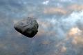
| 01/24/2005 07:50:01 AM |
Lake and Skyby lagavulinComment: This looked better in the thumbnail - I think it would benefit from some post processing - the rock is so dark and the sky is so pale - they seem to compete with eachother rather than work together. I like that the rock is hard/harsh and the sky is soft. I like the way it seems to be floating. Would it look better or worse if the colors of the sky were enhanced? I wonder/ |
| Photographer found comment helpful. |
| 01/23/2005 08:41:17 PM |
West Horizonby thatcloudthereComment: I wonder if this photo will suffer from "poor voter monitor calibration syndrome". It appears dark to me, and hard to make out what the little things are - factories far far away? and the rest is grass? I will come back to this tomorrow at work where the monitor is much better. |
| Photographer found comment helpful. |
| 01/23/2005 08:00:50 PM |
He is mineby vasilkovayaComment: Incredibly compelling faces - wow! Perfect tonal range int he BW something odd about the way her head attatches to her body for me which disappear with just the tiniest bit more cropped off the bottom - 9 |
| Photographer found comment helpful. |
| 01/23/2005 07:56:53 PM |
Who needs a man?by grigrigirlComment: try this: what if you crop somewhere between the eyes and the mouth - leaving the erotic parts as the focus of the image, also leaving the girl anonymous (let the viewer supply his own fantasy). I think the head makes the image bottom heavy and the face, being less soft than the body, competes for attention. Not to say that I dont think its a great picture as it is. |
| Photographer found comment helpful. |
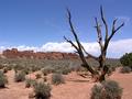
| 01/23/2005 07:52:13 PM |
my best!by turdaveComment: hmm - i like the pale washed out look - makes it look hot and dry - perhaps the tree could have been paler to match? crop the green bush on the right? it is an eyecatcher and drags the eye to the right off the edge - you dont want to draw the viewers eye oof screen, especially on DPC where the speed voter thinks "done, next photo". If you can draw the eye back to center, as the tree does (and its shadow too), the viewer will spend a few extra seconds to appreciate the good points, |
| Photographer found comment helpful. |
Home -
Challenges -
Community -
League -
Photos -
Cameras -
Lenses -
Learn -
Help -
Terms of Use -
Privacy -
Top ^
DPChallenge, and website content and design, Copyright © 2001-2025 Challenging Technologies, LLC.
All digital photo copyrights belong to the photographers and may not be used without permission.
Current Server Time: 06/24/2025 09:22:53 AM EDT.