| Image |
Comment |
| 08/31/2005 04:11:41 PM |
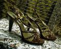
Perspectiveby bamihooComment: Sorry but there is just too much going on in this shot for me to like it at all. If I might give a suggestion it would be to use a bigger aperture next time to try and divert my eye towards just a couple of the shoes, as it is now my eye just wanders all over the place... 4 from me. |
 Photographer found comment helpful. Photographer found comment helpful. |
| 08/31/2005 04:09:34 PM |
Crescentby louisdvComment: Sorry but not at all a fan of the frame, normally I don´t comment on them at all but this one just so firmly grasps at my attention that it took me a second to notice the shot itself and to be honest I don´t care for it at all. I feel the the shot itself is slightly worse than average in this challenge, the alignment of the shoes is kind of interesting but the lighting is poor, the shadow in the back is too dark and big parts of the shoes have blown out highlights. 3 from me, would have given 4 if it weren´t for the frame. |
| Photographer found comment helpful. |
| 08/31/2005 03:46:21 PM |
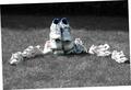
Pick-A-Pairby YoungerComment: Too monotone for my taste, my eye just wanders all over the frame and doesn´t find anything interesting to stop on. 4 from me. |
| Photographer found comment helpful. |
| 08/31/2005 03:45:06 PM |
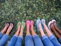
Colorful Thongsby vipvenomComment: Nice, the thumbnail looked nice and it did not dissapoint. Still not jawdroppingly awesome but definately one of the better shots in the challenge, 7 from me. |
| Photographer found comment helpful. |
| 08/31/2005 03:44:00 PM |
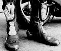
Athlete's Footby PrismComment: I am not really a big fan of the tilted angle here, it just gives me a slight vertigo and I don´t feel comfortable looking at this shot at all, I would have liked this shot a hell of a lot better if you would have flipped it to portrait. Other than that, not bad at all but I wish you would have framed it or cropped it so the green corner would be out as it just draws my eye away from the shoes. 5 from me as it is, would probably have given a 7 if these two issues I gave were corrected. |
| Photographer found comment helpful. |
| 08/31/2005 03:41:09 PM |
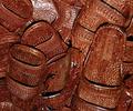
Mad Max?by RussComment: Nice, I like the tones and detail in the shot but it´s framed just a tad too tightly for my taste, you cut of a tiny portion of the front of the shoe to the left... 7 from me. |
| Photographer found comment helpful. |
| 08/31/2005 03:39:20 PM |
Kenneth Cole, New Yorkby banmornComment: Nice, IMO not far from being in a good enough quality to be in a commercial, I like the lighting. 7 from me. |
| Photographer found comment helpful. |
| 08/31/2005 03:38:15 PM |
Body Languageby IsabellSchatzComment: Nice, the "feet without faces" works very well here, nicely composed. I think I would have liked it better though with a sligthly cooler WB as I feel it´s a bit too red but other than that, very nice. 7 from me.
(p.s. oh and why only 535 pixles on the big side, the shot would look better in a bigger resolution). |
| Photographer found comment helpful. |
| 08/31/2005 03:35:07 PM |
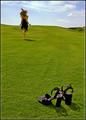
Break Free by elsapoComment: Nice idea, love the composition. Too bad this is a basic editing challenge as I bet you would have darkened the sky if you had the chance, I know I would as it´s the low point of the shot IMHO. 7 from me. |
| Photographer found comment helpful. |
| 08/31/2005 03:31:00 PM |
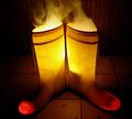
Superman has been gardeningby glodaComment: Nice, I love the idea and the lighting. Only to nitpcik it´s a bit noicy and the red dot on the side close to the heel of the red boot is a bit distracting it still is one of the most interesting shots in the challenge and I love the title. 8 from me. |
| Photographer found comment helpful. |
Home -
Challenges -
Community -
League -
Photos -
Cameras -
Lenses -
Learn -
Help -
Terms of Use -
Privacy -
Top ^
DPChallenge, and website content and design, Copyright © 2001-2025 Challenging Technologies, LLC.
All digital photo copyrights belong to the photographers and may not be used without permission.
Current Server Time: 08/14/2025 10:10:47 PM EDT.