| Image |
Comment |
| 05/17/2005 05:31:53 PM |
Catching the sunby BrinComment: Great shot!! Very creative and well caught. Horizon seems a litle slanted, and there is a lot of unused space in your frame (compared with how filled it is to the right). But great shot! 9 |
 Photographer found comment helpful. Photographer found comment helpful. |
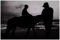
| 05/17/2005 05:30:22 PM |
The rideby ergoComment: Nice shot, but I think there needs to be more contrast between the silhouette and the background. |
| Photographer found comment helpful. |
| 05/17/2005 05:29:35 PM |
|
| Photographer found comment helpful. |
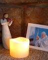
| 04/10/2005 06:49:00 AM |
"T". . . for Tearsby miriam_mrbComment: I've been here in Rome since all of this has gone down with JPII. I will have photos up soon to share if you would like to see. |
| Photographer found comment helpful. |
| 03/31/2005 06:37:01 AM |
|
| Photographer found comment helpful. |
| 03/31/2005 06:36:14 AM |
|
| Photographer found comment helpful. |
| 03/30/2005 11:21:48 AM |
|
| Photographer found comment helpful. |
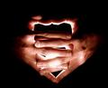
| 03/30/2005 10:59:14 AM |
Tribute to 'Creation of Adam'by SimonkasprzakComment: Great idea! Could have been a little closer to the actual positioning of the hands in the painting, though it is your own artistic interpretation so I won't rate down for that. I like how the light is on the right (God's position in the painting). The hands are a little out of focus, though. - 8 |
| Photographer found comment helpful. |
| 03/30/2005 10:39:51 AM |
Originsby strangeghostComment: Ballsy photo! For what can be seen as a "creationist theme" you dared to challenge the standard many people took with this challenge, I like that. Composition could have been a little stronger (feather is partially out of frame and the front corner on the right of the table doesn't need to be there). While these may be stylistic choices on your part, I don't think they add anything to the shot. But good work - 8 |
| Photographer found comment helpful. |
| 03/30/2005 10:34:19 AM |
Creation of the Universeby scudsComment: Great shot. Maybe a slight improvement would have been to move the light up a little bit, centering in the space within your hands. The other source of light coming from our perspective was necessary to detail the hands, but it is too bright on the middle finger on the left hand. Overall, good work I really like what you did - 9 |
| Photographer found comment helpful. |
Home -
Challenges -
Community -
League -
Photos -
Cameras -
Lenses -
Learn -
Help -
Terms of Use -
Privacy -
Top ^
DPChallenge, and website content and design, Copyright © 2001-2025 Challenging Technologies, LLC.
All digital photo copyrights belong to the photographers and may not be used without permission.
Current Server Time: 08/20/2025 09:41:48 PM EDT.