| Image |
Comment |
| 11/21/2004 12:03:31 AM |
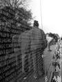
Vietnam on Veterans Dayby TristanGComment: Blown sky and people's backs don't quite convey the right emotions. Also, i don't like that all lines end right in the middle vertically. |
 Photographer found comment helpful. Photographer found comment helpful. |
| 11/21/2004 12:02:04 AM |
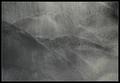
Inside the machineby greslizzzComment: already seen something like this. Things like htis are cool once. Besides, this one is out of focus for no reason and way too symmetrical to my liking... |
| Photographer found comment helpful. |
| 11/20/2004 03:43:03 AM |
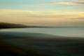
All at Seaby ImagineerComment: The only thing i would change about this is the square crop. Would make it horizontal to add dynamism. Otherwise, this is truly awesome. |
| Photographer found comment helpful. |
| 11/19/2004 11:34:55 PM |
Still LIfe With Pearsby dsidwellComment: Looks photoshopped. Although the effect may also be digital noise at high ISO. I think this would have done better in B/W and softer focus. |
| Photographer found comment helpful. |
| 11/19/2004 11:33:40 PM |
The Purist Peacockby mrorange002Comment: I like the technique, the composition and the colors. I don't like the subject and the blown highlights. And i especially like chromatic aberrations. Was that a single element lens? |
| Photographer found comment helpful. |
| 11/19/2004 11:32:07 PM |
A Pale View Of The Hillsby e301Comment: This is truly amazing, period. Nothing to add or subtract. Very smart choice of b/w, the colors would be distracting here. |
| Photographer found comment helpful. |
| 11/19/2004 11:31:42 PM |
Say it With Flowersby librodoComment: Looks photoshopped and as such doesn't appeal to me. Nice composition and photo in general if you have a version with soft focus i'd like to take a look. Perhaps it would look slightly more appealing flipped hoizontally too. |
| Photographer found comment helpful. |
| 11/19/2004 11:23:11 PM |
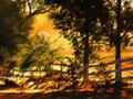
pines at sunsetby ursulaComment: I like this, except for composition. The symmetrical division by the middle pine is not very appealing. Edit: also i would flip this horizontally, to make the brighter yellow on the left. Would be slightly more natural. |
| Photographer found comment helpful. |
| 11/19/2004 11:22:17 PM |
Country Sunrise by BradComment: Looks photoshopped and as such doesn't hold interest to me. I'll come back for a fresh, closer look though. Edit: still think it's photoshop, all the imperfections are just too perfect. |
| Photographer found comment helpful. |
| 11/19/2004 11:21:24 PM |
Serenityby connieComment: Kinda missing a subject here. And i don't like the horizon right in the middle. Edit: i take back the statement about a missing subject. Although it would be nice to have something in the front, that's not the point. But i still insist on the horizon part. |
| Photographer found comment helpful. |
Home -
Challenges -
Community -
League -
Photos -
Cameras -
Lenses -
Learn -
Help -
Terms of Use -
Privacy -
Top ^
DPChallenge, and website content and design, Copyright © 2001-2025 Challenging Technologies, LLC.
All digital photo copyrights belong to the photographers and may not be used without permission.
Current Server Time: 08/26/2025 05:05:13 PM EDT.