| Image |
Comment |
| 05/19/2003 08:29:23 AM |
|
 Photographer found comment helpful. Photographer found comment helpful. |
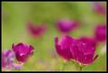
| 05/15/2003 11:49:53 PM |
Primary Rosesby kiwinessComment: This is a nice idea, but the colors seem too fake. Are they oversaturated or overly adjusted? I'm not sure what it is, but the lighting also seems harsh causing them too look fake. |
| Photographer found comment helpful. |
| 05/15/2003 11:47:05 PM |
Primary Peppersby ToddhComment: nice colors. The focus is a little too soft in my opinion. Would have liked to see a stem on the yellow one. The blue looks a little noisy, it could be a little oversaturated. i like the composition. |
| Photographer found comment helpful. |
| 05/15/2003 11:44:18 PM |
Blendingby severinComment: very original...nice shot. Background has a slight red tone to it, would like it to be a deeper black. Colors are a little noisy, probably couldn't avoid it with the technique you used. |
| Photographer found comment helpful. |
| 05/15/2003 11:36:49 PM |
Running Coloursby pinbackComment: Nice action shot...how many tries did it take/ The colors are very good, except the black could have been richer. Lighting is good also. |
| Photographer found comment helpful. |
| 05/15/2003 11:34:33 PM |
Petals by agwrightComment: Nice closeup...your colors are oversaturated and the contrast is a little too high. There are dark shadows in the petals. You need to play with your light source to get a little more light on the flower, instead of using programs to adjust. Or maybe you used a flash/ They are too harsh on a closeup like this. I am only guessing that this might be the problem. The composition is good, the bckground color is good. |
| Photographer found comment helpful. |
| 05/15/2003 08:59:25 PM |
Impressionist canvasby GordonComment: I really like this. My photo of this week is similiar. i like your use of DOF. Good colors. I think i would prefer the main bloom to face into the photo instead of out and be a touch higher. This is in my top pics. |
| Photographer found comment helpful. |
| 05/15/2003 08:55:54 PM |
Purpleby arnitComment: Nice portrait. Good lighting and contrast on both the model and background. My one tiny complaint is that her farhead is a little too purple. |
| Photographer found comment helpful. |
| 05/15/2003 08:46:09 PM |
|
| Photographer found comment helpful. |
| 05/15/2003 08:44:46 PM |
Welcome Home, Troops!by ArtifactsComment: Nice shot. This is one that I have personally tried, and I know it can be difficult. You did a good job, I think the focus could be a touch sharper in the drops. |
| Photographer found comment helpful. |
Home -
Challenges -
Community -
League -
Photos -
Cameras -
Lenses -
Learn -
Help -
Terms of Use -
Privacy -
Top ^
DPChallenge, and website content and design, Copyright © 2001-2025 Challenging Technologies, LLC.
All digital photo copyrights belong to the photographers and may not be used without permission.
Current Server Time: 08/01/2025 03:46:19 AM EDT.