| Image |
Comment |
| 10/11/2003 12:54:20 PM |
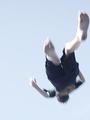
Ever Hit Bottom?by backslashComment: Creative interpretation of the "falling" nightmare. The motion blur adds and overexposed elements add to the dream atmosphere. I think the pattern on the back of the shirt detracts a little because it is the only red in the image and attracts too much attention. |
 Photographer found comment helpful. Photographer found comment helpful. |
| 09/17/2003 05:48:19 PM |
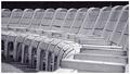
Park Benchesby sahkoComment: Great repetition.
The overall composition is excellent and grabbed my attention.
The lighting is good, but something more on the back of the chairs might have bumped this up yet another notch. |
| Photographer found comment helpful. |
| 09/08/2003 01:04:41 PM |
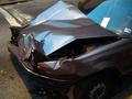
...AND a Ticket?!by banmornComment: Definitely an opps, but I think you could make it a little more photographic. Perhaps move to an angle that is more dramatic and unusual. In this particular image, you could force the flash to fire and add some fill light on the near side of the vehicle. |
| Photographer found comment helpful. |
| 09/05/2003 04:34:34 PM |
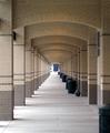
Archesby DigitalGravyComment: You got the repetition and the composition flows off to the left nicely. I think you need to wait for some more interesting lighting to pick this up a little.The bright spot on the left pulls away from the arches, but just a little. |
| Photographer found comment helpful. |
| 09/05/2003 04:31:34 PM |
Out in the Fieldby RefractedComment: Good texture and nice repetition. Needs something to punch it up a bit, but I cannot think of a specific recommendation. |
| Photographer found comment helpful. |
| 09/05/2003 04:28:30 PM |
Arches and Columnsby KevinRiggsComment: Good composition, but I think you need to go for maximum depth of field to make this work really good. Small aperture may require tripod, but it would help this move from good to very interesting. |
| Photographer found comment helpful. |
| 09/05/2003 04:24:23 PM |
Now Dots Tileby GeneralEComment: Cool!
I think you could have skipped the dark space on the bottom and just let the viewers eyes role over all of those dots.
Still very good. |
| Photographer found comment helpful. |
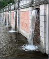
| 09/05/2003 04:22:55 PM |
Cascadeby indigo997Comment: Nice composition!
Good attention to detail with verticles actually being verticle.
I like the sense of perspective as the wall moves out to the left.
The image seems a little flat, but I'm not sure why, very minor. (maybe lack of shadow) |
| Photographer found comment helpful. |
| 09/04/2003 09:37:10 PM |
"Windows"by tfarrell23Comment: I like the bold diagonals and the dark windows stand out nicely against the lightly colored building. |
| Photographer found comment helpful. |
| 09/03/2003 12:59:32 AM |
|
| Photographer found comment helpful. |
Home -
Challenges -
Community -
League -
Photos -
Cameras -
Lenses -
Learn -
Help -
Terms of Use -
Privacy -
Top ^
DPChallenge, and website content and design, Copyright © 2001-2025 Challenging Technologies, LLC.
All digital photo copyrights belong to the photographers and may not be used without permission.
Current Server Time: 08/26/2025 01:38:46 AM EDT.