| Author | Thread |
|
|
09/08/2003 04:19:43 PM |
|
Late is better than never, Paul. Good photo of a good subject. I believe with the crop you would have scored 70 points higher. |
|
 Photographer found comment helpful. Photographer found comment helpful. |
|
|
09/08/2003 03:05:31 PM |
|
Thanks, everyone! With 10 out of 14 commenters requesting it, I had no choice but to upload a re-cropped version for your evaluation. Should I make a printable file of this? |
|
Comments Made During the Challenge  |
|
|
09/07/2003 10:22:49 PM |
|
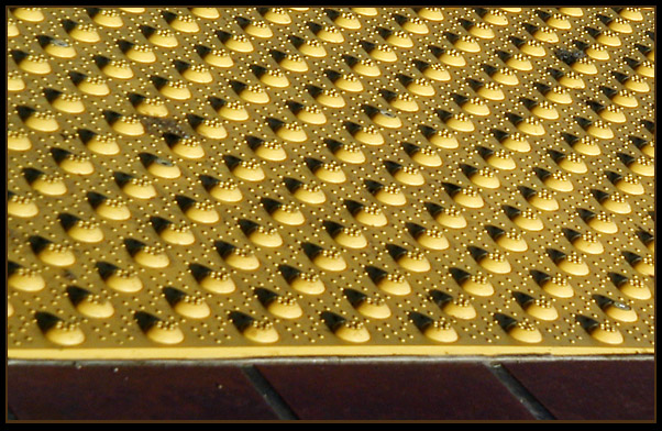
Definately meets challenge. I would like to see this cropped higher up so only the dots can be seen. Just my thought:) |
|
| Photographer found comment helpful. |
|
|
09/07/2003 10:02:44 PM |
|
Hmm would like to see a version without red tiles... just a thought. |
|
| Photographer found comment helpful. |
|
|
09/06/2003 10:38:18 PM |
|
This twists my brain (in a good way). |
|
| Photographer found comment helpful. |
|
|
09/06/2003 04:10:28 AM |
I know what this is! It's the blind student, kept after class, writing 300 times, "I will not let my seeing-eye dog sniff the teacher," right???
Interesting repetition. I liked it |
|
| Photographer found comment helpful. |
|
|
09/06/2003 02:16:33 AM |
|
You really should have cropped out the bottom for more impact - the tiles are very distracting. Nice idea. Your DOF is a little narrow towards the left. |
|
| Photographer found comment helpful. |
|
|
09/05/2003 04:24:23 PM |
Cool!
I think you could have skipped the dark space on the bottom and just let the viewers eyes role over all of those dots.
Still very good. |
|
| Photographer found comment helpful. |
|
|
09/05/2003 02:16:13 AM |
|
meets the challenge title but leaves the eye wandering with nowhere to rest! |
|
| Photographer found comment helpful. |
|
|
09/04/2003 06:59:22 PM |
|
| Photographer found comment helpful. |
|
|
09/03/2003 02:01:44 PM |
|
I think I'd prefer it to be the whole scene, without the interruption at the bottom |
|
| Photographer found comment helpful. |
|
|
09/03/2003 10:42:57 AM |
I feel the bottom black portion of the photo should be cropped off.
The color and detail contrast of the tile is great, though. |
|
| Photographer found comment helpful. |
|
|
09/02/2003 09:56:15 PM |
|
I would have liked it better if you cropped out the lower part of th picture. Nice repetition though. |
|
| Photographer found comment helpful. |
|
|
09/02/2003 09:21:53 PM |
|
the bottom...wish it wasn't there....cool shot. |
|
| Photographer found comment helpful. |
|
|
09/01/2003 08:00:24 PM |
|
I may have been tempted to leave out the brown tile at the bottom -- I think the yellow rivots stand out enough on their own. I like the texture & shadows on 'em! |
|
| Photographer found comment helpful. |
|
|
09/01/2003 04:57:43 PM |
I would have cropped the bottom off.
With the shadows, this makes an interesting pic. |
|
| Photographer found comment helpful. |
Home -
Challenges -
Community -
League -
Photos -
Cameras -
Lenses -
Learn -
Help -
Terms of Use -
Privacy -
Top ^
DPChallenge, and website content and design, Copyright © 2001-2026 Challenging Technologies, LLC.
All digital photo copyrights belong to the photographers and may not be used without permission.
Current Server Time: 06/28/2026 06:51:03 AM EDT.