| Image |
Comment |
| 04/18/2003 02:48:35 AM |
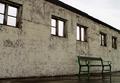
50 years of shitty weatherby helgihelgiComment: The state of the wall/building is probably more due to 50 years or more of shitty maintenance but i will take your word for it :) Nice composition. The blah color of the sky doesn't help the image but it helps you meeting the challenge :) 6 Journey |
 Photographer found comment helpful. Photographer found comment helpful. |
| 04/18/2003 02:45:54 AM |
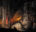
One drop at a time...by mcmurmaComment: This is certainly intriguing. Love the details of textures and the incredibly vivid splashes of colors that are accentuated all the more by the prevailing darkness. Would have cropped off more of the top, it is a little too dark and non-descript there. 8 Journey |
| Photographer found comment helpful. |
| 04/18/2003 02:43:20 AM |
Something's Brewingby JackoComment: This is a beautiful image. Lovely composition. I am strongly getting the impression though that it has been enhanced by something like Neatimage. If so, i would be less impressed because personally i find Neatimage (even though it's fully legit) on a par with heavy Photoshop editing, that is not allowed. 8 Journey |
| Photographer found comment helpful. |
| 04/18/2003 02:39:27 AM |
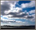
If there were no view...by BeingCleverComment: Nice moody and lonely image. Very forlorn. I like it. Because of the lack of contrast, it's all rather flat but that was the aim, right? :) Good composition. Nicely framed by the tree. 7 Journey |
| Photographer found comment helpful. |
| 04/18/2003 02:33:51 AM |
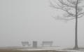
Watercolorby wdebeau1Comment: It is a nice enough image but there's something that bothers me about it that i cannot pinpoint exactly. I think it has to do with the fact that everything in the image represents warm colors/tones. Even the trees are a warm, brownish hue. If they had been black there would have been more contrast and a better balance between warm and cold colors. As it is, it gives me a bit of a sugary feeling when i look at it long enough. 7 Journey |
| Photographer found comment helpful. |
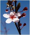
| 04/18/2003 02:27:20 AM |
Sun Kissed Blossomby sagestudioComment: That's a pretty doggone interesting picture. I love taking pictures of flowers but, honestly, to see pictures of flowers gets a bit old and cliche-ish when one see dozens and dozens of pictures of "pretty" flowers. This is not a cliché, however. There's such a lovely juxtaposition between the white flower and the darkish silhouette of the branch and the buds. The light flower is very interesting: just a little bit of detail to make it interesting; otherwise pretty simplefied. Also like the shadow of the branch on the white flower. That other, blurred, branch in the background is a total dog though. Mars an otherwise great picture as it clutters a strong and sharp image. Let me give you a hint: when i plan to take pictures of flowers or leaves, I always carry with me a very small and very sharp herb clipper ($7) so that i can interfere with nature as that suits me :) I don't do that though in private gardens :) 8 Journey |
| Photographer found comment helpful. |
| 12/16/2002 02:39:10 PM |
Tanyaby bamasterComment: Your picture did quite well, so why all your ranting on the forums in the past week. Crybaby! ;) I'll be very honest, i neither care for imagery of pregnancy and breastfeeding and am neither terribly fond of bellydancing. I think that's where your 1s were coming from. I didn't vote but i would have never given it a 1 because it is an interesting picture.
Because Tanya is staring right into the lens, the subject of the image seems more the process of photography than the process of belly-dancing. I really can't make up my mind whether i like that stare-into-the-lens aspect or not.
When i contemplate this image my eye seems to be bothered by some compositional aspects, specifically what is supposed to be the main subject of the image, Tanya or the cloth with motion. This duality creates some confusion in my mind. SinceTanya and the pregnant belly are fairly close to the edge my eye has a tough time staying inside the picture. The cloth Tanya is holding seems another main subject as it occupies a large part of the image, and yes, it has the motion to meet the challenge :) but i find this far less beautiful and interesting than Tanya. There also seems to be a few "stainy" spots on the cloth ( from the camera not from the cloth, it seems)and they are a little distracting (nitpick).
Even though i don't care for the theme, as already stated above, this would be a very intriguing, dynamite image if it would give more focus and space to Tanya and much less to the cloth.
I didn't vote but would have given this an 8 if i had because i can see that you were working towards something really worthwhile.
Okay, i have said it. Now you can beat me up in the forums. Journey |
| Photographer found comment helpful. |
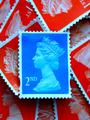
| 12/11/2002 08:48:18 PM |
Royal Blueby MarklaneComment: Mark, these days i don't have the time to submit and vote anymore. However, when looking at the results, your picture grabbed me. I think it's a neat image! IMO, placing the blue stamp dead center was the logical placement choice. I like the composition and the arrangement of the other stamps; the shot has great clarity. My only nitpick is that the light left below the blue stamp is somewhat lacking. Royal blue is the name for a type of English porcelain, isn't it? :) Journey |
| Photographer found comment helpful. |
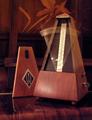
| 12/09/2002 01:59:50 AM |
Timing Motionby gerardComment: The motion of the metronome is interesting. Like the overall brown color scheme in this image. The painting/reproduction in the background, although interesting by itself, clutters the image. Likewise, somewhat, on the rounded edge of the table or desk. This would have been so much more interesting in a spartan setup. Metronome: cool (damn, i like the texture of the wood! and the clarity of the logo); motion: cool; background clutter: uncool. Journey |
| Photographer found comment helpful. |
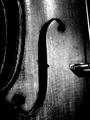
| 12/07/2002 02:12:16 AM |
Portrait of an Old Violinby paganiniComment: Hey, Tony, just wanted to let you know that some time ago i added this img to my Fav and it has become one of few pictures here that i really cherish. It has character, is devoid of gimmicks and all that other crap ... Some comments here regret the presence of the string. I like that string. True, because of its light value one's eye is just about to fall off the picture plane but it does create that lovely triangular shape. I'm very partial to triangular shapes - always try to work them in if i can - they delight my eyes.
What i really, really would like to see with this image is duotoning with a blueish tone (no, it won't give it a bluish cast but suspect that it would give a very nice subtle touch). I thought you had PS (people who don't have PS are losers - they just don't know the kazilion of wows they're missing out on) but if you don't and can't duotone, i would be happy to give it a try for you. I may be mistaken but thought duotoning would enhance this image.
PS: when i voted on this img way back when i gave it a 4! I just can't look at 150+ pictures and expect to really see all of them, let alone give them the score they deserve. I have therefore stopped voting as long as i won't submit. Besides, it took oodles of time and started to feel like "work" (without being paid for it, hey come on). Instead, i comment, and yack away, on the occasional picture whenever the mood strikes me. The new site just restored thumbnails to one's own pictures and favs. Voilà .
Now, don't let all this praise go to your head! ;) Journey |
| Photographer found comment helpful. |
Home -
Challenges -
Community -
League -
Photos -
Cameras -
Lenses -
Learn -
Help -
Terms of Use -
Privacy -
Top ^
DPChallenge, and website content and design, Copyright © 2001-2025 Challenging Technologies, LLC.
All digital photo copyrights belong to the photographers and may not be used without permission.
Current Server Time: 08/19/2025 08:05:20 PM EDT.