| Image |
Comment |
| 02/03/2003 03:26:18 AM |
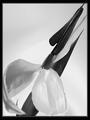
Ode to Mapplethorpeby KarenBComment: favorite pic so far! i love everytihing about it. it is interesting to me that it looks almost like a painting! since you mentioned mapplethorpe, i cant get the calla lilly photo out of my head--so i keep wanting to see more space at the bottom of this picture---but i am definitely open to interpretation! wonderful tones and contrasts! 10 |
 Photographer found comment helpful. Photographer found comment helpful. |
| 02/01/2003 04:36:53 AM |
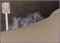
Parking - 30 Minutes Onlyby mcraelComment: CC
hehehe, i bet that car isnt going anywhere in 3 days, much less 30 minutes! first of all, i have to say that i like your choice of converting to negative for this shot! it reminds me of the intro to the old TV show, the Outer Limits! i have stared at it forever, trying to imagine what it would have looked like otherwise, and have decided that it has a wonderful dreamlike quality that makes you want to take a second look!
i enjoy the composition of this photo for what it is--it makes me astounded (and slightly jealous!) that you get so much snow! you did a fabulous job in capturing that (as i am sure was your intention) with your angle. i can totally imagine a car under that mound! also, i really like the tilt to the framing. technically, it looks great--it is really only the post processing that i want to talk about! :)
the rest of this critique is only my opinion--i know that we, the viewers, have no real idea of why a photographer cropped a certain way, or chose certain lighting or any other aspect of a particular picture-- we only know what we might like to see! now, i know virtually nothing about IR type photography, so i could be way off base--but i assume that it turns the darker aspects of your picture lighter and vice versa, right? so in this case, one of the most intriguing aspects of the photo are the trees, since, being the lightest thing in the frame, are what my eyes are drawn to first. basically, i find myself straining my neck to look over the snow to see more of them! i think would like to see perhaps a broader framing�as if you had stepped back a few feet to capture not only the irony of the huge amount of snow against the sign, but more of the fascinating background as well�to break up the smoothness of the snow and sky, and to give more depth to the picture. I just think that in converting this photo to a negative, the snow is relegated to a less interesting part of the picture, due to its murky color. And since the snow takes up a good portion of the frame, it winds up almost detracting from the photo as a whole. ican imagine that the original really enhanced the snow/parking sign with the bright white against the green (?) of the sign---but the switch to negative has a fascinating eerie quality that i am definitely drawn to.
all in all, this is a great photo�you have given me a new appreciation for negative photography! :)
|
| Photographer found comment helpful. |
| 01/29/2003 05:24:16 PM |
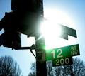
Blinded by the Lightby smellyfish1002Comment: CC
cool shot--the more i look, the more it grows on me! for some reason i could see this as an album cover for some cool alternative/indie band like pavement or sonic youth. ;)
my first thought about the shot was that while i like sun flares very much--this one is overpowering--you can barely see the rays that make these flares so awesome--but it definitely works here.
i love the blue sky against the concentric circles of the sun, and the green of the signs--and also how the trees have taken on the blue hue--helps blend them in to the background with a cool effect.
compositionally, i might have liked to seen the post backed further to the left and not quite so centered in the frame--to enhance the sun and sign a little more--since they are the coolest part of the photo (to me!).
technically, looks good. you put your shutter/aperature speeds to good use in enhancing the sunflare, nice work.
all in all, very cool, cant believe it didnt score higher! |
| Photographer found comment helpful. |
| 01/28/2003 11:41:38 PM |
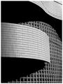
Wall of Windowsby NatashaComment: this is gorgeous--very eye-catching. i cant say enough how well the angles and lines and curves work together here---you have a wonderful eye for graphics. im glad you chose B&W for this as well---wouldnt be the same in color! wonderful work! :) |
| Photographer found comment helpful. |
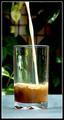
| 01/28/2003 11:28:57 PM |
Cafe (Soy) Latteby lisaeComment: CC
hehe, i figured this was yours lisa! first of all, the lighting and clarity/ color depth of the pic are wonderful. i feel like i am looking at an ad in a sort of holistic magazine! the background is what does it, i think--it gives me a very soothing, nature-friendly sort of impression that fits with the soy milk theme. i think the lighting also helps this--you feel like are outside on a beautiful sunny day... who knows, maybe you are! i can see the sun glinting off of the leaves in the background--very beautiful effect.
technically--I find it interesting that you used an iso of 400---i would have never guessed that! neat image is a very cool thing--i especially like its effect on glass. also, the dof is perfect.
i have been looking at trying to see if there is something, anything i might do differently, and the only thing i can think of is perhaps the angle--maybe come in a little closer to narrow in on the glass more and angle up slightly to catch a more dramatic pour? might be cool, who knows! at any rate, i am very surprised this shot didnt rate higher--i think it is a great shot. |
| Photographer found comment helpful. |
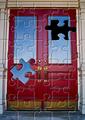
| 01/28/2003 05:33:58 PM |
Puzzling Doorby DougPazComment: sweet!!!!!! the photograph would be cool even with out the puzzle--i really like the contrast of the red door with the surrounding neutral colors. but of course i have to know how you did the puzzle! very creative! 10 |
| Photographer found comment helpful. |
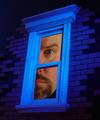
| 01/28/2003 05:20:11 PM |
Blue Window Dreamby MajorChaosComment: very cool. i love the angle of the window and the sporadic placement of the bricks around the frame---really enhances the dreaminess of the photo. and of course the face is very well done--gives the whole thing a sort of parallel universe alice in wonderland feel---maybe allen in wonderland? hehehhe! awesome work. |
| Photographer found comment helpful. |
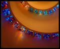
| 01/28/2003 05:15:37 PM |
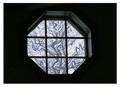
Helical Illumination by crabappl3Comment: this is great! the lines and curves work wonderfully together, and the window colors are very nicely accented by the yellowish walls. great eye! |
| Photographer found comment helpful. |
| 01/28/2003 05:11:43 PM |
Room With A Viewby GekkerComment: wow, the tree is very eye catching! good contrast between light and dark, solid and pattern. |
| Photographer found comment helpful. |
| 01/28/2003 05:06:42 PM |
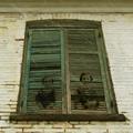
Souvenirby lionelmComment: whoa--trippy--like two little ghosties! maybe i warped myself on stephen king, but this is pretty scary! ;)
i really like the monotone coloring and the rain coming down---adds to the spookiness! nice work! |
| Photographer found comment helpful. |
Home -
Challenges -
Community -
League -
Photos -
Cameras -
Lenses -
Learn -
Help -
Terms of Use -
Privacy -
Top ^
DPChallenge, and website content and design, Copyright © 2001-2025 Challenging Technologies, LLC.
All digital photo copyrights belong to the photographers and may not be used without permission.
Current Server Time: 06/20/2025 01:59:45 AM EDT.