| Image |
Comment |
| 06/23/2008 10:14:01 PM |
Vanishing Pointby jjsmomComment: Sorry! The edit on this pic is rough! You can see all the dodge marks. Try a gradiant mask to a white background it will give you the effect your trying to get here with a MUCH better end result. And I think this is too tight of a frame to be considered a true vaishing point perspective. Not trying to offend here just trying to help. Let me know if you have questions, comments, or concerns. Good Luck. Scott |
 Photographer found comment helpful. Photographer found comment helpful. |
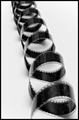
| 06/23/2008 09:53:32 PM |
Unwoundby TirascoComment: WHAT IS THAT??? Just kidding it's simple and great. I just dont like these tall portrats in "advanced editing" I cant view all the pic at once. |
| Photographer found comment helpful. |
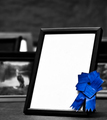
| 06/18/2008 07:13:40 PM |
A Portrait of Successby jodeleeuwComment: Great B&W pic, the ribbon should have six sides to the top circle and the blue should be a little lighter in color and if you had a big bum or something funny in the pic frame I would have given you a 10. good luck |
| Photographer found comment helpful. |
| 06/18/2008 07:05:33 PM |
|
| Photographer found comment helpful. |
| 06/18/2008 06:59:55 PM |
New Level of Successby F-StopBluesComment: LOL too funny, your missing one bill in the circle, the space at the bottom of the circle is a touching and the others don�t, the bottom right ribbon tail should be on top. Money and time well wasted LOL I looked at this pic way too long. Good luck! My title for this is "CASH PRIZE" the bills look funny too but im Canadian! |
| Photographer found comment helpful. |
| 06/18/2008 06:35:52 PM |
|
| Photographer found comment helpful. |
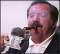
| 06/18/2008 06:29:36 PM |
Money to burnby ClayaComment: A very fitting entry. And I gave it a really good score. Things that would have made it better for me.
1. Adjustment levels - the man is VERY red, even if this is natural I would have used CMY adjustments on this pic to tone it down.
2. Composition - love the smoke just not in his face - the little triangle in the top right very distracting - I would have liked to see the top of his hair and more of the hand too - The $100 looks a little funny but I'm Canadian!
3. Lighting - seems to be just coming from a pot light above to me it needs more from either side
Things that are great - the chair, the Cigar, the clothes, the basics of the setup, and the flame. Please feel free to contact me for questions comments or concerns. I mean no disrespect with my comments it�s a good pic that I feel could have been great. Best of luck. Scott. |
| Photographer found comment helpful. |
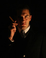
| 06/18/2008 05:44:11 PM |
CEOby brumer0Comment: You nailed this one. All around great. Some smoke and a heater would have been awesome. I'll be upset if your not 1st or 2nd. Good luck! |
| Photographer found comment helpful. |
| 06/18/2008 05:40:23 PM |
|
| Photographer found comment helpful. |
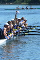
| 06/18/2008 05:38:00 PM |
Successful Flat Spinby ZeusComment: Great shot one of my favs. Would like to see what if any you cropped out after voting. |
| Photographer found comment helpful. |
Home -
Challenges -
Community -
League -
Photos -
Cameras -
Lenses -
Learn -
Help -
Terms of Use -
Privacy -
Top ^
DPChallenge, and website content and design, Copyright © 2001-2025 Challenging Technologies, LLC.
All digital photo copyrights belong to the photographers and may not be used without permission.
Current Server Time: 08/04/2025 04:42:44 PM EDT.