| Image |
Comment |
| 06/09/2005 10:12:27 AM |
Framed in Rockby SteveinnzComment: This was such a great idea, but your lighting is too harsh and it is over exposed. |
 Photographer found comment helpful. Photographer found comment helpful. |
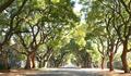
| 06/09/2005 10:09:39 AM |
Suburban Roadby AlanBesComment: Your idea here was good - these lovely old trees certainly frame the road well. But the photo is over exposed - the brightest areas are "blown out". |
| Photographer found comment helpful. |
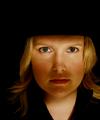
| 02/24/2005 10:22:18 PM |
simplicityby WinterbergComment: Critique Club- Your eyes are the most striking element in this photo. They are well captured and seem to stare right at me. Your use of shadows really keep the attention on your eyes. From my understanding of portrait photography, having the eyes on the top thirds line is recommended, so I think cropping just enough off the top so the eyes are in the thirds position might have made this a stronger entry. I think I would also crop enough off the left hand side to center your face a little more.
Overall, I thought this was an excellent portrait. |
| Photographer found comment helpful. |
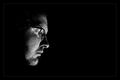
| 02/24/2005 10:14:52 PM |
Glassmanby gudbjargarsonComment: Critique Club-Nice thoughtful photo. Works very well in black and white. I have mixed feelings about the negative space. I think the composition might have been improved slightly if your face was sitting more in the thirds position - it feels like it is sitting more on the 1/4 line - so if it had been just a little further to the right in the frame, I think it would have been a stronger entry.
The other suggestion I would have for improvment would have been a slightly different angle to the face to avoid the "double eye" around the glasses. You don't have a true profile because I can see just a little of the eyeglass frame that is over the other eye.
But it is a good shot and is a good portrait. |
| Photographer found comment helpful. |
| 02/15/2005 12:42:53 PM |
Pink a Plate o' Peppers, Please?by Bear_MusicComment: Critique Club - While this is a very centered composition, it is pleasing. The pink peppers don't seem a realistic color to me for this type of pepper (being from Central Texas I see a lot of these in real life). However, your arrangement of them is artful, your focus is sharp, and depth of field perfect. I also like the glow from the white plate they are sitting on - gives it a "grounded" feel. Interesting take on the challenge. |
| Photographer found comment helpful. |
| 02/13/2005 07:25:45 AM |
A "light" Champagneby wetlandComment: Critique Club- Your composition here is very nice - your glass is nicely offcentered and the lines from the laser light help lead your eye through the photo. I also like the way background flows from the blue into the reds. Very nice job! |
| Photographer found comment helpful. |
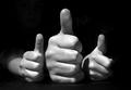
| 02/09/2005 11:39:52 PM |
DPC: three enthusiastic thumbs up!by LevTComment: Critique Club - I think your concept for this photo was excellent. You have great exposure and good focus. I like the arrangement of the hands - a simple elegant composition. However, your lighting picked up a face, and lettering on someone's shirt. These extraneous things pull my eye away from the emphasis on the thumbs. I agree with the suggestion that some black material draped over the arms, faces, and shirts would have made this a cleaner composition. In photoshop, you could have done a layer of "Selective Color" and using the black as your selected color darkened out the background- which would probably have been cleaner than cloning it. |
| Photographer found comment helpful. |
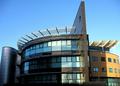
| 01/28/2005 03:00:00 PM |
A building of two halvesby tazzaComment: I really like the architecture of this building - has such a great use of line, shape, and texture. I like the mix of blues and browns, and the texture provided by the items on top of both sides of the building.
As far as composition - none of your "vertical lines" are truly vertical. You have a perspective issue that complicates the situation -common in architectural photography. If this were my shot, I would do one of two things.
Suggestion 1: Choose an area of the photo roughly in the middle, in this case where the shadow line makes such a big difference in lighting slightly to the left of center. I would rotate the image such that the vertical line here is truly vertical in the frame and the horizontal area there should be level with the bottom of the frame. At this point you could leave it as it is.
or
Suggestion 2: Do step one and then do a perspective correction in photoshop by "selecting all" and then pulling the upper corners out just enough to make the outside walls vertical. Then do a final crop.
I also think you were fighting lighting here . . part of the building is in the sun, part partially shaded, and the far left much deeper shade impacts the quality of the photo. Perhaps a curves adjustment in photoshop could lighten that darkest area. |
| Photographer found comment helpful. |
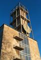
| 01/28/2005 12:33:35 PM |
Aarhus town hall and its tower (designed by Arne Jacobsen, 1942)by visaksenComment: Critique Club
I really like the beautiful stone used in the construction of this tower. I also like the use of color in this photo, because the blue sky makes a dramatic background and contrast which enhances the color of the stone. You had a wonderful sky to work with - great blue.
In terms of composition, I think I would have cropped so that all of the balcony at the bottom was visible rather than "chopped off'. I think I also would have either included more of the left side of the building or cropped all of it out. I think in the original shoot, I would have shot this at several camera angles - one where the right side of the building was squared with the frame, one where the windows were squared (which would still give you the perspective of the lines converging as they get higher), and perhaps one from further away to give a better sense of the height of the tower. |
| Photographer found comment helpful. |
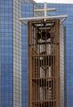
| 01/28/2005 12:08:19 PM |
Contrastsby BeetleComment: Critique Club
Overall, this is a very pleasing image. You have chosen a building with very interesting architecture. Your photo shows a very pleasing use of line, nicely squared and leveled. I like the three dimensional effect created by the building's construction. I think you could have played that up a little more using Curves to selectively brightenthe rows of windows that are offset and darkening the others. That would also have deepened the blue hues in the windows making it seem more colorful.
Your composition is pleasing with the bell tower nicely off centered. I understand why you left that small patch of sky in order to keep the cross intact. However, it was either a cloudy day or the sky is over exposed. The white sky is a little distracting from the mood set with the blues throughout the rest of the photo. |
| Photographer found comment helpful. |
Home -
Challenges -
Community -
League -
Photos -
Cameras -
Lenses -
Learn -
Help -
Terms of Use -
Privacy -
Top ^
DPChallenge, and website content and design, Copyright © 2001-2025 Challenging Technologies, LLC.
All digital photo copyrights belong to the photographers and may not be used without permission.
Current Server Time: 08/22/2025 08:14:27 AM EDT.