| Image |
Comment |
| 02/17/2004 06:32:29 AM |
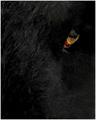
Ramby geewhyComment: I like this shot! I wish there were a larger depth of field though, seeing sharp fur along the nose would add some nice black texture to frame the already really striking eye. I'd also bump the eye maybe 5% or so to the left (or crop some of the left side), I think it would make the eye and and the strip of hilights in the fur sit nicely.
|
 Photographer found comment helpful. Photographer found comment helpful. |
| 12/15/2002 04:49:46 PM |
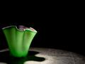
the flowers of naiveté (buried in a layer of frost)by ArachnophiliaComment: I realy like this photo, the only nit I can pick is the slight purple fringey effect on the upper left edges of the petals, you may have done it intentionally, but it reminds me of chromatic aberrarion. I would have tried pushing it all into reds/oranges. Right now it looks kinda low tech, and purer reds might help legitamize the deliberate blow-out and softness... I am always surprised when people can't just let vagueness and softness please the eye as it is. |
| Photographer found comment helpful. |
| 10/21/2002 03:30:00 AM |
|
| Photographer found comment helpful. |
| 10/20/2002 04:07:00 PM |
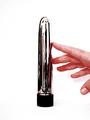
Resultsby Frank BeckmanComment: I like the graphic quality, but the framing isn't very dynamic, try cropping it a few different ways. |
| Photographer found comment helpful. |
| 10/20/2002 03:52:00 PM |
Pride - Union Stationby lionelmComment: It's a little blown out, but Ii like the cynicism! Notice the little sign, 'Black Market', for that extra touch of biting social commentary! |
| Photographer found comment helpful. |
| 10/20/2002 03:24:00 PM |
Monument to Lustby lisaeComment: It's too bad the picture feels so grainy, you lose all the detail in the reflection! |
| Photographer found comment helpful. |
| 10/20/2002 03:09:00 PM |
|
| Photographer found comment helpful. |
| 10/13/2002 08:12:00 PM |
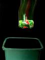
Swish! by alanfreedComment: I think you may have oversharpened this a bit, and unfortunately the waste basket isn't as level as the can, but the composition is good and you obviously put some effort into it! :) |
| Photographer found comment helpful. |
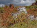
| 10/13/2002 08:05:00 PM |
Apple Cratesby emorgan49Comment: I really like the subject, but there isn't enough contrast in the scene... it looks pretty flat to me. This might be helped with a more obvious foreground/background to add depth, or shooting in the hard to find sweet spot where the boxes are lit by more sun but the sky still looks manacing! |
| Photographer found comment helpful. |
| 10/09/2002 02:58:00 AM |
Regenerationby KonadorComment: I would have scored this higher without the flower, it's so fun to look at and has such an energetic angle, yet that flower vaguely annoys me. :) |
| Photographer found comment helpful. |
Home -
Challenges -
Community -
League -
Photos -
Cameras -
Lenses -
Learn -
Help -
Terms of Use -
Privacy -
Top ^
DPChallenge, and website content and design, Copyright © 2001-2025 Challenging Technologies, LLC.
All digital photo copyrights belong to the photographers and may not be used without permission.
Current Server Time: 07/31/2025 10:09:53 AM EDT.