| Author | Thread |
|
|
11/07/2004 02:44:28 AM |
|
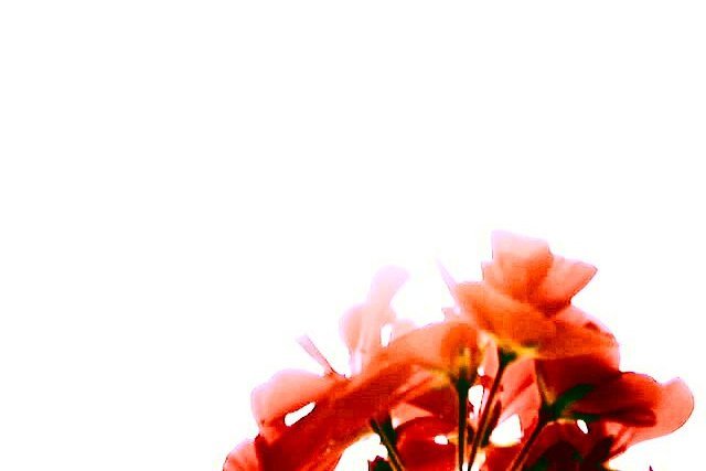
This is one of the best photographs i have seen in a while. |
|
|
|
12/15/2002 04:49:46 PM |
|
I realy like this photo, the only nit I can pick is the slight purple fringey effect on the upper left edges of the petals, you may have done it intentionally, but it reminds me of chromatic aberrarion. I would have tried pushing it all into reds/oranges. Right now it looks kinda low tech, and purer reds might help legitamize the deliberate blow-out and softness... I am always surprised when people can't just let vagueness and softness please the eye as it is. |
|
 Photographer found comment helpful. Photographer found comment helpful. |
|
|
12/09/2002 07:57:31 PM |
I think that the shot is pretty creative... nice way you did the background.. but, in my opinion, maybe try cropping it a bit so that the flowers fill more of the screen? just a thought though.. but im surprised at the score it recieved.. i think it should have been higher
Message edited by author 2002-12-09 19:58:11. |
|
| Photographer found comment helpful. |
|
|
11/18/2002 11:23:00 PM |
i'd just like to comment in response to a few comments i received.
po: i did not cut and paste anything. this is a photo. i will show you the original if you like. the background was sky, which was so bright in contrast to the flowers that camera captured it as white. cutting and pasting would be illegal. the only cut was to remove the top 53 rows of pixels to bring it down to 640x427
the blown out effect was intentional. i liked it in the original, so i played with the contrast etc to accentuate it. same with the colors.
yes. it is supposed to be lacking detail, have bright colors, lots of negative space, and be a little of the fuzzy side. thank you for noticing.
if anyone is interested, the title and inspiration came from a song by nine inch nails called "i'm looking forward to joining you, finally" |
|
Comments Made During the Challenge  |
|
|
11/16/2002 08:51:00 PM |
|
i like the idea, but where you cut and pasted is a bit noticable |
|
|
|
11/16/2002 06:15:00 PM |
|
Way toomuch empty space for me personally. Also too much of the flower out of focus and too bright on the very top of it. This is just my personal appeal. This is probably what you meant to do, and being new that I am it doesn't appeal personally. Sorry. But I will give at a 4. PTL |
|
|
|
11/16/2002 02:43:00 PM |
|
|
|
11/15/2002 10:12:00 PM |
|
I like how this shot was set up, I just wish it were a lot more in focus. |
|
|
|
11/11/2002 10:09:00 PM |
|
I love the negative space and color but it seems really blown out. DPz |
|
|
|
11/11/2002 10:07:00 PM |
|
There's something about this that just grabs me. I love that it takes up so little of the frame. That balance and watercolor effect it has. I like ! Shiiizzzam |
|
|
|
11/11/2002 05:33:00 PM |
|
It's kinda artsy, but I honestly don't care for it. The lack of detail bothers me most, then the blown out background is a strong "next". 4 Swash |
|
|
|
11/11/2002 01:21:00 PM |
|
Nice idea, but the colours look a bit harsh. Like the white background. Jacko. |
|
|
|
11/11/2002 11:02:00 AM |
|
OOF huh!? Interesting crop. Keep shooting. |
|
|
|
11/11/2002 01:14:00 AM |
|
Too much white space to be a macro of the flower. |
|
Home -
Challenges -
Community -
League -
Photos -
Cameras -
Lenses -
Learn -
Help -
Terms of Use -
Privacy -
Top ^
DPChallenge, and website content and design, Copyright © 2001-2026 Challenging Technologies, LLC.
All digital photo copyrights belong to the photographers and may not be used without permission.
Current Server Time: 06/28/2026 04:45:41 AM EDT.