| Image |
Comment |
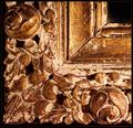
| 02/21/2004 05:55:46 AM |
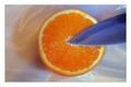
Orangebladeby ChezComment: Nice subtle colors, and I like the simple composition. My two comments are about the lighting... the shadow is cast upwards, not a more natural downwards. Could you have rotated the whole scene 180 degrees and re-shot, then flipped it? Also, the left edge of the orange seems to be in shadow, perhaps tilting it ever so slightly would have brightented it up or even added a hilight. |
 Photographer found comment helpful. Photographer found comment helpful. |
| 02/21/2004 05:51:54 AM |
|
| Photographer found comment helpful. |
| 02/21/2004 05:51:02 AM |
"riet"by middelboschComment: Nice lighting, but I would have tried to get the horizontal weave perfectly horizontal. At this slight angle it looks too off-handed to be really striking, for me. You could try centering the black part in a strong Thirds location, to draw the eye to an interesting detail that's kind of lost up near the top. |
| Photographer found comment helpful. |
| 02/21/2004 05:48:02 AM |
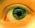
Eye Witnessby nikon_girlComment: I love the freaked out color, and that you're not looking into the subject straight on. Their head appears to be at a substantial angle, and it adds a nice tension to the stare. I bet you're going to get hammered for an eye picture, though. :) |
| Photographer found comment helpful. |
| 02/21/2004 05:45:44 AM |
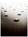
Surface Textureby BukiosComment: Nice blow out! I wish the reflections in the drops were less detailed, and they seem a bit less then random in placement to me. You certainly pegged the dynamic range!
|
| Photographer found comment helpful. |
| 02/21/2004 05:39:20 AM |
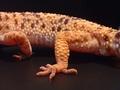
Showin' a Little Legby MrsFuzzButtComment: I really love the soft glow and the texture is fantastic, but i wish it were a more dynamic shot of the whole lizard, or more focsed on the leg itself. It doesn't feel balances to me. A nice tight vertical shot right around the leg could get rid of a lot of extraneous detail. :)
|
| Photographer found comment helpful. |
| 02/21/2004 05:37:03 AM |
Agedby HRoxasComment: Nice and simple, I lke it. The light seems to be coming from the side though, it feels a little off-kilter to me. :) |
| Photographer found comment helpful. |
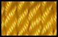
| 02/21/2004 05:35:49 AM |
Golden Ropeby agwrightComment: Really good job placing the rope, it's nice and precise. Blur your eyes, see the two complete hilights on each one? I would have framed the picture about 5% lower, to center those hilights. I like it! |
| Photographer found comment helpful. |
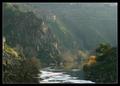
| 02/21/2004 05:29:52 AM |
Painted landscapeby DBoyComment: Absolutely gorgeous, but it doesn't really read 'texture' to me. Did you try cropping the little thing on the left middle edge, or that little strip of building in the upper right? It might clean up the image a bit and put more focus on the house. |
| Photographer found comment helpful. |
| 02/17/2004 08:06:05 AM |
|
| Photographer found comment helpful. |
Home -
Challenges -
Community -
League -
Photos -
Cameras -
Lenses -
Learn -
Help -
Terms of Use -
Privacy -
Top ^
DPChallenge, and website content and design, Copyright © 2001-2025 Challenging Technologies, LLC.
All digital photo copyrights belong to the photographers and may not be used without permission.
Current Server Time: 08/01/2025 10:05:26 PM EDT.