| Image |
Comment |
| 12/31/2002 03:20:39 PM |
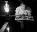
Burning the Midnight Oilby ambakerComment: I like the composition here, but the focus seems overly soft. Also, I wonder if the slant of the "horizon" (the table edge) should either be straighter or more dramatically slanted... The slight slant looks more "accidental" then "artistic"... Of course, that\'s just my opinion, and I\'ve been wrong before :) |
 Photographer found comment helpful. Photographer found comment helpful. |
| 12/31/2002 03:11:32 PM |
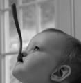
Spoon Fedby nards656Comment: Very interesting composition and nice use of humor... The focus seems a tad softer then necessary and the background lines are pulling my eye off the face and spoon. Otherwise, I wonderful shot :) |
| Photographer found comment helpful. |
| 12/31/2002 03:07:25 PM |
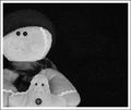
... as fast as you canby TarbiniComment: This is either a very unique interpetation of the challenge, or it just doesn't meet it... I haven't decided yet. The composition seems a tad crowded on the left side... |
| Photographer found comment helpful. |
| 12/31/2002 01:41:28 AM |
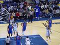
Travel to see MJby rj324Comment: At an NBA game I think you could have gotten a much better "traveling" shot :) If you know what I mean :) Nice shot! |
| Photographer found comment helpful. |
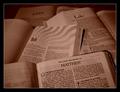
| 12/24/2002 03:13:18 PM |
Four Gospelsby TarbiniComment: Very well composed shot with strong diagonals. The grays are a bit muddy, which is a problem I always have when I shot Black & White. I wish I could tell you how to fix it. Wonderful message and well executed. Congrats on a great shot. |
| Photographer found comment helpful. |
| 12/22/2002 02:45:42 AM |
Self Serviceby SwashbucklerComment: Interesting shot and I'm certain you did it in camera... I just hope your ready to hear the shouts of the angry mobs :) Not sure how I feel about this kind of shot myself yet... I'm going to judge it on it's merits, I just am having some trouble deciding if I like it... |
| Photographer found comment helpful. |
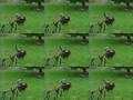
| 12/20/2002 07:18:34 PM |
Primary Swirlsby CreativeFlyPhotoComment: Critique Club Comment
Composition : Great use of a repeating pattern breaking ranks, with the rightmost marble elevated a smidgen above the others. I have to admit that I am also distracted by the fibers on the marbles surface.
Exposure/Lighting : Largely wonderful. There seems to have been a strong light shinning from the upper left that distracted a little bit, but not overly much.
Focus : Excellent. I think you made very effective use of DoF and you had a nice sharp focus where it belonged :)
Opinion : I liked this image quite a bit. Simple ideas are often the best ideas. But I do think you may have wanted to buff them up a bit with a lint free cloth :) |
| Photographer found comment helpful. |
| 12/20/2002 07:04:57 PM |
Christmas Time Is Hereby jenaromComment: Critique Club Comment
Composition : Brilliant use of negative space! The placement of the ornament as well as the branches is masterful!
Exposure/Lighting : I agree with those that liked the "hot spot". I think it added a lot to the image. Great exposure on all aspects. I was especially impressed with the detail in the golden cap of the ornament.
Focus : The softness of the one branch was effective, but I think what distracted some folks was that most of the branches were sharp and just that one part of the branch was outside the DoF. But I have to say, that didn't bother me in the least.
Post Processing : Whatever you did to it in Photoshop, you did extremely well! Seemed a little over-sharp in places (but that's just me)
Emotion/Challenge : Like so many said, print it and mail it out :) Excellent shot! |
| Photographer found comment helpful. |
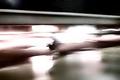
| 12/20/2002 06:35:07 PM |
shopping cart rallyby ArachnophiliaComment: Critique Club Comment
Composition : There is one strong line here that seems to be nicely placed.
Exposure/Lighting : Large portions of the top are completely lost in black while sections of the middle are burned to pure white. As I can't really tell where this was (the title suggests a store) I can't be sure if this could have been avoided.
Focus : Focus didn't seem to be an objective of this image. The blur of whatever is in the middle (shopping cart) seems to indicate motion from the lower left to the upper right, but not so I can be certain of it. I really wish you had included Shutter / Aperture / ISO as that could have helped me figure out what you were going for.
Emotion/Challenge : The feeling of motion is certainly present. I just would have been happier if I could detect direction, and maybe even what was moving.
Opinion : This is one of those shots that I sit and scratch my head over and am not surprised to see in a museum later. This could very well be high art, but if so, it's over my head. |
| Photographer found comment helpful. |
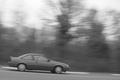
| 12/20/2002 05:47:31 PM |
Crouching Secretary, Hidden Luncheonby jimmythefishComment: Critique Club Comment
Composition : As others mentioned, slanted horizons can be a little distracting. I didn't have a problem with this one, in fact I personally thought it added to the feeling of motion. My nitpick with the slant is that you may have wanted to bring the car up a little higher in the frame. If you are showing downward motion, you might want to give the eye more "down" to look at. You did this very well with the placement of the car on the left side so it could travel into the shot to the right. I was just thinking a little more room on the bottom for the same purpose might have been nice. (As with all comments, this is just my opinion and not necessarily right :) )
Exposure/Lighting : The image is just a tad overexposed to my eye. Not massively, just a little. The grays are kind of muddy and you don't have much in the way of true black.
Focus : This is a text book example of panning. Excellent job. The trees are identifiable and the car is nicely frozen. I especially like the motion on the wheels.
Post Processing : While I think this requires a little tweaking to give richer tones, I have to admit that I have no idea how to do it :) I hope you understand what I mean.
Emotion/Challenge : Definitely no problem here with respect to the challenge. Well thought out and well executed. I assume the title has something to do with "Crouching Tiger, Hidden Dragon" but it was lost on me.
Opinion : Good concept, well executed. I just wished for more room on the bottom and somewhat richer tones. |
| Photographer found comment helpful. |
Home -
Challenges -
Community -
League -
Photos -
Cameras -
Lenses -
Learn -
Help -
Terms of Use -
Privacy -
Top ^
DPChallenge, and website content and design, Copyright © 2001-2025 Challenging Technologies, LLC.
All digital photo copyrights belong to the photographers and may not be used without permission.
Current Server Time: 06/19/2025 01:40:44 AM EDT.