| Image |
Comment |
| 02/24/2003 09:41:02 PM |
|
 Photographer found comment helpful. Photographer found comment helpful. |
| 02/23/2003 06:00:39 PM |
|
| Photographer found comment helpful. |
| 02/15/2003 03:33:46 AM |
|
| Photographer found comment helpful. |
| 02/11/2003 09:48:43 AM |
City Windowsby nathaliedooComment: ~ Critique Club Comment ~
Note : I don't think I can do 1000 words, but I'll do my best :)
Composition : I'm a big fan of strong, geometric lines and there are plenty of them here. My 1 small nitpick is that on the left side the dark line competes with the border. It seems to add more weight to that side and throws the balance a little off. But that's just to my eye.
Exposure / Lighting : There is a nice even distribution of light here. I like the fact that the darker walls to the right have the brighter windows.
Focus : No issues here.
Post Processing : As many of the comments you received pointed out, it certainly has a "painted" feeling to it. While I am more of a fan of photos looking like photos, you did not go overboard with it to the point of being more digital art then photo, but you certainly flirted with the line. I'm also not a big fan of borders, but you did yours very well (with the exception of that line on the left).
Challenge / Wow : Clearly meets the challenge. "Wow" is in the eye of the beholder and clearly you Wow'd some folks here. For me, the grain got in the way (but what do I know :)
My opinion : While I loved the lines, I wasn't bowled over the grain. I know it was intentional and artistic. But it just didn't work for me. |
| Photographer found comment helpful. |
| 02/09/2003 11:57:19 PM |
Manassas Battlefield Old Stone House - 1828by smellyfish1002Comment: ~ Critique Club Comment ~
Composition : Masterfully done... This unique angle makes this shot.
Exposure / Lighting : The dark shadow that the top of the door disappears into most likely could not have been helped, but I think it may (or may not) have improved the shot.
Focus : Deep depth of field extends very nearly to the top of this shot. Very well done!
Challenge / Wow : Challenge not just meet... Challenge nailed! Definitely a WoW factor here too.
My opinion : I'm rushing this critique to get it done before 12 EST, but I hope I've done some justice to this wonderful image. |
| Photographer found comment helpful. |
| 02/07/2003 11:38:53 AM |
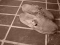
ethnoby andlbComment: ~ Critique Club Comment ~
Note ~ If any of this is unclear due to language or cultural differences, please feel free to email me and I'll try to explain more clearly.
Composition : I'm a big fan of strong lines and there are plenty of them here. Shoes are well placed off center and offsetting the lines of the floor.
Exposure / Lighting : The lighting has a flat feeling (that you may have intended) and might have benefited from more direct light. Most successful Black and White shots have a wide range of tones from pure white to pure black and most in between. Most of this is within a very narrow band. This is not necessarily a bad thing, but it didn't work for me.
Focus : Very nicely done. You can almost feel the texture of the floor and the shoes.
Challenge / Wow : Several commenters feel you didn't meet the challenge, and while I disagree with them (I take a loose interpretation of most challenges) you need to realize this is a common problem for images here. Many voters here need the challenge clearly as the main focus of the image. If you are shooting for good scores and possible ribbons, keep this in mind. If you are shooting to make great images that you can be proud of, then keep doing what you are doing :)
My opinion : While I really enjoyed the composition, the lighting left me a little flat. Very nice effort. |
| Photographer found comment helpful. |
| 02/07/2003 11:06:04 AM |
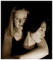
Bedtime Bouquetby GekkerComment: This shot is very nearly a 10. I had to look long and hard to see why it wasn't a 10 for me, and I found 2 very small nitpicks.
1 ~ The horizon line (piano keys) appear to be sloped slightly to the left.
2 ~ The flowers are held just a smidgen too high (or possibly too low). Where they are seems awkward somehow.
That said, I should point out that this shot has many great aspects. The concept is great, the model is adorable, the lighting is fantastic (love the 3/4 side light), etc. The 2 nitpicks hurt the shot for me though. |
| Photographer found comment helpful. |
| 02/07/2003 10:45:19 AM |
Inspired by Seurat: Sunriseby paganiniComment: I think this shot would have been much better before the post processing. It doesn't look like a photograph anymore, and most folks at this site prefer photography to digital art. While that effect is interesting, I believe it won't do well here. |
| Photographer found comment helpful. |
| 02/07/2003 12:05:01 AM |
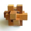
Puzzleby JamieWillmottComment: ~ Critique Club Comment ~
Composition : I really like the simplicity here. The two squares in the foreground give a nice diagonal feel.
Exposure / Lighting : I keep going back and forth on the shadow in the lower left. First i think it adds depth, then i think it distracts. In the end I'm leaning toward liking it, but I wish I could see this with a second light source on the left eliminating that shadow just to compare them.
Focus : Wonderful job with an all encompassing DOF.
Post Processing : If there is any, it has been done well enough so as to not be apparent.
Challenge / Wow : The challenge is certainly met.
My opinion : This may not make sense, but it seems to be both simple and complex at the same time. Very appealing. I'm still debating how I feel about the shadow... |
| Photographer found comment helpful. |
| 02/06/2003 11:22:18 PM |
|
| Photographer found comment helpful. |
Home -
Challenges -
Community -
League -
Photos -
Cameras -
Lenses -
Learn -
Help -
Terms of Use -
Privacy -
Top ^
DPChallenge, and website content and design, Copyright © 2001-2025 Challenging Technologies, LLC.
All digital photo copyrights belong to the photographers and may not be used without permission.
Current Server Time: 06/18/2025 05:53:55 PM EDT.