| Image |
Comment |
| 05/15/2003 10:03:04 PM |
3 cowboysby redhedComment: This had great potential... There are a few problems though. The cowboy on the right has the barrel of his gun chopped off. The black circle thing in the upper left is also distracting. And there is something on the left hand side as well. The focus needs a little work too. Creative idea :) |
 Photographer found comment helpful. Photographer found comment helpful. |
| 05/10/2003 06:43:18 PM |
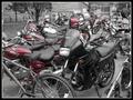
Odd One Outby starblazerComment: ~ Critique Club Comment ~
Composition : I found it a little difficult to pick out which was the "odd" one. First glance, I thought it was the black bike in the center. Then I thought the bicycle might be the subject and wondered why the front was cut off. From your comment, I see you weren't happy with it either. The background didn't really add anything for me either.
Exposure / Lighting : There is a good range of tones and nothing is over/under-exposed. The lighting seems to lend a 1950's kind of feel to it.
Focus : The unfortunate quality setting really hurt you. The low-res pixelation makes it look out of focus even though it isn't. But you already know that, so I won't harp on it.
Post Processing : 2 post processes stand out here. The border and the de-saturation. The border was well done and added to the photo. This coming from someone that usually doesn't like borders. It was simple and clean. The de-saturation didn't work as well (to my eye). I think maybe there were too many red objects to make it effective. Also the turn signals had some red in them and the de-saturation left them kind of dirty brown. For me, de-saturation works best when you have one object (the subject) that will remain in color. Here the subject got desaturated. While this might work, I didn't feel it worked for you here.
Challenge / Wow : Certainly on target challenge-wise... It was a little too cluttered and low-res to really carry much Wow.
My opinion : Nice effort, but it suffered from the mistaken settings and lack of attention to composition. |
| Photographer found comment helpful. |
| 05/10/2003 01:18:13 AM |
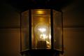
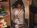
Imprisoned for lightby autumngirl786Comment: The size of the photo itself hurt this photo for me. You can have up to 640 pixals on the longest side and up to 150 kb total. You lost a lot more of your shot then you needed to by trimming down this small. |
| Photographer found comment helpful. |
| 05/10/2003 01:15:35 AM |
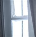
Painted Glassby CountryGirl03Comment: Clever concept / title. The execution fell a bit short though... The trim on the left is very distracting (the slant) and the white (curtain?) on the right doesn't really add anything. |
| Photographer found comment helpful. |
| 05/10/2003 12:34:29 AM |
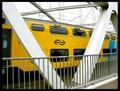
The Commuter Expressby KINGComment: ~ Critique Club Comment ~
Composition : Strong diagonal lines everywhere. I like the composition a lot. I'm not sure how I feel about the bit of sidewalk in the lower right corner though. Have you tried a crop that loses some of that? It may or may not be an improvement.
Exposure / Lighting : Lighting doesn't seem to be an issue (for me) here. The white pillars are certainly not overexposed and the darkest areas (under the train) are not overly underexposed. I agree that the contrast of the bridge to the train is wonderful. Maybe just a tad more saturation of the yellow channel would have brought that out even more dramatically?
Focus : I see from your comment that you already see what I am inclined to point out, but since you asked for a critique, I'll say it anyway. To show the movement of the train, you would have needed a slower shutter speed then 1/320. I don't know if you had a tripod, but you may have wanted to step it to about 1/30 or possibly even slower. I think this one change would have pushed this photo up a full point to around 5.5 or so.
Challenge / Wow : Challenge is certainly met. I think the slower shutter would have added a lot more Wow.
|
| Photographer found comment helpful. |
| 05/01/2003 11:27:38 AM |
|
| Photographer found comment helpful. |
| 05/01/2003 11:12:23 AM |
|
| Photographer found comment helpful. |
| 04/15/2003 10:11:49 PM |
|
| Photographer found comment helpful. |
| 02/26/2003 09:50:27 AM |
Dying For Help !!!by tattooComment: Powerful interputation, well executed. The grain works well to add to the emotion of despair. Right now I (and most of us) are thinking about leading lines... If the arn had been positioned so the countertop edge pointed to the same spot as the needle, it may have made an even stronger image. As it is, it's still VERY powerful. |
| Photographer found comment helpful. |
| 02/25/2003 10:37:25 AM |
Dear "John"by teachme53Comment: I'm assuming this shot is setup since this would have been cruel in the extreme to shoot if she truely felt that way. To your model's credit, it is pulled off well. The grain works for you here. Good job |
| Photographer found comment helpful. |
Home -
Challenges -
Community -
League -
Photos -
Cameras -
Lenses -
Learn -
Help -
Terms of Use -
Privacy -
Top ^
DPChallenge, and website content and design, Copyright © 2001-2025 Challenging Technologies, LLC.
All digital photo copyrights belong to the photographers and may not be used without permission.
Current Server Time: 06/18/2025 11:43:38 AM EDT.