| Image |
Comment |
| 08/06/2004 10:37:36 PM |
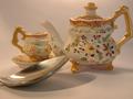
Setting the Still lifeby JC_HomolaComment: Beautiful composition. This image generates a really sombre mood. It almost creates a sense of silence.The only negative is that it does appear a little dark to me. Good Luck. |
 Photographer found comment helpful. Photographer found comment helpful. |
| 08/06/2004 10:35:14 PM |
Welcome to the Jungleby BobsterLobsterComment: This image makes an instant impact. The colours and lighting are handled expertly. The composition works really well and the depth of field work is perfect |
| Photographer found comment helpful. |
| 08/06/2004 10:32:34 PM |
Mini Roseby dwolffComment: Lovely. The composition is interesting and I think it works well. The colour and lighting are beautiful. The blue tint on the background compliments the flowers really well. The textures are inspiring and the soft focus is inspired. |
| Photographer found comment helpful. |
| 08/06/2004 10:25:14 PM |
Sevilla's Queenby greslizzzComment: Beautiful image. The colour, lighting, DOF and composition are all beautiful. The border works well too. This image has a luxurious feel about it. The texture in the foreground works so well against the softened background. Well Done. |
| Photographer found comment helpful. |
| 08/06/2004 10:21:53 PM |
Figure It Outby cassilda_terryComment: I like the random balance that you've created. The depth of field works well too. The focus seems a little soft. I think a border would help to "contain" the subject matter. You've made a bunch of quite different objects into quite an interesting picture. |
| Photographer found comment helpful. |
| 08/06/2004 10:15:49 PM |
|
| Photographer found comment helpful. |
| 08/06/2004 10:13:43 PM |
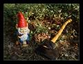
Gnomberjackby gsingalComment: Great composition. The border really works well too. The lighting adds real depth to the image.The head of the axe is just a little obscure in the shadow at the front so that it takes a moment for me to actually identify what the scene is. Nice image though. |
| Photographer found comment helpful. |
| 08/06/2004 10:10:20 PM |
Roses are Redby sfaliceComment: Great composition. I love the vertical versus horizontal aspects of the subject matter. The lighting is good also. I think that given all the strong red in the picture that a dark background and bench top would have really emphasized the colour even more. |
| Photographer found comment helpful. |
| 08/06/2004 10:07:56 PM |
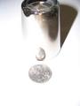
petite reflectionsby hitendraComment: Intersesting image. I think you could have gone even further with the idea to make it a bit more solid. I would suggest that the cropping could have more space at the top to have some blank space above the glass. Also a simple border would just top it of as something that could hang on a wall in a modern cafe. I would also sharpen it a little as the focus is a bit soft. The lighting could also have been diffused as it is a bit harsh and bright. Also you could consider the things that are reflecting in the glass. I don't mean to harp on I just think this is a great idea with lots of potential and that its just a few technical things that stand out to me. Good luck. |
| Photographer found comment helpful. |
| 08/06/2004 10:00:34 PM |
Sampsonby xcharrierComment: What a cool little subject. The depth of field works well and so does the composition. Actually I think this shot might also work really well in black and white. There's good contrast between the little guy and the hand. |
| Photographer found comment helpful. |
Home -
Challenges -
Community -
League -
Photos -
Cameras -
Lenses -
Learn -
Help -
Terms of Use -
Privacy -
Top ^
DPChallenge, and website content and design, Copyright © 2001-2025 Challenging Technologies, LLC.
All digital photo copyrights belong to the photographers and may not be used without permission.
Current Server Time: 08/20/2025 10:50:48 PM EDT.