| Image |
Comment |
| 11/03/2004 11:38:17 PM |
Splashby BudComment: I'm sorry, but this isn't one of my favorites in the challenge. I'm not sure why you chose to keep the grass spriggs in the shot, and it's taking an awful lot of eye strain to see what that splash subject actually is. |
 Photographer found comment helpful. Photographer found comment helpful. |
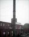
| 11/03/2004 11:35:48 PM |
October Moodby dimitriiComment: I'm not sure where the visual interest is in this shot, I'm sorry. I don't like the pole right in the center, and I wish I could read all of the sign. A polarizer would have helped with the sky, too. If you don't have one of those, I highly recommend one, it's really helped with my outdoor shots! These are just my opinions. If you're happy, just be happy. :) |
| Photographer found comment helpful. |
| 11/03/2004 11:32:54 PM |
Stippled Primroseby vtruanComment: I know you're going for a stippling effect, but it just looks pixelated to me. I'm sorry. I'd be interested to see the original, maybe in color... I just feel like this is lacking something. |
| Photographer found comment helpful. |
| 11/03/2004 11:31:02 PM |
Delivering Opinionsby zeuszenComment: This looks more like an oil painting... I'm guessing it was neat-imaged heavily... it's just my opinion, but this is beginning to stray a little too far from actual photography and crossing more into digital art, which is fine for a genre in itself (and this is a nice example of digital art, if that's what you're going for)... but I feel the point of this site is the photography. I do hope you'll post the original when the challenge is over, I'd like to see what the real background looks like. Also, I apologize if I've made any assumptions that aren't correct, and I just want to reiterate that it's just my opinion. I hope you're one that appreciates comments... |
| Photographer found comment helpful. |
| 11/03/2004 11:26:38 PM |
Brillanceby xtabintunComment: I'm sorry, but I feel like you should have found a shot that wasn't so similar to the one you entered into the defining features challenge (I think that was the one). The angle's just slightly different, but the photo is essentiallly the same. Just my opinion. |
| Photographer found comment helpful. |
| 11/01/2004 11:20:08 PM |
Ladyby JackoComment: Fabulous use of primary colors, leading lines, rule of thirds... you just covered all your bases, didn't you! Technically and compositionally a great shot! Bumping you to an 8. |
| Photographer found comment helpful. |
| 11/01/2004 11:17:12 PM |
Sylviaby joannsComment: One of my four highest-scoring portraits. Lovely skin tones... and the pose is beautiful. What a lovely photo!! 9 |
| Photographer found comment helpful. |
| 11/01/2004 11:16:38 PM |
|
| Photographer found comment helpful. |
| 11/01/2004 11:14:34 PM |
Apriellaby connieComment: One of the best and most unique portraits in this challenge. Great work. 9 |
| Photographer found comment helpful. |
| 11/01/2004 11:13:41 PM |
Boundby BobsterLobsterComment: Wow. Beautiful photo. The *only* slight itty bitty thing that bugs me is the gather on her clothing (on her left side, torso area). It kind of makes her skin look strangely wrinkled. But again, wow. 9 |
| Photographer found comment helpful. |
Home -
Challenges -
Community -
League -
Photos -
Cameras -
Lenses -
Learn -
Help -
Terms of Use -
Privacy -
Top ^
DPChallenge, and website content and design, Copyright © 2001-2025 Challenging Technologies, LLC.
All digital photo copyrights belong to the photographers and may not be used without permission.
Current Server Time: 08/26/2025 11:30:18 PM EDT.