| Image |
Comment |
| 06/08/2006 03:16:33 PM |
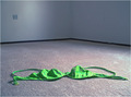
Abandonby tembaComment: I think you did a good job of showing an empty room but the picture is just ok however it does meet the challenge. There is nothing to make me say wow. You did a good job of obviously letting us see your one prop in the room. But it is a shark contrast to it's surroundings. The green is a bit to bright and blown to the point that the blue lines are hardly visible.
I like the Dof but the composition could of been a little better IMO. The corner of the room is to close to the middle of the picture and the layout of your prop is not random as it would be if someone would of pulled it off and dropped it to the floor. It looks to staged.
I would of liked to have seen the corner of the room a little more to the right of the picture (about on the third line) and the swim top off to the left in a random drop making it appear to be dropped to the floor instead of placed.
I'm trying to tie the title into the picture and the prop. I can see where the room and the title corresponds but the prop is a little of a stretch for me. But in fairness I don't know what your reason was for that particular prop, maybe abandoning a top as well and going topless. So it's not a bad title or prop.
As I was typing this I alternate shot came to mind. I think it would of taken this shot to a new level if you would of chosen a yellow poke dot bikini and had it on a rack hanging on the wall on the left side by the wall plate where the light is. Then it would of given me (the viewer) a sense of abandon room and the abandoned idea of someone being able to fit wear the bikini.
Overall your picture is not bad. I has good lighting, focus, and DOF. Composition could of been better. Good job maybe worth a second take.
Keep up the good work. 5
SDW |
 Photographer found comment helpful. Photographer found comment helpful. |
| 06/08/2006 02:05:18 AM |
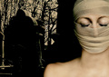
This Boy ( Beatle album 1963)by fredahenryComment: From the Critique Club
Oh I'm glad I pulled this image. I like it a lot. I think your photograph ties in very well with the title and song lyrics. The song (B side of "I want to hold your hand) is about a boy loosing his girl to another boy. And he (This Boy) wants her back. The other boy want be happy, where he will if he gets her back.
So I take that and look at the photograph and I can see that in the picture. Yes the boy in the photograph is young but we all remember I first puppy loves. And I think that is where this picture and the title along with the challenge works well. Congratulations on a good choice.
Now as far as the technical aspect of the photograph I don't see much wrong there. I love the tone -by far the best for this photo. I think the lighting from the highlights, midtones, and shadows are all great. And the composition is good.
If I had one or two things to pick on it would be the bright areas in the background. Even though they are very well softened by the use of a shallow dof they still draw a little attention away from the face. I wish his eyes would of been a little brighter showing more detail. Other than that, I think this is a great piece of work from the photo to the title to making it all fit the challenge. Great Photograph!
Keep up the good work and I hope you find the critique helpful.
SDW |
| Photographer found comment helpful. |
| 06/08/2006 01:28:10 AM |
In my hour of darkness ( Let it be )by Arti-ElviComment: From the Critique Club
Very nice focus and lighting on the subject. Also good placement of the subject. As you know the photo is good as reflected by your score. But I feel a little more detail in the background, be it highlights or midtones, would of helped the overall image. And there is one place that keeps drawing my eyes and thats the perceived "V" in the middle of the photo caused by the tilt of the stone and tree. Being in the center it somehow wants to compete with the subject. I really would have really liked to see some detail on the side of the tree (if that is what is is) because it seems flat and splits the picture almost down the middle.
Overall good title with picture choice that a few adjust would of made better. I hope you find this critique helpful.
Thanks,
SDW
|
| Photographer found comment helpful. |
| 06/08/2006 12:22:56 AM |
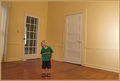
Curiosityby ShaneBlakeComment: Ok keep it real here. The photo is not bad but I have a few issues with it. The main one is the horizontal line that bends and goes down to the child's head. That is very distracting. It also, with the bend, ends up almost in the center of the picture make the picture look like it is split. I think, in this photo, black and white or some other duotone would of worked better than the colored version. Everything from the child, floor, walls, and doors seem to have the yellowish tint. And the border does not do anything to help that. I think maybe positioning the child near the glass pane door with a reflection or shadow coming it would of helped. With that said you did meet the challenge. |
| Photographer found comment helpful. |
| 06/08/2006 12:11:12 AM |
by fotomann_foreverComment: I don�t get the since of any empty room in your shot. |
| Photographer found comment helpful. |
| 05/29/2006 12:47:17 AM |
1400°C by gaurawaComment: Congratulations on your ribbon. A wonderfully executed photograph.
SDW |
| Photographer found comment helpful. |
| 05/29/2006 12:35:30 AM |
|
| Photographer found comment helpful. |
| 05/27/2006 03:35:01 AM |
Red Eyeby SJCarterComment: Now this is great. Love everything about it. Great Job! |
| Photographer found comment helpful. |
| 05/23/2006 04:27:39 PM |
|
| Photographer found comment helpful. |
| 05/22/2006 12:34:17 AM |
the ball and the fieldby crayonComment: Hi,
I did not vote on this challenge but here is what I see in your picture outside of the challenge.
If you were looking for an abandoned feel it is portrayed well in this shot. With the tall grass and dark fringe's around the bottom of the picture gives me a feel that the soccer ball is left outside, the kids are tired of playing with it and have gone on to do something else leaving the ball to deal with the elements. Emotionally it has a depressing, lonely, abandoned, and an overtaken feel to it.
The photograph technically is good. The blown sky is distracting making me think a gradulant layer may have helped.
I hope this helps and is the kind of comment you were looking for. Remember all my comments are my opinion and everyone see photographs differently.
-SDW |
| Photographer found comment helpful. |
Home -
Challenges -
Community -
League -
Photos -
Cameras -
Lenses -
Learn -
Help -
Terms of Use -
Privacy -
Top ^
DPChallenge, and website content and design, Copyright © 2001-2025 Challenging Technologies, LLC.
All digital photo copyrights belong to the photographers and may not be used without permission.
Current Server Time: 08/23/2025 11:26:14 PM EDT.