| Image |
Comment |
| 06/16/2006 02:44:49 AM |
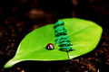
Better togetherby hannekeComment: From the Critique Club
OK keeping it real here! I think your photograph looks good and defiantly meet the challenge. I think the separation of the leaf and stitching back together is neat. I have not seen that before and It looks good. You focal point is good and the lighting is great. But I do have a few issues with the photograph that IMO kept it from going above 6.
1. I think the DOF is a little to shallow. I would of loved to see the complete leaf and stitching in focus.
2. To be honest and I maybe wrong but the lady bug looks fake. The reflection across the back is sold from one wing to the other and should be separated as the wings are.
3. The straight line on the cut leaf seams to me it would of been better, compositionally, if it was on more of a tilt in relation to the photograph instead of the top ending up near center.
Overall a good photograph that meet the challenge. Good light with good color along with creativity pushed your score upward. A few minor adjustments and I believe it would of ended up in the 6 club.
I hope you find this critique helpful and if you have any questions feel free to contact me.
regards,
SDW |
 Photographer found comment helpful. Photographer found comment helpful. |
| 06/14/2006 10:21:00 PM |
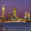
City at Sunset (Square Crop Challenge Revisited)by QikiComment: From the Critique Flag
Hi- IMO you have improved upon your image a great deal. The lighting is much better and you can clearly see the skyline. I like the color, they complement each other very well.
However your photograph does have a couple distractions to me. As I always say if it don't enhance your photograph get ride of it and I think the boat falls into that saying. It appears withing the 25 seconds that you were taking the photograph the boat was moving ever so slightly causing it to be out of focus. I would of (if possible) moved more to the right as go get the boat out of frame but still leaving the tallest building in frame. You don't want to loose that building.
With this being an advanced editing challenge I would of used a layer to tone down the blown out lights at the top of the buildings. Other than that you did a great job improving over your original challenge.
Overall good photograph with niche lighting and composition. I would of rid the picture of those few distractions but thats all. The color is great.
Keep up the good work and I hope you find this critique helpful.
regards,
SDW |
| Photographer found comment helpful. |
| 06/14/2006 09:15:36 PM |
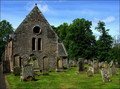
"I may be old and small but I am full of spirit"by ThaiComment: From the Critique Club
I had to go back to your original picture and compare the two. I believe you improved upon the biggest thing which was the sky. However I feel your composition was better in the original.
The original also had a mood to it with the flush green grass and darkness which is not present in the take two challenge. That's why I feel your score only gained a few points.
What I would of like to have seen would of been a combination of both shots. Keeping the composition of the first and sky of the take two. The lighting was not great in this shot looks almost mid day making shadows flat and taking away from depth. Even with the composition and lighting problem in the take two shot i feel you could of pulled it out if you would of taken advantage of more editing since this time it was an advanced editing challenge.
I took your picture and done some more editing in PS/CS to let you see what I am talking about. If you would like to see the edit you can at here 
Overall a good picture that needed just a little more mood IMO. Keep up the good work.
I hope you find this critique helpful and if you have any questions feel free to contact me.
regards,
SDW Message edited by author 2006-06-14 21:18:29. |
| Photographer found comment helpful. |
| 06/14/2006 08:38:01 PM |
The Look "Take Two" http://images.dpchallenge.com/images_challenge/480/321352.jpgby bryantbusComment: From the Critique Club
I think you photograph is well done technically and I like that you have opened up the crop on take two over the original. The eye contact between the model and camera is great and the focus is good. The bottom half of her body does seem a little uncomfortable but the rest of the pose is great. I do think the background is a bit distracting with the line or border at the bottom going straight through her arm. I feel it would of been better if the dark portion of the background would of continued all the way down to the model.
Overall a very good setup and technically sound. A few distracting elements eliminated would of made the picture great.
I hope you find this critique helpful and if you have any questions feel free to contact me.
regards,
SDW |
| Photographer found comment helpful. |
| 06/14/2006 01:58:46 AM |
Nature Reservedby sacredspiritComment: Very nice picture and a great capture. However I can't help but believe you entered it in the wrong challenge. I see now shadows just silhouettes from the lighting in the background. What a shame I feel this would of done very well in the framing II Challenge. |
| Photographer found comment helpful. |
| 06/14/2006 01:54:39 AM |
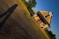
Room with a viewby rblantonComment: Nice lines and good shadows. Focus is good along with the lighting. The photograph does not have a wow factor for me me but still good. |
| Photographer found comment helpful. |
| 06/14/2006 01:53:19 AM |
Reflective Lightby sherpetComment: Good job of capturing the shadow but the picture seems out of focus both on the subject and the shadow. |
| Photographer found comment helpful. |
| 06/14/2006 01:51:40 AM |
|
| Photographer found comment helpful. |
| 06/13/2006 06:22:09 PM |
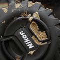
Nikor Mud Cut (no grass) lens cap contestby KronusComment: From the Critique Club
I have taken a few hours to look at your take two picture and the original. I see that the original scored higher than your second shot. Even though your take two shot is technically good. Good focus, macro, and lighting.
IMO I believe you went for to tight of a crop. The lens cap seems to be forced into our face and takes up the majority of the page. Elements that were in the first photograph that made your picture look more realistic is omitted in this photograph and I believe that hurt your score some.
IMO a more open crop showing some of the vehicles wheel components and maybe part of the fender would of made this a great shot.
Keep up the good work and I hope you find the critique helpful. If you have any questions feel free to contact me.
regards,
SDW |
| Photographer found comment helpful. |
| 06/13/2006 03:18:58 AM |
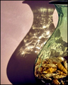
Cut the Mustard(Try 2)by RMyers1314Comment: From the Critique Club
You achieved a better focus on the second take and I believe that the point of view is also better. However the focus is still soft. I like the reflections on the bottom half of the picture and feel that balanced the image a little more. What I think is hurting the over all image is the strong background. It is competing with the subject. I would recommend a black background. The contrast seems to be week and I would of darkened up the photograph a little if possible. I think you should of taken advantage of more processing allowed under advanced editing.
Overall a good photograph. I hope you find this critique helpful and if you have any questions feel free to contact me.
-SDW |
| Photographer found comment helpful. |
Home -
Challenges -
Community -
League -
Photos -
Cameras -
Lenses -
Learn -
Help -
Terms of Use -
Privacy -
Top ^
DPChallenge, and website content and design, Copyright © 2001-2025 Challenging Technologies, LLC.
All digital photo copyrights belong to the photographers and may not be used without permission.
Current Server Time: 08/23/2025 11:25:27 PM EDT.