| Image |
Comment |
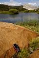
| 07/11/2004 09:36:46 PM |
Stay in Touchby photomComment: I know everyone hates comments on content, but when I looked at this shot, I thought "Wouldn't it be funny if there were someone (or several someones) in the water in the background?" I think the hint of innuendo might add to the draw of the brand. The idea of being in the middle of nowhere comes across, but what about being somewhere so far that noone will see you? Maybe a pile of clothes next to the phone would give the same effect :) Anyway, I like the image, I thought at first that the phone should be larger, but I like it now, it really works. |
 Photographer found comment helpful. Photographer found comment helpful. |
| 07/11/2004 09:33:23 PM |
|
| Photographer found comment helpful. |
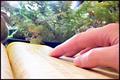
| 07/11/2004 09:31:32 PM |
The Yellow Pages. Let your fingers do the walking.by zeke123caComment: The idea here is interesting, you seem to have over edited a bit, though. The hand is nice and sharp, very good detail, and the pose is a good leader into the center of the frame. The phonebook, unfortunately, is terribly washed out, I wouldn't know what it was without your title. The background is very odd, did you overuse the sharpening tools? There seem to be fuzzy trees with sharp edges, and some of the effect even occurs on the hand. Could also be due to overusing levels. I think you propably have a very strong original, try re-editing to show us that strength. |
| Photographer found comment helpful. |
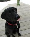
| 07/09/2004 03:18:55 PM |
Gimme...Gimme...Gimme...by ursulasComment: The dog is adorable, and you have the right idea here. I think what you need to make this shot snap is to bring more focus to the Milkbone itself. Right now the dog dominates the shot, even though your DOF is correct. By bringing the Milkbone to the foreground (larger and more to the center of the image), and shallowing out your DOF a bit more, you can capure the moment while focusing on the product. Essentially, we want to be looking "through" the Milkbone at the dog, rather than from the dog to the Milkbone. |
| Photographer found comment helpful. |
| 07/08/2004 09:18:45 PM |
|
| Photographer found comment helpful. |
| 07/08/2004 09:16:49 PM |
|
| Photographer found comment helpful. |
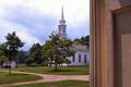
| 07/08/2004 09:15:24 PM |
The Meeting House- Visit Hale Farm and Village, Bath, Ohioby STEINRComment: Why the doorframe? The picture is very sharp and nice, with good color balance, but it's not an ad or even a print. Think about what someone who had never heard of your product/subject/town would get out of your image. Remember that context often shades our own opinion of our photos, but my neighborhood hot dog stand looks pretty much like every other hot dog stand to someone who doesn't know me or my town. |
| Photographer found comment helpful. |
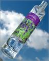
| 07/08/2004 09:06:54 PM |
Heaven Scentby peeceeComment: Too bad you couldn't crop that bottom corner. Otherwise a nice, clear ad, good color and sharpness. Would have helped if the bottle was full :) |
| Photographer found comment helpful. |
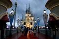
| 07/08/2004 09:05:07 PM |
New Theme Park in Townby akshaComment: As nice as your composition is, this looks like a snapshot from the family album. The clouds don't make the theme park look very appealling, and the people are all blurry. we should see smiling faces and sunny skies in a theme park ad. |
| Photographer found comment helpful. |
| 07/08/2004 09:03:07 PM |
|
| Photographer found comment helpful. |
Home -
Challenges -
Community -
League -
Photos -
Cameras -
Lenses -
Learn -
Help -
Terms of Use -
Privacy -
Top ^
DPChallenge, and website content and design, Copyright © 2001-2025 Challenging Technologies, LLC.
All digital photo copyrights belong to the photographers and may not be used without permission.
Current Server Time: 08/04/2025 10:52:09 PM EDT.