| Image |
Comment |
| 08/01/2003 04:57:40 AM |
|
 Photographer found comment helpful. Photographer found comment helpful. |
| 07/16/2003 03:35:49 AM |
Saver Lifeby SonifoComment: I like this shot but IMO if you had made the center lifesaver laying down it would have made the shot more powerful. |
| Photographer found comment helpful. |
| 07/16/2003 03:29:22 AM |
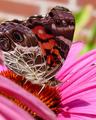
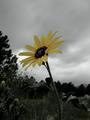
Butterflyby ladpupmoeComment: I see the circles on the butterflys wings but it just doesn't say "round" to me. It says this is a photo of a flower and a butterfly. 4. |
| Photographer found comment helpful. |
| 07/11/2003 01:32:27 AM |
soft sun by DrJOnesComment: Very high key shot. Pose is nice and I love the hat. Lighting is nice except it looks a little dark just to the left of the navel. I give you a 9. Great shot. |
| Photographer found comment helpful. |
| 07/11/2003 01:30:49 AM |
Sun baskerby kiwinessComment: Very nice. I love the shallow dof, pose and expression is excellent (doesnt look forced at all). Perfectly sharp and I love the greenish sepia tone. My one and only 10 for the challenge. Great shot. |
| Photographer found comment helpful. |
| 07/11/2003 12:49:57 AM |
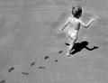
Free Spiritby SonifoComment: Looks to me like you did some dodging and burning around the kid. Looks like she seems to be glowing which actually might have been your reasoning behind it. |
| Photographer found comment helpful. |
| 06/27/2003 01:41:33 AM |
Left Aloneby K-RobComment: Sorry about your score. IMO this definately meets the challenge as a low key shot. I gave you an 8. Should have placed much, much higher in the challenge.
Brian |
| Photographer found comment helpful. |
| 06/26/2003 04:02:56 AM |
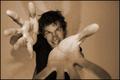
Lo-fi Self Portrait in Sepiaby SharQComment: Critique Club Critique:
First of all I have to say I really liked this shot and it got a 9 from me.
Composition wise your pose is excellent and so is your facial expression. Maybe lowering your left hand and exposed all of your face might have helped just a little bit.
Technically wise I wish you would have used a greater depth of field. It seems that the part of the photo that has the sharpest focus is your right thumb and palm. I like how the ends of your fingers are a little blurred but your face seems a tad soft to me in comparrison to your hand. Don't get me wrong, I love soft focus but not when your hand is so sharp and this is after all a self portrait. Besides that the lighting is good as is the tonal range. Plus im such a sucker for B&W and sepia so that almost always works for me. The shadows on the wall add another element to the photo which balances to almost create a square around you.
Overall this is a very creative shot which shows much character in you which in my opinion is the best thing about self portraits. It doesn't just show you...it shows who you really are. Good job.
Brian |
| Photographer found comment helpful. |
| 06/20/2003 12:18:45 AM |
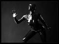
Plastic Surgeryby DrJOnesComment: Beautiful Dr. Jones. How do you get to be so lucky? Perfect lighting, nice depth of field. 10. |
| Photographer found comment helpful. |
| 06/19/2003 03:03:49 AM |
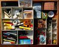
toolboxby Pep VentosaComment: Critique Club Critique:
This definately is art, abstractly as it may be. First off the focus looks a little soft to me. I think maybe using a little more light and maybe a little faster shutter speed would have helped that out a bit.
The composition seems cluttered, like you put as much stuff as you could into the photo and there is no main subject. My eyes just keep wandering with no place to rest.
Overall I think picking one or two things out of your "drawer of many things" would have decreased the subjects and give the viewer a chance to rest his/her eyes. |
| Photographer found comment helpful. |
Home -
Challenges -
Community -
League -
Photos -
Cameras -
Lenses -
Learn -
Help -
Terms of Use -
Privacy -
Top ^
DPChallenge, and website content and design, Copyright © 2001-2025 Challenging Technologies, LLC.
All digital photo copyrights belong to the photographers and may not be used without permission.
Current Server Time: 08/17/2025 08:20:22 AM EDT.