| Image |
Comment |
| 08/01/2004 12:20:36 PM |
daily practiceby PhileineComment: Very nice. Unique and different background that works well here. How was it done? Cloth backdrop? |
 Photographer found comment helpful. Photographer found comment helpful. |
| 08/01/2004 12:17:09 PM |
|
| Photographer found comment helpful. |
| 08/01/2004 05:35:04 AM |
The Slideby Soleil9Comment: Oooh, this is cool! I love the smooth texture and lines of the slide, and the wispy clouds and blue sky complement it so well. Very nice. No complaints. |
| Photographer found comment helpful. |
| 08/01/2004 05:24:46 AM |
|
| Photographer found comment helpful. |
| 08/01/2004 05:23:48 AM |
From the Psychedelic Kitchenby e301Comment: Gorgeous colors and creamy smooth textures in the reflections. Cute title. Nice composition. I can't find anything not to like about this fabulous shot. |
| Photographer found comment helpful. |
| 08/01/2004 05:19:08 AM |
Every Single Dayby kevrobertsonComment: Very nice image. The focus is crisp on the main subject of the composition. The composition is interesting, the addition of the pen keeping it from feeling too empty and leading the viewer's eyes to the important part of the image. |
| Photographer found comment helpful. |
| 08/01/2004 05:16:44 AM |
Different Everydayby ctaloiComment: Oooh, this is a beautiful exposure! Something about the warm tones of light and the old-looking thermostat make me feel cozy inside. Nice focus and DOF. I also like the choice of placement within the frame. I wish I could make such mundane objects into such nice compositions. |
| Photographer found comment helpful. |
| 07/31/2004 08:51:27 PM |
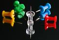
Pushpin's musketeersby beletteComment: Great colors. Nice reflections. Is it a mirror, or a glossy tabletop?
Good framing and composition, but it looks like it's been posterized (reduced to N colors) or NeatImaged to death, because the pins, especially the clear one in the center, are full of flat patchy areas. Maybe that's the intent of the photographer, and I love the way it works on the colored pins, but the clear one bothers me. 8 |
| Photographer found comment helpful. |
| 07/31/2004 08:48:32 PM |
Evolutionby photomComment: Wowzers! This is a fabulous composition! Brilliant idea, superbly executed. The lighting, exposure, and focus are perfect. I love the two-tone background, it really makes this image stand out for me. The little rim of light visible around the globe of the bulb is cool too.
There are only a couple of small problems: The line between the black and white in the background is not quite horizontal, and it's a little ragged (not crisp enough). Also, the reflection of your ceiling light in the globe of the bulb is a bit distracting, though it took me a minute before I noticed it. And one last critique, there is a little bit of text on the bottom right side of the threads on the bulb, that clutters the otherwise supremely clean composition.
If those tiny problems didn't exist, this would be a 10. But, still, this is my favorite in the challenge! 9. |
| Photographer found comment helpful. |
| 07/31/2004 08:29:33 PM |
Signby dyriComment: Nice colors, nice subject. Too bad the lamp posts protrude into the composition from below, they kind of throw off the emperor's groove. Maybe if you got down just a smidge lower, you could isolate the sign? Still, an interesting photo. Is it from the UK? I was just there a few weeks ago and I remember seeing this kind of sign. |
| Photographer found comment helpful. |
Home -
Challenges -
Community -
League -
Photos -
Cameras -
Lenses -
Learn -
Help -
Terms of Use -
Privacy -
Top ^
DPChallenge, and website content and design, Copyright © 2001-2025 Challenging Technologies, LLC.
All digital photo copyrights belong to the photographers and may not be used without permission.
Current Server Time: 08/20/2025 02:35:14 AM EDT.