| Image |
Comment |
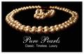
| 04/25/2005 06:18:45 PM |
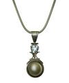
My Wife's Favorite Necklaceby rlinn3Comment: I can easily see this as an advertisement. Makes for a great ad copy. Have you considered shooting against black? I think gemstones appear much more flattering against black. 7 |
 Photographer found comment helpful. Photographer found comment helpful. |
| 04/25/2005 04:57:01 PM |
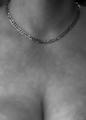
All You Need Is Goldby Mr_PantsComment: And a little bit of cleavage doesn't hurt?
I like the soft focus and the necklace is well lit. I would have cropped off the bottom personally. However, the advantage for adding it in are two-fold: helps to define the location and dimensions of the necklace and offers a bit of adolescent sex appeal, which overall does not seem to negatively effect the ratings here at DPC. The lighting is a bit irregular on the right breast (the one on the left side of the picture) and therefore gives further cause to have either edited it or cropped it out.
The model's skin as a side note is blemished a bit due to the freckles which detracts from an advertisement point-of-view. |
| Photographer found comment helpful. |
| 04/25/2005 04:45:47 PM |
The Gameby mpembertonComment: I like the humor in this entry. :-)
The lighting appears a bit harsh, directed low from the bottom, but overall a nice entry. |
| Photographer found comment helpful. |
| 04/25/2005 04:42:46 PM |
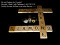
Iceby bruskiComment: Wow! What a fantastic entry. Love the DOF. Excellent lettering as well. My top three for the challenge. |
| Photographer found comment helpful. |
| 04/25/2005 04:41:02 PM |
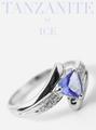
Diamonds are foreverby TrollManComment: I like the model's pose and her upward gaze. The lighting is great and it imparts a flattering soft glow. The position of the earring I think could have been made to be more the center of focus in this ad perhaps by cropping less of the right edge. |
| Photographer found comment helpful. |
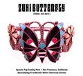
| 04/25/2005 04:38:52 PM |
Zuni Butterflyby GeneralEComment: I like the lighting here but it has a pinkish cast to it which may actually reflect the true color of this piece, but appears somewhat odd. I think this works very well for an advertisement. 7 |
| Photographer found comment helpful. |
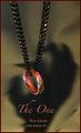
| 04/25/2005 04:37:29 PM |
The Oneby jperez1690Comment: Love the humor in this entry. I would like to suggest the following: selectively highlight the chain and desaturate the blues and reds to eliminate the colored highlights off those links. |
| Photographer found comment helpful. |
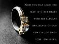
| 04/25/2005 04:28:55 PM |
Round Brilliant Two-Tone Ringby mocabelaComment: What can I say, this is just exceptional! The only suggestion is to rotate the ring so that the center stone is angled up higher instead of resting on the surface and thus being angled down. Perhaps use a dot of glue to prop it in that position. Other than the position of the stones, you nailed this one with this excellent jewellery advertisment! 10 |
| Photographer found comment helpful. |
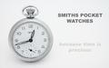
| 04/25/2005 04:23:14 PM |
Smithsby justinbrookComment: I like the soft lighting and the composition. The lettering is OK, but it appears too sharp (aliased and jagged). |
| Photographer found comment helpful. |
| 04/25/2005 04:21:16 PM |
|
| Photographer found comment helpful. |
Home -
Challenges -
Community -
League -
Photos -
Cameras -
Lenses -
Learn -
Help -
Terms of Use -
Privacy -
Top ^
DPChallenge, and website content and design, Copyright © 2001-2025 Challenging Technologies, LLC.
All digital photo copyrights belong to the photographers and may not be used without permission.
Current Server Time: 06/17/2025 02:06:00 AM EDT.