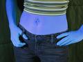
Blue Genesby
DougPazComment: Hello Douglas, don't wonder why you get another critique. Your your photo was assigned to me in context of the Critique Club. So here it goes:
Composition: I agree with John, that a portrait orientation would look better. I would have cropped out the left arm (left as seen from the viewer). It looks a bit strange because you can see the arm belonging to the left hand but then the right hand looks like it is "glued" to her hip. I think you should either show both arms or none.
I also agree that the background is distracting. Maybe if you tried to let your wife stand a bit further away from the background, that would have helped.
Lighting/Colours: You didn't tell it in your photo details but some other people said in their comments that you used black light. I'm not sure about that because when I adjust the hue in my photo editing program by about +160 it looks pretty normal to me (normal skin colour, black jeans, blue shirt). But I never used black light and maybe that is the effect of that type of lighting.
Anyway, while I like the effect in in general, the blue is a bit too much blue for my taste. It looks too unnatural and like you played too much with your image editor. I would like it better if it would be a more faint colour tone.
The drop shadow of your wife is distracting. I thik the suggestion above, to let your wife stand futher away from the backgound, would have helped with that, too.
Focus: As far as I can see everything of your wife is in focus. That's good.
Art: I got the wordplay "blue genes"/"blue jeans" a bit late ;-) I guess that's because the jeans seem to be play a totally unimportant role in this photo. The effect of the blue skin dominates.
Anyway, it's a creative effect and I really like the concept. Also you fulfilled the challenge perfectly but personally I would have liked a less smurf coloured version ;-).
I have a different version (different crop, colour hue and saturation) of your photo. I can send it to you if you want.
Stephan