| Image |
Comment |
| 02/23/2003 07:07:08 PM |
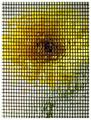
Portrait of a Gerbera (Chuck Close tribute)by 'PongComment: Very interesting. I like this abstract and I think this is very creative (well, creativity inspired by Mr. Close probably, but that's ok).
The grid maybe is a little bit too thick because the flower is almost not recognisable, but maybe that was intened.
It takes some time until you notice that some of the spaces are filled with water and create a refraction. There seems to be no pattern though.
If this photo was inspired by a spcific painting from Chuck Close, I would like to know which one. I looked on the Web for a while but didn't fine one. |
 Photographer found comment helpful. Photographer found comment helpful. |
| 02/22/2003 10:21:48 PM |
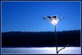
Other Sideby crabappl3Comment: Greetings from the Critique Club, Danny!
Composition: Very interesting. At a first glance I also would have said, that you should have cropped more from the right side. But then I realised that the patterns on the wall are quite interesting. But there is something about the composition which feels odd. I think using the rule of thirds would improve the photo. The centering doesn't fit here. I don't know if it would have been technically possible, but instead of cropping from the right I would like to see more from the left side. Then there also could be seen more of the darker area on the left, which corresponds the the right side.
Lighting: I guess the red colour comes from a wrong or no white balance setting. I don't know of that was intentional but I would like it be more "natural". I know it's a bit silly because for this subject it does not matter if it's red, yellow, blue or green. But the red just _looks_ like a technical "error". While testing some different crops I also changed the hue a little (+16) which results in a more golden/yellow tone. I think that's much better.
The "star" effect created by the small aperture is nice.
Focus: Generally ok. 1/2s exposure time, so you surely used a tripod. I can't make out where the camera focussed, but the foliage could be a bit sharper.
Challenge: Met. A deeper tunnel would have had more impact, but it certainly fits to the challenge theme.
Creativity: Well, not overly creative, but not totally boring either.
If you have questions just send me an Email. I'll happily discuss this more.
-Stephan
|
| Photographer found comment helpful. |
| 02/02/2003 09:35:13 PM |
Shadow of a squareby dimitriiComment: Wow, I really like the colours and the fuzzy look of the square. The dark area in the upper right corner is a bit distracting because it disturbs the clear segmentation of light and dark areas. Same with the reflection on the lower side (although much less distracting). Nice texture on the wood and (again) the colouring is very nice because it fits to the wood. |
| Photographer found comment helpful. |
| 02/02/2003 09:25:25 PM |
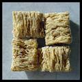
The Adult Sideby jimmythefishComment: I like the concept and the composition but a uniform backgound wouldn't distract so much. I also don't like the long shadow on the table although that kind of lighting makes the nice texture coming out nicely. Still, I think a top lighting would be better. Also you could have easily removed the crumbs. The focus is good, very crisp!
|
| Photographer found comment helpful. |
| 01/19/2003 09:22:08 PM |
The Lake is Ours Todayby ChrisW123Comment: I like the negative space. Expresses the wideness of the lake well. I would have cropped out the upper part with the woods and the shore, so that only the lake is visible. That would increase that expression even more. |
| Photographer found comment helpful. |
| 01/19/2003 09:14:41 PM |
|
| Photographer found comment helpful. |
| 01/12/2003 02:31:47 PM |
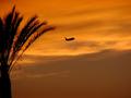
Leaving Californiaby seussieComment: Hello Susie! Your photo was assigned to me in context of the Critique Club. So here it goes:
Composition: Very good. I like the palm tree on the left and also the open space to the right, where the plane flies to. It really shows "Leaving California". I think it would look even better when the plane would be a little lower below the tree, but that's only a minor issue. I guess it was hard enough to capture the plane like that.
Lighting: A nice sunset. It gives a good lighting and makes your subjects just silhouettes. I like it.
Focus: As GeneralE said: Very good focus on the plane. It almost seems to be better focussed than the palm tree. Well done.
Art: You met the challenge very well. As said above your photo really shows what the title says. So overall my "critique" is a bit short because I really can't see anything wrong. Neither technically nor artistically.
Keep shooting,
Stephan
|
| Photographer found comment helpful. |
| 01/12/2003 12:16:16 PM |
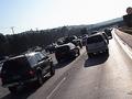
Trafficby terik65Comment: Greetings from the Critique Club, Teri. Your photo was assigned to me, so here it goes:
Composition: I like the rotation. It makes the photo look chaotic and I guess that's what you wanted to show: the chaos of the traffic on holidays. I would have zoomed in (or cropped a bit more) to leave less space on the right side and also cut the car on the left a little. Now it looks like the car was made to fit into the fame. This somehow goes against the "chaos" look.
Lighting: The back lighting makes this photo interesting. But such lighting is also very difficult to handle. You can see that some parts of the photo are too bright while others are too dark. I loaded your photo to my image editor and I think a little less contrast would improve it. I also would like a black&white version much more. It then has a "documentary" look, like as if it was for a newspaper, which would fit here.
Focus: The focus is not good, although you used a fairly fast shutter speed. Was the photo taken while you drove or when the car stood still? It also looks oversharpened in postprocessing.
Digital processing: Your photo only has a file size of 48kB. Remember that you can use up to 150kB here on DPC. I think your photo could look much better when you would have used a higher JPEG quality when saving (maxing out the 150kB limit).
Art: I think your photo meets the challenge well. The slant shows creativity (and some kind of braveness, because these things normally don't do well here on DPC). I also think it's visible that you did it on purpose and not just accidentally. However, it's hard to make an ordinary subject look interesting. Maybe the above suggestions can help you.
Have fun,
Stephan |
| Photographer found comment helpful. |
| 12/22/2002 11:09:12 PM |
|
| Photographer found comment helpful. |
| 12/22/2002 10:59:24 PM |
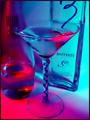
Shaken, not stirred... by AleciaComment: Cool colours! The composition is ok but because of the transparency it looks a bit crowded. The glass also seems to lack focus. And although you pretty much maxed out (148kB) the file size, I can make out some jpeg compression artifacts, e.g. on the writing of the right bottle.
Stephan |
| Photographer found comment helpful. |
Home -
Challenges -
Community -
League -
Photos -
Cameras -
Lenses -
Learn -
Help -
Terms of Use -
Privacy -
Top ^
DPChallenge, and website content and design, Copyright © 2001-2025 Challenging Technologies, LLC.
All digital photo copyrights belong to the photographers and may not be used without permission.
Current Server Time: 08/31/2025 07:45:15 AM EDT.