| Image |
Comment |
| 10/13/2002 08:15:00 AM |
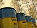
Standing Tallby spillerComment: Nice angle! I like how the trees in the background are aligned to the barrels. Unfortunately the photo suffers from bad JPEG compression. E.g. on the first barrel in the front you see these typical distortions. That's not necessary. You can use up to 150 kB for your photo. -stephan |
 Photographer found comment helpful. Photographer found comment helpful. |
| 10/13/2002 09:21:00 AM |
Don't forget to throw that out...by lumbardhComment: Funny :) I especially like how you teared open the condom in exactly the opposite direction than the package suggests. Is that some kind of statement of you? ;-) -stephan |
| Photographer found comment helpful. |
| 10/13/2002 07:14:00 PM |
OK Papa?by JEMComment: Great composition and good lighting, too. Unfortunately this photo suffers from bad JPEG compression. You can see that by the strange pixels e.g. around the two people. Remember, your photo can be as big as 150 kB. But it's still a great photo. -stephan |
| Photographer found comment helpful. |
| 10/13/2002 07:05:00 PM |
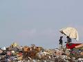
Pizza Hutby sanandanComment: Wow! This seems to be the perfect photo to me. It has a very photo-journalistc feel and is very touching. I really would like to know more about the circumstances of this photo. Great work! -stephan |
| Photographer found comment helpful. |
| 10/06/2002 04:45:00 PM |
Reflecting on Bathtime Memoriesby SonifoComment: For a couple of seconds I belived that there's really a baby reflection in a mirror or something. Now I see that it's a photo. Nice idea! -stephan |
| Photographer found comment helpful. |
| 09/29/2002 12:21:00 PM |
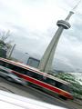
Toronto, Ontario...ehby zadoreComment: Creative shot! Very interesting. Apart from the nice tower I also like the motion blur of the train in this picture. It adds to the overall weird look of the photo. I guess you used a reflective surface to create this "warp" effect? If not, I really would like to know how you did it. -stephan |
| Photographer found comment helpful. |
| 09/22/2002 11:58:00 AM |
Memento Moriby greenem2Comment: "Remember your death". Creative approach to the challenge. I like that. The face depicts the memento mori theme fine. The lighting is interesting. However it has a bit too much contrast for my taste. -stephan |
| Photographer found comment helpful. |
| 09/15/2002 10:05:00 PM |
Son of 'Son of Man' (Magritte Revisited)by ClubJuggleComment: Great idea! Magritte is one of my favourite painters (love the one with the pipe). I also submitted a photo of something which is normally seen as paintings. I like that idea very much :-) I'm very interested how you did it. The shadow of the head/hat looks not so good and it would be better without. The background of the original is better ;-) Other than that I think that's not only a very creative but also technically good photo. So high points from me. -stephan |
| Photographer found comment helpful. |
| 09/14/2002 10:21:00 PM |
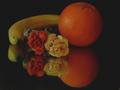
Fruits'n'Bloomsby mcraelComment: I like the composition and the mirror effect. You also chose the colours well. Corresponding orange and yellow of the roses to the fruits. But I would have liked it more with a bit more contrast. The black background is not black but grey. Pitch black would accentuated the colours even more. -stephan |
| Photographer found comment helpful. |
| 09/14/2002 10:33:00 PM |
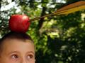
Zoink!by KarenBComment: Funny Wilhelm Tell reference. I like the title :-) I also like the crop and that the face of the child is not fully seen. The eyes are important but it keeps a good balance so that the focus is not primarily on the kids face but on the apple/arrow. Good contrast of the red apple vs. the green background. -stephan |
| Photographer found comment helpful. |
Home -
Challenges -
Community -
League -
Photos -
Cameras -
Lenses -
Learn -
Help -
Terms of Use -
Privacy -
Top ^
DPChallenge, and website content and design, Copyright © 2001-2025 Challenging Technologies, LLC.
All digital photo copyrights belong to the photographers and may not be used without permission.
Current Server Time: 09/02/2025 11:58:41 PM EDT.