| Image |
Comment |
| 05/17/2004 06:36:45 PM |
Chains of the ocean.by JokullComment: Critique Club Comment:
It seems to me that you have a good eye for colour; the chains on the rocks both have so-called earth colours and they work great together giving the picture a natural look which fits the title well.
The composition gives the photo an abstract touch. The way you divided the photo into squares, makes the background get as much attention as the chain. Since the chain is your subject, you could think of other ways to present it in your picture. Your camera was straight above the chain, so the 'huge'-ness you speak of in your own comments, is a bit lost. A shot from beside the chain facing up, would have showed the size of the chain maybe better.
Like other members already have noticed: the focus of the photo is more on the rocks than on the chains, so the chains are slightly unsharp. The attention is thereby also more drawn to the rocks than to the chains.
The photo met the challenge well; the rust is very much present in the texture of the chains and in the colour. When the light would have been a bit less sharp, the texture and colours would have been even more clear. I see your ISO was on 200, for outdoor shooting you can choose an ISO of 100 or less, like 50.
All in all it's a good picture which is peacefull to look at.
Fotowereld. |
 Photographer found comment helpful. Photographer found comment helpful. |
| 05/17/2004 05:25:48 PM |
|
| Photographer found comment helpful. |
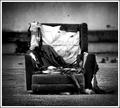
| 05/17/2004 05:14:21 PM |
scrapby jus6681Comment: Ooh I like this a lot!! This is photojournalism style.. nice b/w (lots pure blacks and pure whites..great!) the grain adds that little more..wauw this one is really really great!! This one must score high, it must!! |
| Photographer found comment helpful. |
| 05/17/2004 05:10:47 PM |
Just Me, Myself and Skyby ImagineerComment: yep great composition! Maybe the grass is a bit over saturated, but on the other hand that works well in this picture!! (and knowing the cow doesn't even know he's the center of attention over here makes it even more nice!!) |
| Photographer found comment helpful. |
| 05/17/2004 05:06:58 PM |
Bachmannby Herblacklist12Comment: you photographed into the sunlight and now it is falling over your centerpiece! |
| Photographer found comment helpful. |
| 05/17/2004 05:05:49 PM |
Las Vegas Showgirlby dimitriiComment: great one! This must score high, and not because it shows a naked woman, but because of the use of light and the adding of grain is superb, her hands are not only hiding her butt (excuse me if this isn't a decent English word, but I don't know many words for it in English and this one seemed the most decent one..) but they become part of the whole picture.. the background works just right for the paleness of the model and her hair! |
| Photographer found comment helpful. |
| 05/17/2004 05:02:15 PM |
Maxby Links 2 3 4Comment: when the dog would have looked into the camera it would have been a lot more appealing to me..nice fluffy dog though! |
| Photographer found comment helpful. |
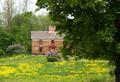
| 05/17/2004 05:01:36 PM |
Springtimeby emorgan49Comment: the house is in the center, but meanwhile everything else gets my attention, because the house looks a bit dull..the tree in the front is also blocking my sight..maybe you should have stepped a few metres to the front?? |
| Photographer found comment helpful. |
| 05/17/2004 04:58:01 PM |
Just One More Picture Pleaseby ccaseyComment: this one plays with me! I have seen this idea been worked out before though and then the person who wore the glasses was completely sharp, I miss that here, also the overlighted areas on the nose and on the right of the face are a bit disturbing..composition and colours are realy smooth though..like it a lot!!! |
| Photographer found comment helpful. |
| 05/17/2004 04:55:54 PM |
|
| Photographer found comment helpful. |
Home -
Challenges -
Community -
League -
Photos -
Cameras -
Lenses -
Learn -
Help -
Terms of Use -
Privacy -
Top ^
DPChallenge, and website content and design, Copyright © 2001-2025 Challenging Technologies, LLC.
All digital photo copyrights belong to the photographers and may not be used without permission.
Current Server Time: 06/18/2025 12:49:02 AM EDT.