| Image |
Comment |
| 01/13/2006 06:48:56 PM |
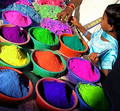
Pots of Colorby SteveinnzComment: What a great candid! the colors are so bright they almost look surreal here. The slightly skewed angle and framing works well for the feel of this shot. I'm finding the shadows near the lower part of the shot distracting. I think that there's so much color in the other elements of the shot, you could have probably cropped the lower part out and not lost any of the shot's impact. Just my own opinion, nice capture nonetheless.... 8 |
 Photographer found comment helpful. Photographer found comment helpful. |
| 01/13/2006 06:45:02 PM |
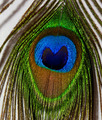
Ruby in Redby kiwinickComment: Very cute photo. I like the eye-level angle you've chosen to shoot this and the composition of your subject. The detail and focus are nice |
| Photographer found comment helpful. |
| 01/13/2006 06:42:19 PM |
|
| Photographer found comment helpful. |
| 01/13/2006 06:38:44 PM |
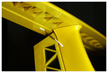
A piece of tailby TrollManComment: I've always found structural elements of buildings, vehicles, and machinery quite interesting to look at. Industrial art of sorts. All the spars and connecting elements of this tail section are very interesting. Your choice of a black background works well to create 'pop' in the yellow tail. |
| Photographer found comment helpful. |
| 01/13/2006 06:35:44 PM |
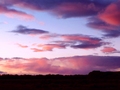
A Study in Cloudsby KivetComment: Very pretty colors you've captured here. I like the textures and layers in the clouds. For some reason, I find the horizon detracts from the shot. It looks dark and heavy against the feel of this shot. Maybe more crop on the horizon or removing it all together? Just my own opinion, nice shot nonetheless |
| Photographer found comment helpful. |
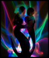
| 01/13/2006 06:33:24 PM |
Strength Through Unityby ImagineerComment: Very interesting photo to look at. It seems the more I stare at it, the more I can see. Aesthetically, it is quite pleasing and I like how you've taken on this challenge by utilizing negative space and darkness..... 8 |
| Photographer found comment helpful. |
| 01/13/2006 06:31:01 PM |
Sarah - Land downunder coloursby trobergeComment: I normally don't like portraits that have been overly treated, or post-processed in any way. But given the challenge theme, I think the effect you've used works well to emphasize it and create a "feel" appropriate to this challenge. The high contrasts and loud colors work well here.... 7 |
| Photographer found comment helpful. |
| 01/13/2006 06:28:23 PM |
a shot in the darkby rldamitComment: Not really sure what I'm looking at here. But I think an abstract feel is what you're going for? Maybe using less black space would have added to the shot? |
| Photographer found comment helpful. |
| 01/13/2006 06:26:27 PM |
Pink Princessby cbellerComment: Very nice portrait. Good focus on the eyes and face. The shot seems cropped a little tight IMHO and her face seems a bit 'crowded'? Just my own opinion, nice shot nonetheless.... 7 |
| Photographer found comment helpful. |
| 01/13/2006 06:19:52 PM |
Fruity Chairsby lkn4truthComment: I like the different elements in this shot and how the different colored chairs create visual layers. One thing that distracts me is the apparent fringing/bleeding around some areas of the shot? It is particularly evident around the edges of the blue chairs. Not sure if this was due to post processing? |
| Photographer found comment helpful. |
Home -
Challenges -
Community -
League -
Photos -
Cameras -
Lenses -
Learn -
Help -
Terms of Use -
Privacy -
Top ^
DPChallenge, and website content and design, Copyright © 2001-2025 Challenging Technologies, LLC.
All digital photo copyrights belong to the photographers and may not be used without permission.
Current Server Time: 08/15/2025 04:39:52 PM EDT.