| Image |
Comment |
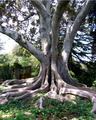
| 08/24/2004 09:50:19 AM |
Secretsby KylieComment: If you could re-take this image when the sun was bit lower in the sky you could avoid some of the minor blown-out highlights in the sky and on the trunk. The gate in the left is also an interesting subject which could be more complimentary if the perspecitve shifted it slightly to be more visible. Great subject - I bet many people would walk right by without thinking to stop and capture this tree. |
 Photographer found comment helpful. Photographer found comment helpful. |
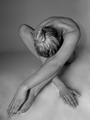
| 08/23/2004 09:36:15 AM |
Bed Headby ElemmennopeComment: The lighting in this image is fantastic. I like the pose as well. The only thing I might change would be cloning out the bedpost in the background as it doesn't rea;;y add to the image. Might even try taking the image a second time with a different angle the gets it out of the frame. Excellent work! |
| Photographer found comment helpful. |
| 08/23/2004 09:32:02 AM |
Passionby Firstrich1Comment: Great use of selective desaturation, and even better is your play on imagination. This is one of the best I've seen - I hope you do well in this challenge! |
| Photographer found comment helpful. |
| 08/23/2004 09:23:01 AM |
La Femmeby ScantyNebulaComment: Great editing - very cool effect. The expression on the model is perfect as well. Nice job! |
| Photographer found comment helpful. |
| 08/23/2004 09:22:13 AM |
Togetherby midnightride2Comment: The blurring of the image is a distraction for me. The woman's expression seems to unnatural, as is her pose. I'm just not getting the message this is intended to convey. |
| Photographer found comment helpful. |
| 08/23/2004 09:17:00 AM |
Touching the Voidby dacrazyrnComment: What a cool idea! I wish the "climber" was a more recognizable figure as I had to look for a while to figure out what was going on there. Bonus points for doing somethign cool! |
| Photographer found comment helpful. |
| 08/23/2004 09:14:48 AM |
Black Mistby NatatorComment: I like the idea, but the reflection and texture on the black veil doesn't work for me. I think if it had been ironed first it would work better. Just my thought since I don't know exactly what you were envisioning. |
| Photographer found comment helpful. |
| 08/23/2004 09:12:18 AM |
Bashfulby DufusComment: I like the pose and the b/w, but the seam/corner/dark line in the background forms a very visualy horizontal which clashes with the otherwise smooth composition. |
| Photographer found comment helpful. |
| 08/19/2004 07:39:37 AM |
The Neon Gods They Madeby strangeghostComment: I'm not seeing any photographic elements which build on the sign itself, or show photographic creativity in laying out the shot. If we consider the neon sign to be a neon artist's work, that would make this image a direct photo of prior art, which is not permitted in the contest rules. It's a gray area, so I'm not recommending this shot for DQ, but my vote reflects the fact that while this is a technically comptetant image, it is not using observable (to me) unique interpretation, perspective, lighting, or photoediting. |
| Photographer found comment helpful. |
| 08/19/2004 07:32:07 AM |
The Pink Stilettoby jackditchComment: It's difficult to see how any photographic elements contributed to this work, vs. the pre-existing elements of the neon art. It looks more like a head-on shot of prior art which is technically not allowed by challenge rules. Since I don't know exactly what was done, I'm voting as though this shot was legitimate, but something to think about. |
| Photographer found comment helpful. |
Home -
Challenges -
Community -
League -
Photos -
Cameras -
Lenses -
Learn -
Help -
Terms of Use -
Privacy -
Top ^
DPChallenge, and website content and design, Copyright © 2001-2025 Challenging Technologies, LLC.
All digital photo copyrights belong to the photographers and may not be used without permission.
Current Server Time: 06/19/2025 08:05:04 AM EDT.